## Scatter Plot: Malicious vs. Safe Data Point Distribution
### Overview
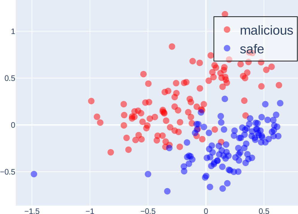
The image is a 2D scatter plot visualizing the distribution of two classes of data points, labeled "malicious" and "safe." The plot uses color coding to distinguish between the classes and shows their spatial relationship across two numerical dimensions. There is no explicit chart title.
### Components/Axes
* **Legend:** Located in the top-right corner of the plot area. It contains two entries:
* A red circle symbol labeled "malicious".
* A blue circle symbol labeled "safe".
* **X-Axis:** A horizontal numerical axis. The visible major tick marks and labels are: `-1.5`, `-1`, `-0.5`, `0`, `0.5`. The axis extends slightly beyond these bounds.
* **Y-Axis:** A vertical numerical axis. The visible major tick marks and labels are: `-0.5`, `0`, `0.5`, `1`. The axis extends slightly beyond these bounds.
* **Grid:** A light gray grid is present, with lines corresponding to the major tick marks on both axes.
* **Data Points:** Numerous semi-transparent circular markers are plotted. Their color corresponds to the legend: red for "malicious," blue for "safe."
### Detailed Analysis
* **Data Series - "malicious" (Red Points):**
* **Trend/Visual Distribution:** The red points show a general upward trend from left to right. They are predominantly located in the upper-right quadrant of the plot.
* **Spatial Range:** They span approximately from X = -1.0 to X = 0.7 and from Y = -0.3 to Y = 1.1. The highest concentration appears between X = -0.5 to 0.5 and Y = 0 to 0.8.
* **Data Series - "safe" (Blue Points):**
* **Trend/Visual Distribution:** The blue points are primarily clustered in the lower-right quadrant. Their distribution is denser and more compact compared to the red points.
* **Spatial Range:** They span approximately from X = -1.5 (one outlier) to X = 0.7 and from Y = -0.7 to Y = 0.3. The main cluster is concentrated between X = -0.2 to 0.6 and Y = -0.6 to 0.1.
* **Overlap Region:** There is a region of overlap between the two classes, primarily in the central area around X = -0.2 to 0.2 and Y = -0.2 to 0.2. In this zone, red and blue points are intermingled.
### Key Observations
1. **Class Separation:** There is a clear, though not absolute, separation between the two classes. "Malicious" points tend to have higher values on both the X and Y axes compared to "safe" points.
2. **Density Difference:** The "safe" (blue) points form a tighter, more dense cluster, while the "malicious" (red) points are more dispersed.
3. **Outliers:** A few "safe" points exist as outliers far to the left (e.g., near X=-1.5, Y=-0.5). A few "malicious" points are also present within the main "safe" cluster and vice-versa, indicating potential misclassifications or edge cases if this represents model output.
4. **Axis Labels:** The axes lack descriptive titles (e.g., "Feature 1," "Principal Component 1," "Score"). They are labeled only with numerical values.
### Interpretation
This scatter plot likely represents the output of a dimensionality reduction technique (like PCA or t-SNE) or the activation space of a machine learning model, projecting high-dimensional data into 2D for visualization. The clear spatial separation suggests that the underlying features or model representations for "malicious" and "safe" samples are distinct. The "malicious" class exhibits greater variance in its representation.
The overlap region is critical; it represents samples where the model's distinction between classes is less clear, which could correspond to ambiguous cases, adversarial examples, or novel attack patterns. The presence of outliers, particularly the "safe" point at the far left, may indicate anomalous but benign data or a failure mode of the projection technique.
**Language Note:** All text in the image is in English.