## Scatter Plot: Distribution of Malicious and Safe Data Points
### Overview
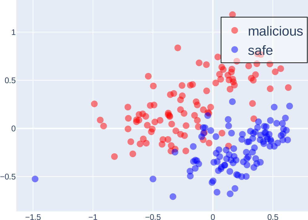
The image is a scatter plot visualizing the distribution of two categories: "malicious" (red dots) and "safe" (blue dots) across a two-dimensional space defined by X and Y axes. The plot lacks explicit axis labels or units, but the legend clarifies the color coding. The data points are densely clustered in specific regions, with notable overlap between the two categories in the central area.
### Components/Axes
- **Axes**:
- X-axis: Unlabeled, spans approximately from -1.5 to 1.0.
- Y-axis: Unlabeled, spans approximately from -0.5 to 1.0.
- **Legend**:
- Positioned in the **top-right corner**.
- Labels:
- **Red**: "malicious"
- **Blue**: "safe"
### Detailed Analysis
- **Data Distribution**:
- **Malicious (Red)**:
- Predominantly concentrated in the **upper-right quadrant** (X > 0, Y > 0).
- Density decreases as X approaches -1.5 and Y approaches -0.5.
- Notable outliers: A few red points appear in the lower-left quadrant (X < -0.5, Y < 0).
- **Safe (Blue)**:
- Clustered in the **lower-right quadrant** (X > 0, Y < 0).
- Extends slightly into the central region (X ≈ 0, Y ≈ 0).
- Fewer points in the upper-left quadrant (X < -0.5, Y > 0).
- **Overlap**:
- Significant overlap occurs in the **central region** (X ≈ -0.5 to 0.5, Y ≈ -0.25 to 0.5), where red and blue points intermingle.
- Overlap density is highest near the origin (X ≈ 0, Y ≈ 0).
### Key Observations
1. **Clustering Patterns**:
- Malicious points dominate the upper-right quadrant, suggesting a potential correlation between higher X and Y values and malicious activity.
- Safe points are concentrated in the lower-right quadrant, indicating a possible inverse relationship with malicious activity.
2. **Ambiguity in Central Region**:
- The overlap in the central area implies uncertainty or misclassification for some data points.
3. **Outliers**:
- A small number of red points in the lower-left quadrant may represent rare or anomalous malicious cases.
- Blue points in the upper-right quadrant could indicate false positives or edge cases.
### Interpretation
The plot suggests a **partial separation** between malicious and safe data points, with clear clustering in distinct quadrants but significant ambiguity in the central region. This could reflect:
- **Model Performance**: If this is a classification visualization, the overlap indicates suboptimal accuracy, particularly near decision boundaries.
- **Data Characteristics**: The separation might highlight inherent differences in feature distributions between the two categories, though the overlap suggests contextual or overlapping behaviors.
- **Potential Biases**: The dominance of red points in the upper-right quadrant could indicate a bias in data collection or labeling.
The absence of axis labels limits quantitative interpretation, but the spatial distribution emphasizes the need for further analysis (e.g., feature engineering, model refinement) to improve classification clarity.