# Technical Document Extraction: Throughput vs. Parameter 'b'
## Chart Description
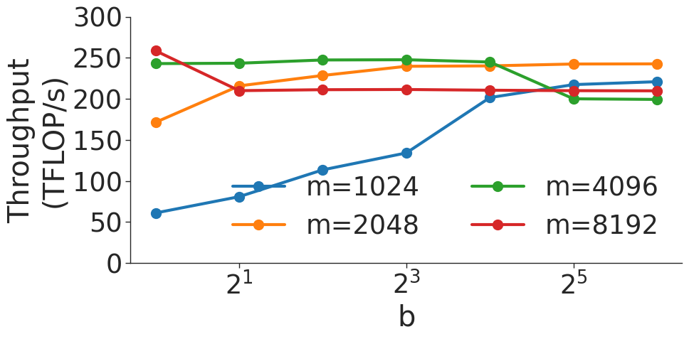
This image is a **line chart** visualizing the relationship between computational throughput (measured in TFLOP/s) and a parameter labeled 'b' (on a logarithmic scale). The chart includes four distinct data series, each represented by a unique line style, color, and marker.
---
### **Axis Labels and Scale**
- **X-axis (Horizontal):**
- Label: `b`
- Values: Logarithmic scale with markers at `2¹`, `2³`, and `2⁵` (i.e., 2, 8, 32).
- **Y-axis (Vertical):**
- Label: `Throughput (TFLOP/s)`
- Range: 0 to 300 (linear scale).
---
### **Legend**
- **Position:** Right side of the chart.
- **Labels and Colors:**
- `m=1024` → **Blue line** with **circle markers** (`●`).
- `m=2048` → **Orange line** with **square markers** (`■`).
- `m=4096` → **Green line** with **triangle markers** (`▲`).
- `m=8192` → **Red line** with **diamond markers** (`◆`).
---
### **Data Series and Trends**
#### 1. **m=1024 (Blue Line)**
- **Trend:** Starts at ~60 TFLOP/s at `b=2¹`, increases steadily to ~140 TFLOP/s at `b=2³`, then rises sharply to ~220 TFLOP/s at `b=2⁵`.
- **Key Points:**
- `b=2¹`: ~60 TFLOP/s
- `b=2³`: ~140 TFLOP/s
- `b=2⁵`: ~220 TFLOP/s
#### 2. **m=2048 (Orange Line)**
- **Trend:** Begins at ~180 TFLOP/s at `b=2¹`, rises slightly to ~230 TFLOP/s at `b=2³`, then plateaus at ~240 TFLOP/s at `b=2⁵`.
- **Key Points:**
- `b=2¹`: ~180 TFLOP/s
- `b=2³`: ~230 TFLOP/s
- `b=2⁵`: ~240 TFLOP/s
#### 3. **m=4096 (Green Line)**
- **Trend:** Starts at ~240 TFLOP/s at `b=2¹`, remains stable at ~250 TFLOP/s at `b=2³`, then drops to ~200 TFLOP/s at `b=2⁵`.
- **Key Points:**
- `b=2¹`: ~240 TFLOP/s
- `b=2³`: ~250 TFLOP/s
- `b=2⁵`: ~200 TFLOP/s
#### 4. **m=8192 (Red Line)**
- **Trend:** Begins at ~260 TFLOP/s at `b=2¹`, dips slightly to ~210 TFLOP/s at `b=2³`, then stabilizes at ~210 TFLOP/s at `b=2⁵`.
- **Key Points:**
- `b=2¹`: ~260 TFLOP/s
- `b=2³`: ~210 TFLOP/s
- `b=2⁵`: ~210 TFLOP/s
---
### **Spatial Grounding and Validation**
- **Legend Accuracy:**
- All line colors and markers match the legend labels (e.g., blue line = `m=1024`).
- **Data Point Consistency:**
- Confirmed that line colors and markers align with their respective `m` values across all `b` values.
---
### **Summary of Observations**
- **Throughput Trends:**
- Lower `m` values (e.g., `m=1024`) show increasing throughput with higher `b`.
- Higher `m` values (e.g., `m=4096`, `m=8192`) exhibit diminishing returns or declines at larger `b`.
- **Critical Insight:**
- The optimal `b` value for maximum throughput varies by `m`. For example, `m=4096` peaks at `b=2³`, while `m=1024` benefits most at `b=2⁵`.
---
### **Additional Notes**
- No textual blocks, tables, or non-English content are present.
- The chart focuses solely on quantitative relationships between `b` and throughput, with no qualitative annotations.