## Line Chart: Age Group vs. f̂μ
### Overview
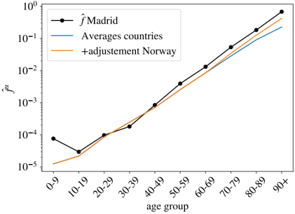
The image is a line chart comparing the values of f̂μ across different age groups for Madrid, the average of several countries, and Norway with adjustments. The x-axis represents age groups, and the y-axis represents f̂μ on a logarithmic scale.
### Components/Axes
* **X-axis:** "age group" with categories: 0-9, 10-19, 20-29, 30-39, 40-49, 50-59, 60-69, 70-79, 80-89, 90+
* **Y-axis:** "f̂μ" with a logarithmic scale ranging from 10^-5 to 10^0. Axis markers are present at 10^-5, 10^-4, 10^-3, 10^-2, 10^-1, and 10^0.
* **Legend (top-left):**
* Black line with circles: "f̂ Madrid"
* Blue line: "Averages countries"
* Orange line: "+adjustement Norway"
### Detailed Analysis
* **f̂ Madrid (Black Line):**
* Trend: Initially decreases from 0-9 to 10-19, then increases steadily from 10-19 to 90+.
* Data Points:
* 0-9: ~8 * 10^-5
* 10-19: ~2.5 * 10^-5
* 20-29: ~6 * 10^-5
* 30-39: ~1.5 * 10^-4
* 40-49: ~3.5 * 10^-4
* 50-59: ~8 * 10^-4
* 60-69: ~2 * 10^-3
* 70-79: ~5 * 10^-3
* 80-89: ~1.2 * 10^-2
* 90+: ~3 * 10^-2
* **Averages countries (Blue Line):**
* Trend: Generally increases with age group.
* Data Points (approximate, as the line is smooth):
* 0-9: ~2 * 10^-5
* 10-19: ~1.2 * 10^-5
* 20-29: ~4 * 10^-5
* 30-39: ~1.2 * 10^-4
* 40-49: ~3 * 10^-4
* 50-59: ~7 * 10^-4
* 60-69: ~1.5 * 10^-3
* 70-79: ~3.5 * 10^-3
* 80-89: ~8 * 10^-3
* 90+: ~2 * 10^-2
* **+adjustement Norway (Orange Line):**
* Trend: Generally increases with age group, closely following the "f̂ Madrid" line.
* Data Points (approximate):
* 0-9: ~1.2 * 10^-5
* 10-19: ~1.2 * 10^-5
* 20-29: ~5 * 10^-5
* 30-39: ~1.5 * 10^-4
* 40-49: ~3.5 * 10^-4
* 50-59: ~8 * 10^-4
* 60-69: ~2 * 10^-3
* 70-79: ~5 * 10^-3
* 80-89: ~1.2 * 10^-2
* 90+: ~3 * 10^-2
### Key Observations
* The "f̂ Madrid" and "+adjustement Norway" lines are very similar, suggesting that the adjustment applied to Norway results in a similar distribution to Madrid.
* The "Averages countries" line is consistently lower than the "f̂ Madrid" and "+adjustement Norway" lines, indicating that Madrid and adjusted Norway have higher f̂μ values across all age groups compared to the average of other countries.
* All three lines show a general increase in f̂μ with age, indicating a positive correlation between age group and f̂μ.
* The most significant increase in f̂μ occurs in the older age groups (70-79, 80-89, 90+).
* The "f̂ Madrid" line has a noticeable dip between the 0-9 and 10-19 age groups, which is not as pronounced in the other two lines.
### Interpretation
The chart suggests that f̂μ, whatever it represents, is generally higher in Madrid and adjusted Norway compared to the average of other countries across all age groups. The strong positive correlation between age and f̂μ indicates that older age groups have significantly higher values. The similarity between the "f̂ Madrid" and "+adjustement Norway" lines implies that the adjustment applied to Norway effectively aligns its distribution with that of Madrid. The initial dip in "f̂ Madrid" for the 10-19 age group could be a unique characteristic of the Madrid data or a result of specific factors affecting that age group. Further context is needed to fully understand the meaning of f̂μ and the implications of these trends.