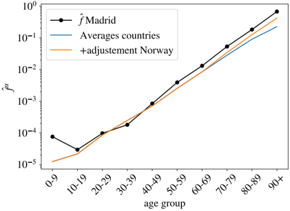
## Line Chart: Age-Specific Mortality Rate
### Overview
This image presents a line chart illustrating the age-specific mortality rate (denoted as *fμ*) across different age groups. Three data series are plotted: mortality rates for Madrid, averages across countries, and mortality rates for Norway with an adjustment. The chart uses a logarithmic y-axis.
### Components/Axes
* **X-axis:** "age group" with markers at 0-9, 10-19, 20-29, 30-39, 40-49, 50-59, 60-69, 70-79, 80-89, and 90+.
* **Y-axis:** "*fμ*" (mortality rate) on a logarithmic scale, ranging from approximately 10<sup>-5</sup> to 10<sup>0</sup> (or 1).
* **Legend:** Located in the top-left corner, identifying the three data series:
* Black circles with line: “ˆMadrid”
* Blue line: “Averages countries”
* Orange line: “+adjustment Norway”
### Detailed Analysis
**1. Madrid (Black Line):**
The black line representing Madrid shows an increasing trend in mortality rate with age.
* 0-9: Approximately 3 x 10<sup>-5</sup>
* 10-19: Approximately 2 x 10<sup>-5</sup>
* 20-29: Approximately 2.5 x 10<sup>-5</sup>
* 30-39: Approximately 5 x 10<sup>-5</sup>
* 40-49: Approximately 1.2 x 10<sup>-4</sup>
* 50-59: Approximately 2.5 x 10<sup>-4</sup>
* 60-69: Approximately 5 x 10<sup>-4</sup>
* 70-79: Approximately 1 x 10<sup>-3</sup>
* 80-89: Approximately 2 x 10<sup>-3</sup>
* 90+: Approximately 5 x 10<sup>-3</sup>
**2. Averages Countries (Blue Line):**
The blue line representing the average across countries also shows an increasing trend, but it is generally lower than the Madrid data for younger age groups and converges with Madrid at older ages.
* 0-9: Approximately 1 x 10<sup>-5</sup>
* 10-19: Approximately 1 x 10<sup>-5</sup>
* 20-29: Approximately 1.5 x 10<sup>-5</sup>
* 30-39: Approximately 3 x 10<sup>-5</sup>
* 40-49: Approximately 6 x 10<sup>-5</sup>
* 50-59: Approximately 1.2 x 10<sup>-4</sup>
* 60-69: Approximately 2.5 x 10<sup>-4</sup>
* 70-79: Approximately 5 x 10<sup>-4</sup>
* 80-89: Approximately 1 x 10<sup>-3</sup>
* 90+: Approximately 2.5 x 10<sup>-3</sup>
**3. +adjustment Norway (Orange Line):**
The orange line, representing Norway with adjustment, initially lies between the Madrid and average countries lines. It shows a similar increasing trend with age.
* 0-9: Approximately 2 x 10<sup>-5</sup>
* 10-19: Approximately 1.5 x 10<sup>-5</sup>
* 20-29: Approximately 2 x 10<sup>-5</sup>
* 30-39: Approximately 4 x 10<sup>-5</sup>
* 40-49: Approximately 8 x 10<sup>-5</sup>
* 50-59: Approximately 1.8 x 10<sup>-4</sup>
* 60-69: Approximately 3.5 x 10<sup>-4</sup>
* 70-79: Approximately 7 x 10<sup>-4</sup>
* 80-89: Approximately 1.5 x 10<sup>-3</sup>
* 90+: Approximately 3.5 x 10<sup>-3</sup>
### Key Observations
* All three data series exhibit a positive correlation between age and mortality rate.
* Madrid consistently has the highest mortality rates, particularly in younger age groups.
* The average across countries has the lowest mortality rates in younger age groups, but converges with the other lines at older ages.
* The adjusted Norway data falls between Madrid and the average countries, showing a slightly higher mortality rate than the average, especially in middle and older age groups.
* The logarithmic scale compresses the differences in mortality rates at higher ages, making the lines appear closer together.
### Interpretation
The chart demonstrates the general principle that mortality rates increase with age. The differences between the three data series suggest variations in healthcare systems, lifestyle factors, or other demographic characteristics between Madrid, the average across countries, and Norway. The adjustment made to the Norway data likely reflects a correction for specific factors influencing mortality in that country. The convergence of the lines at older ages suggests that, beyond a certain point, the influence of these factors diminishes, and mortality rates become more similar across populations. The use of a logarithmic scale is crucial for visualizing the large range of mortality rates, allowing for a clearer comparison of trends across different age groups. The data suggests that Madrid has a higher mortality risk across most age groups compared to the average of the countries considered, and Norway, with its adjustment, falls in between.