## Line Chart: Age-Specific Values (f̂) for Madrid, Country Averages, and Norway Adjustment
### Overview
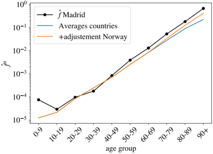
The image is a line chart plotted on a semi-logarithmic scale (logarithmic y-axis, linear x-axis). It displays the relationship between age groups and a variable denoted as "f̂" for three different data series: Madrid, an average of countries, and an adjusted average including Norway. The chart suggests an exponential increase in the value of f̂ with age.
### Components/Axes
* **Chart Type:** Line chart with markers for one series.
* **Y-Axis:**
* **Label:** `f̂` (f-hat).
* **Scale:** Logarithmic (base 10).
* **Range:** From `10^-5` (0.00001) at the bottom to `10^0` (1) at the top.
* **Major Ticks:** `10^-5`, `10^-4`, `10^-3`, `10^-2`, `10^-1`, `10^0`.
* **X-Axis:**
* **Label:** `age group`.
* **Categories (from left to right):** `0-9`, `10-19`, `20-29`, `30-39`, `40-49`, `50-59`, `60-69`, `70-79`, `80-89`, `90+`.
* **Legend:**
* **Position:** Top-left corner of the plot area.
* **Series 1:** `f̂ Madrid` - Represented by a **black line with circular markers**.
* **Series 2:** `Averages countries` - Represented by a **solid blue line**.
* **Series 3:** `+adjustment Norway` - Represented by a **solid orange line**.
### Detailed Analysis
**Trend Verification & Data Point Extraction:**
All three series show a clear upward trend, with f̂ increasing by several orders of magnitude across the age groups. The increase appears roughly linear on this semi-log plot, indicating an exponential relationship with age.
1. **`f̂ Madrid` (Black line with markers):**
* **Trend:** Starts relatively high, dips slightly at the 10-19 age group, then increases steadily and steeply, consistently remaining above the other two lines for most age groups.
* **Approximate Data Points:**
* `0-9`: ~`8 x 10^-5`
* `10-19`: ~`3 x 10^-5` (local minimum)
* `20-29`: ~`1 x 10^-4`
* `30-39`: ~`2 x 10^-4`
* `40-49`: ~`8 x 10^-4`
* `50-59`: ~`4 x 10^-3`
* `60-69`: ~`1.5 x 10^-2`
* `70-79`: ~`5 x 10^-2`
* `80-89`: ~`2 x 10^-1`
* `90+`: ~`7 x 10^-1`
2. **`Averages countries` (Blue line):**
* **Trend:** Starts the lowest, increases smoothly and consistently. It runs parallel to but below the Norway adjustment line for most of the range.
* **Approximate Data Points:**
* `0-9`: ~`1.2 x 10^-5`
* `10-19`: ~`2 x 10^-5`
* `20-29`: ~`8 x 10^-5`
* `30-39`: ~`2 x 10^-4` (very close to Madrid at this point)
* `40-49`: ~`7 x 10^-4`
* `50-59`: ~`3 x 10^-3`
* `60-69`: ~`1 x 10^-2`
* `70-79`: ~`3.5 x 10^-2`
* `80-89`: ~`1.2 x 10^-1`
* `90+`: ~`3 x 10^-1`
3. **`+adjustment Norway` (Orange line):**
* **Trend:** Starts slightly above the "Averages countries" line and maintains a small, consistent positive offset throughout the age range. The gap appears to widen slightly in the older age groups.
* **Approximate Data Points:**
* `0-9`: ~`1.5 x 10^-5`
* `10-19`: ~`2.5 x 10^-5`
* `20-29`: ~`1 x 10^-4`
* `30-39`: ~`2.5 x 10^-4`
* `40-49`: ~`9 x 10^-4`
* `50-59`: ~`4 x 10^-3`
* `60-69`: ~`1.3 x 10^-2`
* `70-79`: ~`4.5 x 10^-2`
* `80-89`: ~`1.5 x 10^-1`
* `90+`: ~`4 x 10^-1`
### Key Observations
1. **Exponential Growth:** The primary observation is the strong exponential increase of f̂ with age for all series, spanning 4-5 orders of magnitude from the youngest to the oldest group.
2. **Madrid's Anomaly:** The `f̂ Madrid` series shows a distinct dip at the `10-19` age group, which is not present in the smoothed average lines. This could indicate a specific demographic or event-related effect for that age cohort in Madrid.
3. **Divergence at Older Ages:** While the lines are close in the middle age groups (e.g., 30-39), they begin to diverge more noticeably from age 50-59 onward. Madrid's values become significantly higher than the averages.
4. **Norway Adjustment:** The "+adjustment Norway" line is consistently higher than the "Averages countries" line, suggesting that including or adjusting for Norwegian data raises the estimated average f̂ value across all ages.
### Interpretation
This chart likely represents an **age-specific risk or rate**, such as mortality rate, infection fatality ratio, or a similar demographic parameter (f̂), where risk increases exponentially with age.
* **What the data suggests:** The data demonstrates that the measured quantity (f̂) is not uniform across populations or age groups. Madrid exhibits a higher baseline and a steeper age-gradient than the international average. The dip in Madrid's data for young adults (10-19) is a notable outlier that would warrant investigation—it could be a data artifact, or reflect a real phenomenon like lower exposure or higher resilience in that group during a specific event (e.g., a pandemic wave).
* **Relationship between elements:** The "Averages countries" line serves as a baseline model. The "+adjustment Norway" line shows how incorporating data from a specific country (Norway) modifies this baseline, resulting in a uniformly higher estimate. The `f̂ Madrid` line is an empirical observation from a specific location, showing how local conditions can cause significant deviation from modeled or averaged expectations, particularly at the extremes of age (very young and very old).
* **Significance:** The chart underscores the importance of age-stratification in analyzing such metrics. Using a single average value would be highly misleading. The divergence in older age groups is particularly critical, as it shows that the absolute difference in risk between Madrid and the average becomes very large for the elderly, which has major implications for resource allocation and public health strategy. The logarithmic scale is essential for visualizing this multiplicative, exponential relationship clearly.