## Line Chart: Attention Key Query Score, a=80
### Overview
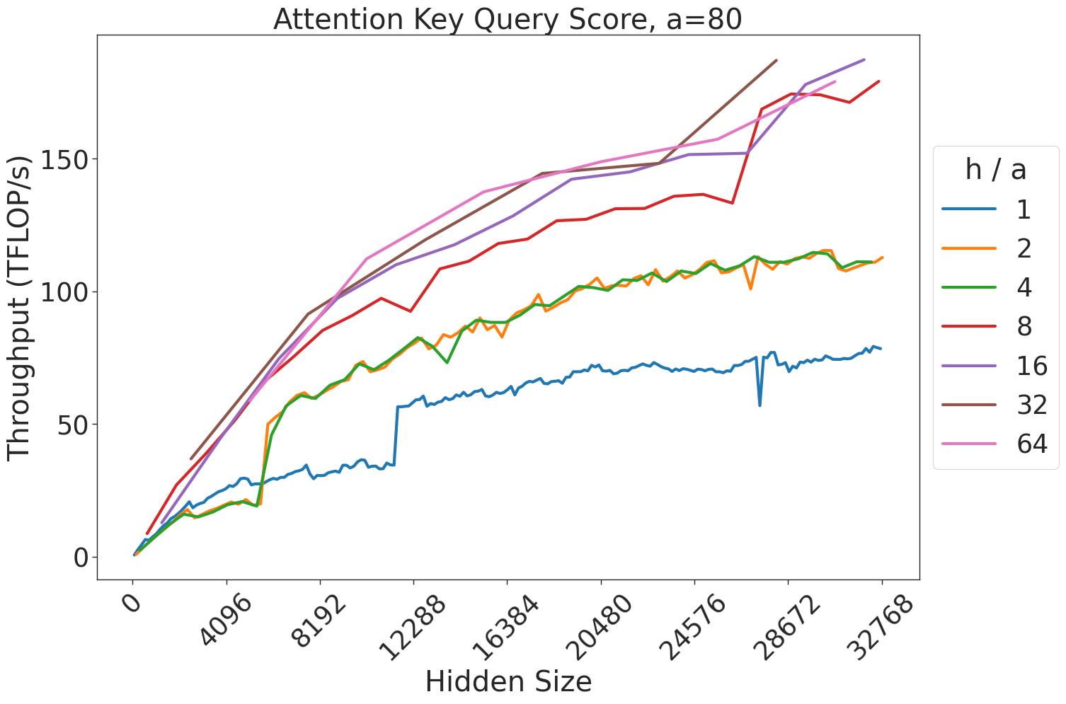
This chart illustrates the relationship between the "Hidden Size" of a neural network model (x-axis) and the resulting "Throughput" in TFLOP/s (y-axis). The data is segmented by different "h / a" ratios, which appear to represent architectural configurations of an attention mechanism. The chart demonstrates that throughput generally increases with hidden size, but the rate of improvement varies significantly based on the "h / a" ratio.
### Components/Axes
* **Title:** "Attention Key Query Score, a=80" (Centered at the top).
* **X-Axis:** "Hidden Size". The scale ranges from 0 to 32768, with major tick marks at intervals of 4096 (0, 4096, 8192, 12288, 16384, 20480, 24576, 28672, 32768).
* **Y-Axis:** "Throughput (TFLOP/s)". The scale ranges from 0 to 150+, with major tick marks at 0, 50, 100, and 150.
* **Legend:** Positioned on the right side of the chart. It defines the "h / a" ratio for seven distinct data series, color-coded as follows:
* **Blue:** 1
* **Orange:** 2
* **Green:** 4
* **Red:** 8
* **Purple:** 16
* **Brown:** 32
* **Pink:** 64
### Detailed Analysis
The chart displays seven distinct lines, all showing a positive correlation between Hidden Size and Throughput.
* **Trend Verification:** All lines slope upward from left to right.
* **Data Series Groupings:**
* **Low Throughput Group (Blue, h/a=1):** This line is the lowest on the chart. It rises steadily until a hidden size of approximately 12288, where it exhibits a sharp, vertical jump in throughput (from ~35 to ~60 TFLOP/s). It continues to rise, ending at approximately 80 TFLOP/s at a hidden size of 32768.
* **Mid Throughput Group (Orange, h/a=2; Green, h/a=4):** These two lines are nearly identical and overlap significantly throughout the entire range. They rise to approximately 60 TFLOP/s at a hidden size of 8192, and end at approximately 110-115 TFLOP/s at a hidden size of 32768.
* **High Throughput Group (Red, h/a=8; Purple, h/a=16; Brown, h/a=32; Pink, h/a=64):** These lines show the highest performance.
* **Red (h/a=8):** Rises steadily, ending at approximately 175-180 TFLOP/s.
* **Purple (h/a=16), Brown (h/a=32), Pink (h/a=64):** These three lines are tightly clustered at the top of the chart. They show the highest throughput, all converging near 185-190 TFLOP/s at the maximum hidden size.
### Key Observations
* **Diminishing Returns:** As the "h / a" ratio increases, the marginal gain in throughput decreases. The jump from h/a=1 to 2 is significant, as is the jump from 4 to 8. However, the difference between h/a=16, 32, and 64 is negligible, suggesting the system reaches a saturation point for throughput at these configurations.
* **Kernel Optimization Anomaly:** The sharp vertical jump in the Blue line (h/a=1) at a hidden size of 12288 is a notable anomaly. This likely indicates a change in the underlying computational kernel or memory access strategy triggered at that specific hidden size threshold.
* **Clustering:** The data naturally clusters into three performance tiers: the lowest tier (h/a=1), the middle tier (h/a=2, 4), and the high-performance tier (h/a=8, 16, 32, 64).
### Interpretation
This chart is a performance benchmark for an attention mechanism implementation (likely a GPU kernel). The "h / a" ratio likely represents the ratio of attention heads to the attention dimension.
The data suggests that for this specific hardware/software implementation, increasing the "h / a" ratio beyond 8 provides very little benefit in terms of raw throughput (TFLOP/s). The system is likely compute-bound or memory-bandwidth-bound at these higher ratios. The distinct jump in the blue line suggests that the implementation is not perfectly smooth across all hidden sizes, and there are specific "sweet spots" or threshold-based optimizations in the code that handle different hidden sizes differently. Engineers using this data would likely choose an "h / a" ratio of 8 to maximize throughput while avoiding the overhead or complexity of higher ratios that yield no additional performance.