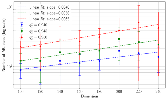
## Line Chart: Number of MC Steps vs. Dimension
### Overview
The chart displays three linear fits (blue, green, red) representing the relationship between dimension (x-axis) and the number of Markov Chain (MC) steps (y-axis, log scale). Data points with error bars are plotted for three q* values (0.940, 0.945, 0.950), each corresponding to a distinct color. The legend is positioned in the top-left corner.
### Components/Axes
- **X-axis (Dimension)**: Linear scale from 100 to 240, incrementing by 20.
- **Y-axis (Number of MC steps)**: Logarithmic scale from 10² to 10³.
- **Legend**:
- Blue: Linear fit slope = 0.0048 (q* = 0.940)
- Green: Linear fit slope = 0.0058 (q* = 0.945)
- Red: Linear fit slope = 0.0065 (q* = 0.950)
- **Data Points**: Vertical error bars indicate uncertainty in MC steps for each q* value.
### Detailed Analysis
1. **Blue Line (q* = 0.940, slope = 0.0048)**:
- Data points cluster near the lower bound of the y-axis (e.g., ~100 at dimension 100, ~200 at dimension 240).
- Error bars are smallest (~±20 at dimension 100, ~±50 at dimension 240).
- Trend: Gradual increase with minimal variability.
2. **Green Line (q* = 0.945, slope = 0.0058)**:
- Data points are mid-range (e.g., ~120 at dimension 100, ~300 at dimension 240).
- Error bars are moderate (~±30 at dimension 100, ~±70 at dimension 240).
- Trend: Steeper than blue, with consistent upward trajectory.
3. **Red Line (q* = 0.950, slope = 0.0065)**:
- Data points are highest (e.g., ~140 at dimension 100, ~400 at dimension 240).
- Error bars are largest (~±40 at dimension 100, ~±100 at dimension 240).
- Trend: Sharpest increase, with growing uncertainty at higher dimensions.
### Key Observations
- **Slope Correlation**: Higher q* values correspond to steeper slopes (0.0048 → 0.0065), indicating a direct relationship between q* and MC step growth rate.
- **Error Bar Trends**: Uncertainty increases with dimension for all q* values, but most pronounced for q* = 0.950.
- **Data Point Alignment**: Points for each q* align closely with their respective linear fits, confirming the linear relationship.
### Interpretation
The chart demonstrates that the number of MC steps required scales linearly with dimension, with the growth rate accelerating as q* increases. The logarithmic y-axis emphasizes exponential growth trends. The error bars suggest that higher q* values (and thus steeper slopes) introduce greater variability in MC step requirements, particularly at larger dimensions. This could imply that systems with higher q* values (e.g., more complex models or parameters) demand significantly more computational resources as dimensionality increases. The consistency of data points with their linear fits validates the linear approximation, though real-world applications might require accounting for non-linear deviations at extreme dimensions.