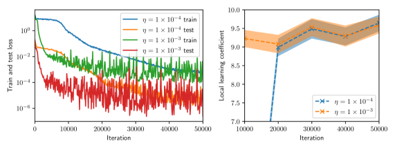
## Dual-Plot Analysis: Training Loss and Local Learning Coefficient
### Overview
The image contains two side-by-side scientific plots. The left plot is a line chart showing training and test loss over iterations for two different learning rates (η). The right plot is a line chart with shaded confidence intervals, showing the "Local learning coefficient" over iterations for the same two learning rates. Both plots share the same x-axis label ("Iteration") but have different y-axes and data.
### Components/Axes
**Left Plot:**
* **Chart Type:** Line chart with logarithmic y-axis.
* **Y-axis:** Label: "Train and test loss". Scale: Logarithmic, ranging from 10⁻⁶ to 10⁰ (0.000001 to 1). Major tick marks at 10⁻⁶, 10⁻⁴, 10⁻², 10⁰.
* **X-axis:** Label: "Iteration". Scale: Linear, ranging from 0 to 50,000. Major tick marks at 0, 10000, 20000, 30000, 40000, 50000.
* **Legend:** Located in the top-right corner, inside the plot area. Contains four entries:
1. `η = 1 × 10⁻⁴ train` (solid blue line)
2. `η = 1 × 10⁻⁴ test` (solid orange line)
3. `η = 1 × 10⁻³ train` (solid green line)
4. `η = 1 × 10⁻³ test` (solid red line)
**Right Plot:**
* **Chart Type:** Line chart with shaded regions (likely representing standard deviation or confidence intervals).
* **Y-axis:** Label: "Local learning coefficient". Scale: Linear, ranging from 7.0 to 10.0. Major tick marks at 7.0, 7.5, 8.0, 8.5, 9.0, 9.5, 10.0.
* **X-axis:** Label: "Iteration". Scale: Linear, ranging from 10,000 to 50,000. Major tick marks at 10000, 20000, 30000, 40000, 50000.
* **Legend:** Located in the bottom-right corner, inside the plot area. Contains two entries:
1. `η = 1 × 10⁻⁴` (blue line with 'x' markers, blue shaded region)
2. `η = 1 × 10⁻³` (orange line with 'x' markers, orange shaded region)
### Detailed Analysis
**Left Plot (Loss vs. Iteration):**
* **Trend Verification:**
* **Blue Line (η = 1 × 10⁻⁴ train):** Starts high (~10⁰), shows a smooth, steady downward slope, ending near 10⁻⁴ at 50,000 iterations.
* **Orange Line (η = 1 × 10⁻⁴ test):** Follows a similar smooth downward trend to the blue line but is consistently positioned above it, ending slightly above 10⁻³.
* **Green Line (η = 1 × 10⁻³ train):** Starts lower than the blue line (~10⁻²), exhibits high-frequency noise/oscillation throughout, but follows a general downward trend, ending near 10⁻⁴.
* **Red Line (η = 1 × 10⁻³ test):** Starts around 10⁻², is extremely noisy with large oscillations, but maintains a general downward trend, ending between 10⁻⁴ and 10⁻⁵. It is consistently the lowest line after approximately 15,000 iterations.
* **Data Points (Approximate):**
* At Iteration 0: Blue/Orange ~1.0, Green/Red ~0.01.
* At Iteration 25,000: Blue ~0.001, Orange ~0.01, Green ~0.001, Red ~0.0001.
* At Iteration 50,000: Blue ~0.0001, Orange ~0.002, Green ~0.0002, Red ~0.00005.
**Right Plot (Local Learning Coefficient vs. Iteration):**
* **Trend Verification:**
* **Blue Line (η = 1 × 10⁻⁴):** Starts at a low value (~7.0 at 15,000 iterations), shows a very sharp upward slope between 15,000 and 30,000 iterations, then plateaus with a slight upward trend, ending near 9.7 at 50,000 iterations. The blue shaded region is narrow.
* **Orange Line (η = 1 × 10⁻³):** Starts at a higher value (~9.2 at 10,000 iterations), shows a gentle, steady upward slope throughout, ending near 9.6 at 50,000 iterations. The orange shaded region is wider than the blue one, indicating higher variance.
* **Data Points (Approximate):**
* At Iteration 15,000: Blue ~7.0, Orange ~9.2.
* At Iteration 30,000: Blue ~9.5, Orange ~9.4.
* At Iteration 50,000: Blue ~9.7, Orange ~9.6.
### Key Observations
1. **Learning Rate Impact on Loss:** The higher learning rate (η = 1 × 10⁻³) results in significantly noisier loss curves (green, red) but achieves a lower final test loss (red line) compared to the lower learning rate (η = 1 × 10⁻⁴).
2. **Generalization Gap:** For both learning rates, the test loss (orange, red) is higher than the corresponding training loss (blue, green), which is the expected generalization gap.
3. **Learning Coefficient Dynamics:** The local learning coefficient for the lower learning rate (blue) undergoes a dramatic phase of increase between 15k-30k iterations before stabilizing. The higher learning rate (orange) starts high and increases gradually.
4. **Convergence:** By 50,000 iterations, the loss curves for both learning rates appear to be converging, though the higher learning rate curves remain noisier.
### Interpretation
This data suggests a trade-off controlled by the learning rate (η) in a machine learning training process.
* A **lower learning rate (1 × 10⁻⁴)** leads to stable, smooth convergence in both loss and the local learning coefficient, but may converge to a solution with slightly higher final test loss.
* A **higher learning rate (1 × 10⁻³)** introduces significant noise and oscillation during training, which appears to help the model escape local minima, ultimately finding a solution with lower test loss. However, this comes at the cost of training stability.
* The **local learning coefficient** (right plot) appears to be a metric that adapts during training. Its sharp rise for the lower learning rate suggests the model's optimization landscape or its sensitivity changes dramatically during a specific phase of training (15k-30k iterations). The higher learning rate starts in a different regime (higher coefficient) and evolves more smoothly.
* The relationship between the two plots is key: the phase where the blue learning coefficient rises sharply (15k-30k iterations) corresponds to the period where the blue loss curve (left plot) is decreasing most rapidly. This implies the local learning coefficient may be a useful diagnostic for understanding training dynamics and convergence phases. The noisier, but ultimately more effective, training with the higher learning rate is reflected in the higher-variance, but steadily increasing, learning coefficient.