\n
## Heatmap: Performance Metrics for Different Categories
### Overview
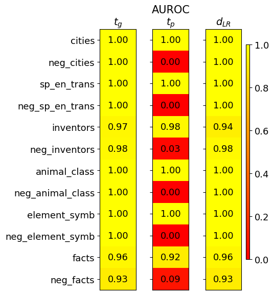
This image presents a heatmap displaying performance metrics for ten categories and their corresponding negative counterparts. The metrics are represented by color intensity, with a scale ranging from 0.0 to 1.0. The heatmap is divided into three columns, each representing a different metric: *t<sub>G</sub>*, *AUROC<sub>tp</sub>*, and *d<sub>LR</sub>*. The rows represent the categories being evaluated.
### Components/Axes
* **Rows (Categories):**
* cities
* neg\_cities
* sp\_en\_trans
* neg\_sp\_en\_trans
* inventors
* neg\_inventors
* animal\_class
* neg\_animal\_class
* element\_symb
* neg\_element\_symb
* facts
* neg\_facts
* **Columns (Metrics):**
* *t<sub>G</sub>* (Top-left column)
* *AUROC<sub>tp</sub>* (Center column)
* *d<sub>LR</sub>* (Right column)
* **Color Scale:** Located on the right side of the heatmap, ranging from approximately 0.0 (dark red) to 1.0 (yellow).
* **Axis Titles:** The column headers (*t<sub>G</sub>*, *AUROC<sub>tp</sub>*, *d<sub>LR</sub>*) are positioned at the top of their respective columns. Row labels are positioned to the left of the heatmap.
### Detailed Analysis
The heatmap displays numerical values for each category and metric combination. The values are represented by color intensity.
* **cities:** *t<sub>G</sub>* = 1.00, *AUROC<sub>tp</sub>* = 1.00, *d<sub>LR</sub>* = 1.00
* **neg\_cities:** *t<sub>G</sub>* = 1.00, *AUROC<sub>tp</sub>* = 0.00, *d<sub>LR</sub>* = 1.00
* **sp\_en\_trans:** *t<sub>G</sub>* = 1.00, *AUROC<sub>tp</sub>* = 1.00, *d<sub>LR</sub>* = 1.00
* **neg\_sp\_en\_trans:** *t<sub>G</sub>* = 1.00, *AUROC<sub>tp</sub>* = 0.00, *d<sub>LR</sub>* = 1.00
* **inventors:** *t<sub>G</sub>* = 0.97, *AUROC<sub>tp</sub>* = 0.98, *d<sub>LR</sub>* = 0.94
* **neg\_inventors:** *t<sub>G</sub>* = 0.98, *AUROC<sub>tp</sub>* = 0.03, *d<sub>LR</sub>* = 0.98
* **animal\_class:** *t<sub>G</sub>* = 1.00, *AUROC<sub>tp</sub>* = 1.00, *d<sub>LR</sub>* = 1.00
* **neg\_animal\_class:** *t<sub>G</sub>* = 1.00, *AUROC<sub>tp</sub>* = 0.00, *d<sub>LR</sub>* = 1.00
* **element\_symb:** *t<sub>G</sub>* = 1.00, *AUROC<sub>tp</sub>* = 1.00, *d<sub>LR</sub>* = 1.00
* **neg\_element\_symb:** *t<sub>G</sub>* = 1.00, *AUROC<sub>tp</sub>* = 0.00, *d<sub>LR</sub>* = 1.00
* **facts:** *t<sub>G</sub>* = 0.96, *AUROC<sub>tp</sub>* = 0.92, *d<sub>LR</sub>* = 0.96
* **neg\_facts:** *t<sub>G</sub>* = 0.93, *AUROC<sub>tp</sub>* = 0.09, *d<sub>LR</sub>* = 0.93
**Trends:**
* For *t<sub>G</sub>*, most categories achieve a score of 1.00, except for "inventors" (0.97) and "facts" (0.96), and "neg_facts" (0.93).
* For *AUROC<sub>tp</sub>*, the "neg\_" categories consistently score 0.00, while the non-"neg\_" categories generally score 1.00, except for "inventors" (0.98) and "facts" (0.92).
* For *d<sub>LR</sub>*, most categories achieve a score of 1.00, with "inventors" being slightly lower at 0.94.
### Key Observations
The most striking observation is the consistent 0.00 score for *AUROC<sub>tp</sub>* across all "neg\_" categories. This suggests a significant performance difference between the original categories and their negative counterparts in terms of *AUROC<sub>tp</sub>*. The other two metrics, *t<sub>G</sub>* and *d<sub>LR</sub>*, remain high (close to 1.00) for all categories, including the negative ones.
### Interpretation
This heatmap likely represents the performance of a model or system on different categories of data, and their corresponding negative examples. The metrics *t<sub>G</sub>*, *AUROC<sub>tp</sub>*, and *d<sub>LR</sub>* likely represent different aspects of performance.
* *t<sub>G</sub>* might be a threshold-based metric, where a value of 1.00 indicates perfect performance.
* *AUROC<sub>tp</sub>* (Area Under the Receiver Operating Characteristic curve for true positives) is a common metric for evaluating the ability of a model to distinguish between positive and negative examples. The consistently low scores for the "neg\_" categories suggest the model struggles to identify negative instances correctly.
* *d<sub>LR</sub>* (Likelihood Ratio) measures the ability of a model to discriminate between positive and negative examples.
The fact that the negative categories perform poorly on *AUROC<sub>tp</sub>* but not on *t<sub>G</sub>* and *d<sub>LR</sub>* suggests that the model is able to identify *something* about the negative examples, but it is not able to reliably distinguish them from positive examples. This could be due to a variety of factors, such as an imbalanced dataset, or the negative examples being too similar to the positive examples. The consistent pattern across all "neg\_" categories suggests this is not a category-specific issue, but rather a systemic problem with how the model handles negative examples.