## Chart: AURC vs. Number Explanations
### Overview
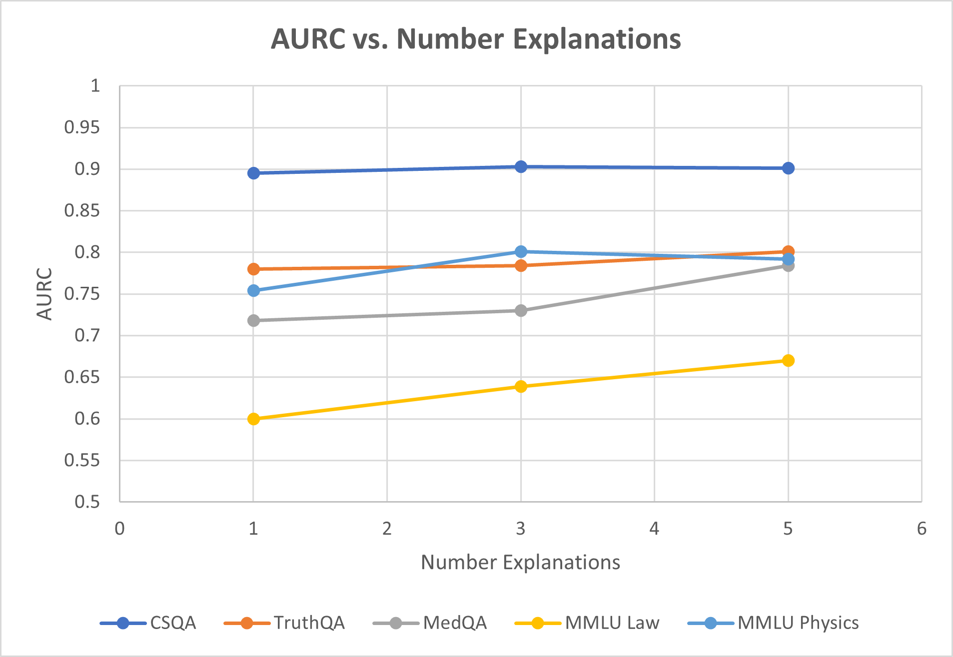
The image is a line chart comparing the AURC (Area Under the ROC Curve) values for five different datasets (CSQA, TruthQA, MedQA, MMLU Law, and MMLU Physics) against the number of explanations provided (ranging from 1 to 5). The chart shows how the AURC changes as the number of explanations increases for each dataset.
### Components/Axes
* **Title:** AURC vs. Number Explanations
* **X-axis:** Number Explanations, with ticks at 0, 1, 2, 3, 4, 5, and 6.
* **Y-axis:** AURC, with ticks at 0.5, 0.55, 0.6, 0.65, 0.7, 0.75, 0.8, 0.85, 0.9, 0.95, and 1.
* **Legend:** Located at the bottom of the chart, it identifies the datasets by color:
* Blue: CSQA
* Orange: TruthQA
* Gray: MedQA
* Yellow: MMLU Law
* Light Blue: MMLU Physics
### Detailed Analysis
* **CSQA (Blue):** The line is almost flat, indicating a stable AURC.
* At 1 explanation: AURC ≈ 0.89
* At 3 explanations: AURC ≈ 0.90
* At 5 explanations: AURC ≈ 0.90
* **TruthQA (Orange):** The line is relatively flat.
* At 1 explanation: AURC ≈ 0.78
* At 3 explanations: AURC ≈ 0.79
* At 5 explanations: AURC ≈ 0.79
* **MedQA (Gray):** The line shows an upward trend.
* At 1 explanation: AURC ≈ 0.75
* At 3 explanations: AURC ≈ 0.73
* At 5 explanations: AURC ≈ 0.79
* **MMLU Law (Yellow):** The line shows an upward trend.
* At 1 explanation: AURC ≈ 0.60
* At 3 explanations: AURC ≈ 0.64
* At 5 explanations: AURC ≈ 0.67
* **MMLU Physics (Light Blue):** The line shows a slight upward trend.
* At 1 explanation: AURC ≈ 0.76
* At 3 explanations: AURC ≈ 0.80
* At 5 explanations: AURC ≈ 0.79
### Key Observations
* CSQA consistently has the highest AURC across all numbers of explanations.
* MMLU Law has the lowest AURC, but it shows the most significant improvement as the number of explanations increases.
* TruthQA remains relatively stable across different numbers of explanations.
* MedQA shows a moderate increase in AURC as the number of explanations increases.
* MMLU Physics shows a slight increase in AURC as the number of explanations increases.
### Interpretation
The chart suggests that the number of explanations can have varying impacts on the performance (measured by AURC) of different question-answering datasets. CSQA appears to be the most robust, maintaining high performance regardless of the number of explanations. MMLU Law, while starting with the lowest performance, benefits the most from additional explanations. The other datasets show more modest improvements or remain relatively stable. This could indicate that the type of questions or the nature of the data in each dataset influences how effectively explanations can improve the model's accuracy.