## Line Chart: AURC vs. Number Explanations
### Overview
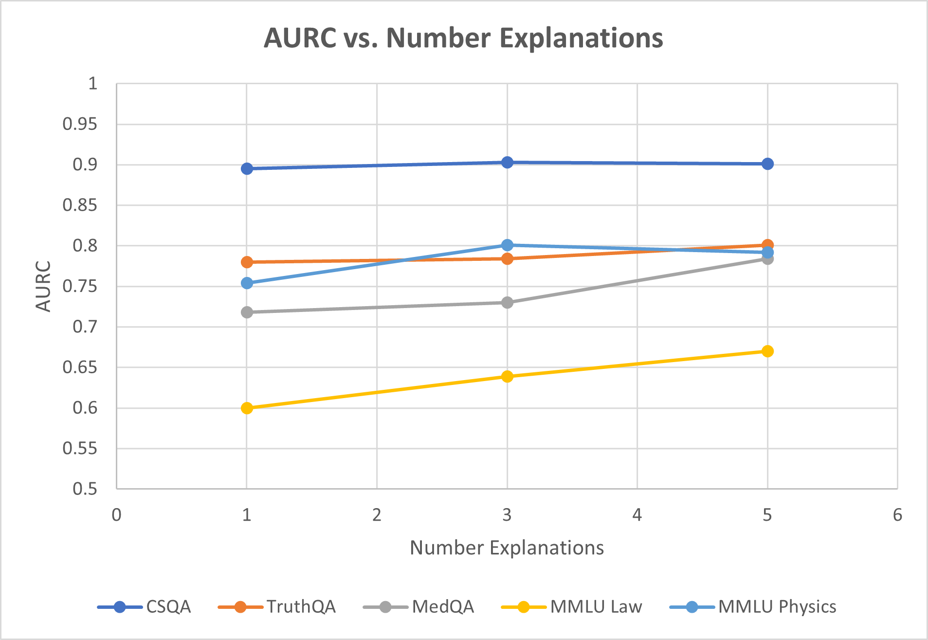
This line chart depicts the relationship between the Area Under the Receiver Operating Characteristic curve (AURC) and the number of explanations provided, for five different question answering datasets: CSQA, TruthQA, MedQA, MMLU Law, and MMLU Physics. The x-axis represents the number of explanations (ranging from 0 to 6), and the y-axis represents the AURC score (ranging from 0 to 1).
### Components/Axes
* **Title:** AURC vs. Number Explanations
* **X-axis Label:** Number Explanations (Scale: 0, 1, 2, 3, 4, 5, 6)
* **Y-axis Label:** AURC (Scale: 0, 0.5, 0.6, 0.65, 0.7, 0.75, 0.8, 0.85, 0.9, 0.95, 1)
* **Legend:** Located at the bottom-center of the chart.
* CSQA (Blue Line)
* TruthQA (Red Line)
* MedQA (Gray Line)
* MMLU Law (Orange Line)
* MMLU Physics (Green Line)
### Detailed Analysis
Here's a breakdown of each data series and their trends:
* **CSQA (Blue Line):** The line is relatively flat, starting at approximately 0.91 at x=1 and remaining around 0.90 throughout the range of explanations, with a slight upward trend.
* (1, 0.91), (2, 0.90), (3, 0.90), (5, 0.90)
* **TruthQA (Red Line):** The line shows a slight upward trend from x=1 to x=3, then plateaus.
* (1, 0.78), (2, 0.79), (3, 0.80), (5, 0.80)
* **MedQA (Gray Line):** The line starts at approximately 0.74 at x=1, increases to around 0.77 at x=3, and then decreases slightly to around 0.76 at x=5.
* (1, 0.74), (2, 0.75), (3, 0.77), (5, 0.76)
* **MMLU Law (Orange Line):** The line shows a significant decreasing trend. It starts at approximately 0.60 at x=1 and decreases to around 0.58 at x=5.
* (1, 0.60), (2, 0.63), (3, 0.62), (5, 0.58)
* **MMLU Physics (Green Line):** The line starts at approximately 0.79 at x=1, decreases to around 0.76 at x=3, and then increases slightly to around 0.78 at x=5.
* (1, 0.79), (2, 0.77), (3, 0.76), (5, 0.78)
### Key Observations
* CSQA consistently exhibits the highest AURC scores across all numbers of explanations.
* MMLU Law shows a consistent decline in AURC as the number of explanations increases.
* TruthQA and MedQA show relatively stable AURC scores with minor fluctuations.
* MMLU Physics shows a more complex pattern, with an initial decrease followed by a slight increase.
### Interpretation
The chart suggests that providing more explanations does not necessarily improve the AURC score for all datasets. For CSQA, the AURC remains consistently high regardless of the number of explanations, indicating that the model already performs well on this dataset. The decreasing trend for MMLU Law suggests that adding explanations might be detrimental to performance on this dataset, potentially due to the explanations being misleading or irrelevant. The relatively stable performance of TruthQA and MedQA suggests that explanations have a limited impact on these datasets. The fluctuating performance of MMLU Physics could indicate a more nuanced relationship between explanations and performance, where the quality or relevance of the explanations plays a crucial role.
The differences in trends across datasets highlight the importance of tailoring explanation strategies to the specific characteristics of each dataset. It is possible that some datasets benefit from explanations, while others do not, or even suffer from them. Further investigation is needed to understand why these differences exist and to develop more effective explanation methods. The chart also suggests that simply providing more explanations is not a guaranteed way to improve model performance, and that the quality and relevance of the explanations are critical factors.