## Neural Network Training and Spike Patterns
### Overview
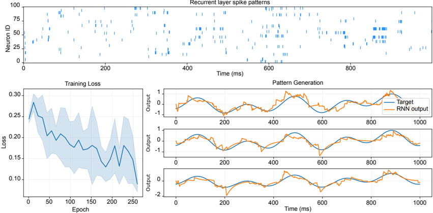
The image presents a series of plots illustrating the training process and output of a recurrent neural network (RNN). The plots show recurrent layer spike patterns, training loss over epochs, and the generated patterns compared to a target signal.
### Components/Axes
**1. Recurrent Layer Spike Patterns (Top Plot):**
* **Title:** Recurrent layer spike patterns
* **Y-axis:** Neuron ID, ranging from 0 to 100.
* **X-axis:** Time (ms), ranging from 0 to 1000.
* The plot displays vertical blue lines representing the timing of spikes for different neurons over time.
**2. Training Loss (Bottom-Left Plot):**
* **Title:** Training Loss
* **Y-axis:** Loss, ranging from 0.10 to 0.30.
* **X-axis:** Epoch, ranging from 0 to 250.
* The plot shows the training loss decreasing over epochs, with a shaded region indicating the variance or confidence interval.
**3. Pattern Generation (Bottom-Right Plots - 3 subplots):**
* **Title:** Pattern Generation
* **Y-axis:** Output, ranging from approximately -2 to 1.
* **X-axis:** Time (ms), ranging from 0 to 1000.
* **Legend (Top-Right):**
* Blue line: Target
* Orange line: RNN output
* Each subplot shows the target signal (blue) and the RNN output (orange) over time. The target signal appears to be a sine wave.
### Detailed Analysis
**1. Recurrent Layer Spike Patterns:**
* The spike patterns show activity across different neurons at various time points.
* There appear to be periods of higher activity around 400-600 ms and 800-1000 ms.
* The neuron IDs with the most frequent spikes seem to be distributed across the entire range (0-100).
**2. Training Loss:**
* The loss starts around 0.28 and generally decreases to approximately 0.10 by epoch 250.
* The shaded region indicates the variability in the loss, which also decreases over time.
* The loss decreases rapidly in the first 50 epochs, then slows down.
**3. Pattern Generation:**
* The target signal is a smooth sine wave.
* The RNN output attempts to mimic the target signal.
* In the first subplot, the RNN output follows the target signal reasonably well, but with some noise and deviations.
* In the second subplot, the RNN output is similar to the first, with some differences in the noise pattern.
* In the third subplot, the RNN output has a larger negative deviation around 200 ms and 700 ms.
### Key Observations
* The training loss decreases over epochs, indicating that the RNN is learning.
* The RNN output approximates the target signal, but with some errors and noise.
* The spike patterns in the recurrent layer show activity that correlates with the generated patterns.
### Interpretation
The plots demonstrate the training of an RNN to generate a specific pattern (sine wave). The decreasing training loss indicates that the network is learning to minimize the difference between its output and the target signal. The spike patterns in the recurrent layer likely represent the internal dynamics of the network as it learns to generate the desired output. The differences in the RNN output across the three subplots may be due to variations in the initial conditions or random fluctuations during training. The RNN is able to approximate the target signal, but there is still room for improvement in terms of reducing noise and deviations.