\n
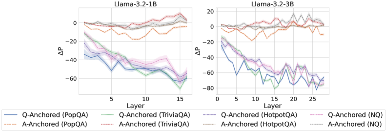
## Line Chart: ΔP vs. Layer for Llama Models
### Overview
The image presents two line charts comparing the change in probability (ΔP) across layers for two Llama models: Llama-3.2-1B and Llama-3.2-3B. Each chart displays multiple lines representing different anchoring and question-answering datasets. The x-axis represents the layer number, and the y-axis represents ΔP.
### Components/Axes
* **X-axis:** Layer (ranging from approximately 0 to 15 for the 1B model and 0 to 25 for the 3B model).
* **Y-axis:** ΔP (ranging from approximately -80 to 20).
* **Left Chart Title:** Llama-3.2-1B
* **Right Chart Title:** Llama-3.2-3B
* **Legend:** Located at the bottom of the image, containing the following labels and corresponding line styles/colors:
* Q-Anchored (PopQA) - Solid Blue Line
* A-Anchored (PopQA) - Dashed Orange Line
* Q-Anchored (TriviaQA) - Solid Purple Line
* A-Anchored (TriviaQA) - Dashed Pink Line
* Q-Anchored (HotpotQA) - Dashed Gray Line
* A-Anchored (HotpotQA) - Solid Green Line
* Q-Anchored (NQ) - Solid Cyan Line
* A-Anchored (NQ) - Dashed Magenta Line
### Detailed Analysis or Content Details
**Llama-3.2-1B Chart:**
* **Q-Anchored (PopQA):** The blue line starts at approximately 5, decreases steadily to approximately -50 at layer 15.
* **A-Anchored (PopQA):** The orange dashed line starts at approximately 10, decreases to approximately -25 at layer 15.
* **Q-Anchored (TriviaQA):** The purple line starts at approximately 0, decreases to approximately -40 at layer 15.
* **A-Anchored (TriviaQA):** The pink dashed line starts at approximately 5, decreases to approximately -30 at layer 15.
* **Q-Anchored (HotpotQA):** The gray dashed line starts at approximately 5, decreases to approximately -30 at layer 15.
* **A-Anchored (HotpotQA):** The green line starts at approximately 10, decreases to approximately -40 at layer 15.
* **Q-Anchored (NQ):** The cyan line starts at approximately 10, decreases to approximately -60 at layer 15.
* **A-Anchored (NQ):** The magenta dashed line starts at approximately 5, decreases to approximately -50 at layer 15.
**Llama-3.2-3B Chart:**
* **Q-Anchored (PopQA):** The blue line starts at approximately 5, decreases to approximately -50 at layer 25.
* **A-Anchored (PopQA):** The orange dashed line starts at approximately 10, decreases to approximately -20 at layer 25.
* **Q-Anchored (TriviaQA):** The purple line starts at approximately 0, decreases to approximately -50 at layer 25.
* **A-Anchored (TriviaQA):** The pink dashed line starts at approximately 5, decreases to approximately -30 at layer 25.
* **Q-Anchored (HotpotQA):** The gray dashed line starts at approximately 5, decreases to approximately -30 at layer 25.
* **A-Anchored (HotpotQA):** The green line starts at approximately 10, decreases to approximately -40 at layer 25.
* **Q-Anchored (NQ):** The cyan line starts at approximately 10, decreases to approximately -70 at layer 25.
* **A-Anchored (NQ):** The magenta dashed line starts at approximately 5, decreases to approximately -60 at layer 25.
### Key Observations
* In both charts, all lines generally exhibit a downward trend, indicating a decrease in ΔP as the layer number increases.
* The Q-Anchored (NQ) lines consistently show the most significant decrease in ΔP across layers in both models.
* The A-Anchored lines are generally less negative than the Q-Anchored lines, suggesting a different behavior based on the anchoring method.
* The 3B model shows a more extended range of layers (up to 25) compared to the 1B model (up to 15).
* The magnitude of ΔP decrease appears to be similar between the 1B and 3B models, despite the difference in model size.
### Interpretation
The charts demonstrate how the change in probability (ΔP) evolves across different layers of the Llama models when using various question-answering datasets and anchoring methods. The consistent downward trend suggests that the models' internal representations become less sensitive to the initial input as information propagates through deeper layers.
The differences between Q-Anchored and A-Anchored lines indicate that the anchoring method significantly influences the model's behavior. Q-Anchored lines, particularly with the NQ dataset, show a more substantial decrease in ΔP, potentially indicating a stronger reliance on the question context.
The fact that the 3B model has more layers suggests a greater capacity for complex representation learning, but the similar magnitude of ΔP decrease implies that the fundamental behavior of information processing is comparable between the two models. The charts provide insights into the internal dynamics of these language models and how they process information at different levels of abstraction. The negative ΔP values suggest a reduction in the initial probability as the information flows through the layers, which could be related to the model refining its predictions or focusing on more relevant features.