## Diagram: Spurious Correlation and Environment Shift in Machine Learning
### Overview
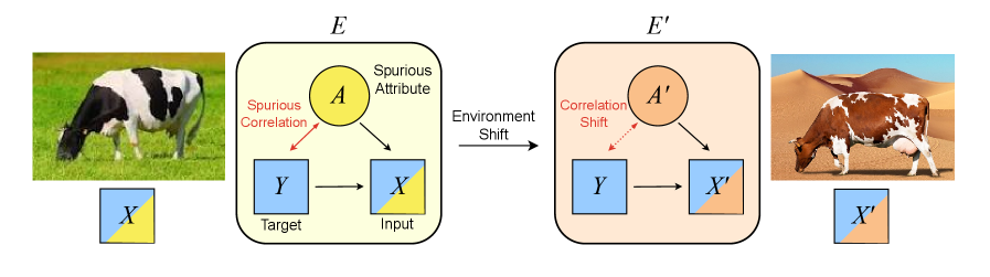
The image is a conceptual diagram illustrating the problem of spurious correlations in machine learning models and how these correlations can break down due to an "Environment Shift." It uses the example of a cow image to show how a model might incorrectly learn to associate the target (cow) with a spurious attribute (green grass background) that is not causally related.
### Components/Axes
The diagram is divided into two main sections, left and right, connected by a central arrow.
**1. Left Section (Environment E):**
* **Label:** `E` (top center of the box).
* **Visual Example:** A photograph of a black and white cow grazing on green grass.
* **Diagram Components (within a rounded rectangle):**
* **Yellow Circle:** Labeled `A` inside. Text above: `Spurious Attribute`.
* **Blue Square:** Labeled `Y` inside. Text below: `Target`.
* **Split Blue/Yellow Square:** Labeled `X` inside. Text below: `Input`. The square is divided diagonally, with the top-left half blue and the bottom-right half yellow.
* **Connections:**
* A red, dashed, double-headed arrow connects `A` and `Y`. Label: `Spurious Correlation`.
* A solid black arrow points from `A` to `X`.
* A solid black arrow points from `Y` to `X`.
**2. Central Transition:**
* A solid black arrow points from the left box (`E`) to the right box (`E'`).
* Label above the arrow: `Environment Shift`.
**3. Right Section (Environment E'):**
* **Label:** `E'` (top center of the box).
* **Visual Example:** A photograph of a brown and white cow in a desert/sandy environment.
* **Diagram Components (within a rounded rectangle):**
* **Orange Circle:** Labeled `A'` inside. Text above: `Correlation Shift`.
* **Blue Square:** Labeled `Y` inside. (Same as left side).
* **Split Blue/Orange Square:** Labeled `X'` inside. The square is divided diagonally, with the top-left half blue and the bottom-right half orange.
* **Connections:**
* A red, dashed, double-headed arrow connects `A'` and `Y`. Label: `Correlation Shift`.
* A solid black arrow points from `A'` to `X'`.
* A solid black arrow points from `Y` to `X'`.
**4. Legend/Key (Bottom Left & Right):**
* Below the left photograph, a small square key shows the split blue/yellow color scheme labeled `X`.
* Below the right photograph, a small square key shows the split blue/orange color scheme labeled `X'`.
### Detailed Analysis
The diagram presents a causal model across two environments.
* **In Environment E (Training):**
* The **Target (Y)** is the concept "cow."
* The **Input (X)** is the image data, represented as a combination of the target signal (blue) and a **Spurious Attribute (A)**, which is the green grass background (yellow).
* A strong **Spurious Correlation** exists between the attribute `A` (grass) and the target `Y` (cow) in the training data. The model learns this shortcut: "green grass often means cow."
* The model's input `X` is formed from both `Y` and `A`.
* **The Environment Shift:**
* This represents a change in the data distribution, such as deploying the model in a new setting.
* **In Environment E' (Testing/Deployment):**
* The **Target (Y)** remains "cow."
* The **Spurious Attribute has shifted (A')**. The background is now sand (orange), not grass.
* The **Correlation Shift** indicates the previously learned correlation between grass and cows is now broken or reversed.
* The input `X'` is now a combination of the target `Y` (blue) and the new, shifted attribute `A'` (orange).
* A model that relied on the spurious correlation from Environment E is likely to fail in Environment E', as the cue it learned (grass) is absent or misleading.
### Key Observations
1. **Color Coding is Critical:** The diagram uses color consistently to track components. Blue always represents the true target signal (`Y`). Yellow represents the spurious attribute in the first environment (`A`), and orange represents the shifted attribute in the new environment (`A'`). The input squares (`X` and `X'`) are split to show they are composites.
2. **Spatial Grounding:** The legend keys (`X` and `X'`) are placed directly below their corresponding photographic examples, reinforcing the link between the abstract diagram and the concrete visual data.
3. **Trend/Flow:** The flow is strictly left-to-right, indicating a temporal or causal sequence: training in one environment, then encountering a shift.
4. **Textual Labels:** All text is in English. The labels precisely define the role of each node (`Target`, `Input`, `Spurious Attribute`) and the nature of the relationships (`Spurious Correlation`, `Correlation Shift`).
### Interpretation
This diagram is a pedagogical tool explaining a core challenge in building robust and fair machine learning models. It demonstrates that models can achieve high accuracy by learning "shortcuts" or spurious correlations (e.g., "cows are on grass") rather than the true causal feature ("cow-ness"). These shortcuts are brittle.
The **Environment Shift** is the critical event that exposes this brittleness. When the correlation between the spurious attribute and the target changes (e.g., cows appear in deserts), the model's performance degrades because its learned decision rule is invalid in the new context. The diagram argues for the importance of developing methods that force models to learn the invariant, causal relationship (the blue `Y` component) and ignore the spurious, environment-specific attributes (`A`/`A'`). This is fundamental to achieving generalization, reliability, and fairness in AI systems.