\n
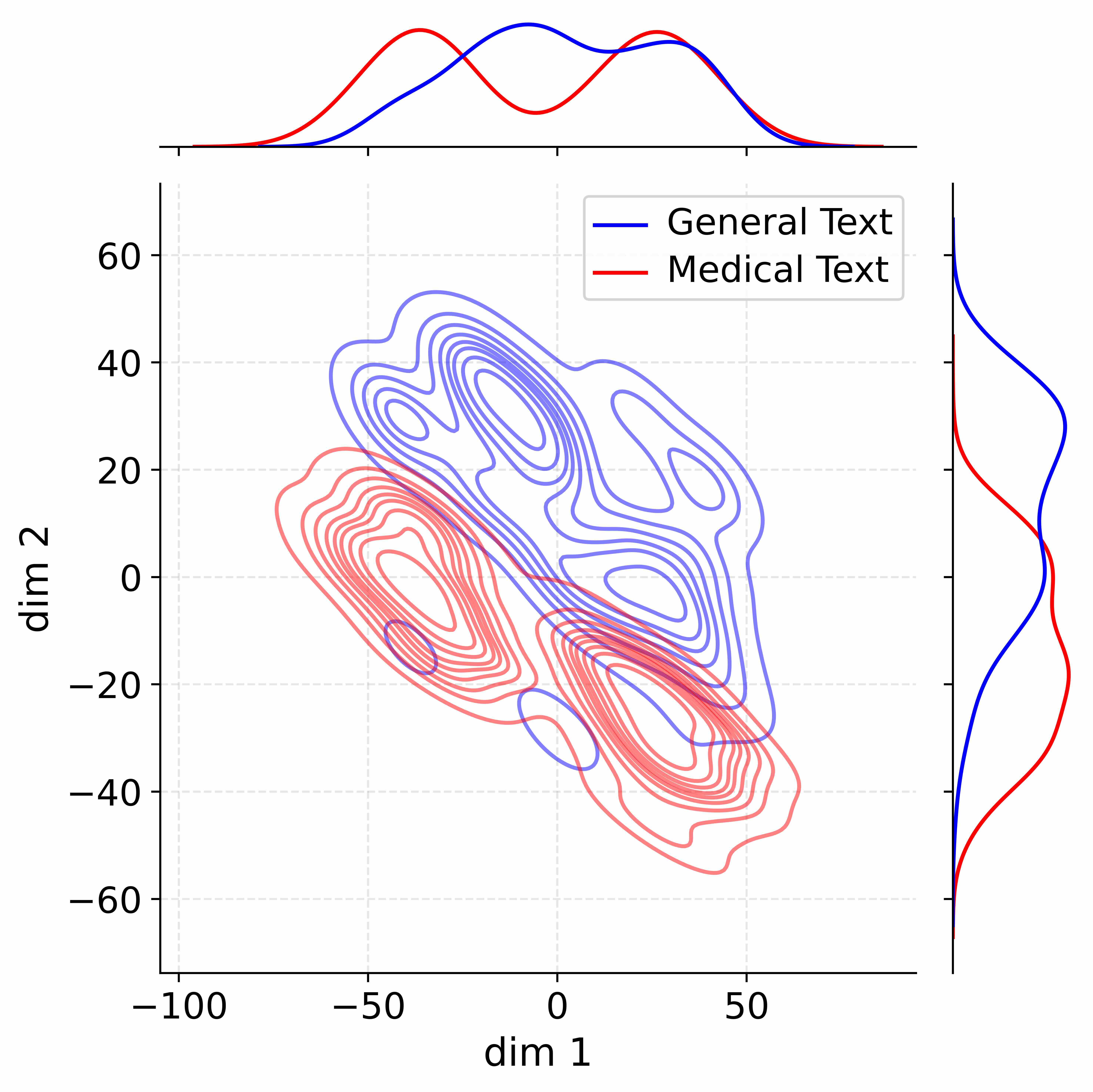
## Contour Plot: Dimensionality Reduction of Text Data
### Overview
This image presents a contour plot visualizing the distribution of two text categories – "General Text" and "Medical Text" – across two dimensions, labeled "dim 1" and "dim 2". The plot appears to be the result of a dimensionality reduction technique (likely t-SNE or UMAP) applied to text data, showing how the two categories are separated in this reduced space. Marginal distributions (density plots) are shown above the main contour plot, representing the distribution of each category along the respective dimension.
### Components/Axes
* **X-axis:** "dim 1" ranging from approximately -100 to 50.
* **Y-axis:** "dim 2" ranging from approximately -60 to 60.
* **Contour Lines:** Represent density of data points.
* **Legend (Top-Right):**
* Blue Line: "General Text"
* Red Line: "Medical Text"
* **Marginal Distributions (Top):**
* Blue Curve: Density of "General Text" along dim 1.
* Red Curve: Density of "Medical Text" along dim 1.
### Detailed Analysis
The contour plot shows two distinct clusters of data points.
**General Text (Blue):**
* The cluster is elongated and oriented diagonally, roughly from the top-left to the bottom-right.
* The highest density of "General Text" appears around dim 1 = -50 and dim 2 = 20.
* The density decreases as you move towards the top-left (dim 1 < -50, dim 2 > 40) and bottom-right (dim 1 > 0, dim 2 < -20).
* The marginal distribution shows a peak around dim 1 = -20, indicating a higher concentration of "General Text" in that region.
**Medical Text (Red):**
* The cluster is more compact and centered around dim 1 = 0 and dim 2 = -20.
* The highest density of "Medical Text" appears around dim 1 = 0 and dim 2 = -20.
* The density decreases as you move towards the top-right (dim 1 > 20, dim 2 > 0) and bottom-left (dim 1 < -40, dim 2 < -50).
* The marginal distribution shows a peak around dim 1 = 20, indicating a higher concentration of "Medical Text" in that region.
The marginal distributions show that "General Text" is more concentrated towards negative values of dim 1, while "Medical Text" is more concentrated towards positive values of dim 1.
### Key Observations
* There is a clear separation between the "General Text" and "Medical Text" clusters, suggesting that the dimensionality reduction has successfully separated the two categories.
* The "Medical Text" cluster is more tightly packed than the "General Text" cluster, indicating that "Medical Text" may be more homogeneous in this reduced space.
* There is some overlap between the two clusters, particularly in the region around dim 1 = -20 and dim 2 = 0, suggesting that some texts may be difficult to classify.
* The marginal distributions confirm the visual separation observed in the contour plot.
### Interpretation
This plot demonstrates the effectiveness of dimensionality reduction in separating "General Text" and "Medical Text" based on their underlying features. The two dimensions, "dim 1" and "dim 2", represent a compressed representation of the original feature space, capturing the most important differences between the two text categories.
The separation suggests that there are distinct characteristics in the language used in "General Text" versus "Medical Text". These characteristics could relate to vocabulary, syntax, or topic. The fact that the clusters are not perfectly separated indicates that there is some ambiguity in the data, and some texts may contain elements of both categories.
The marginal distributions provide further insight into the distribution of each category along each dimension. The peaks in the distributions indicate the most common values of dim 1 and dim 2 for each category. The shape of the distributions can also provide information about the variability within each category.
This type of visualization is useful for exploring high-dimensional data and identifying patterns and relationships between different categories. It can be used to gain insights into the underlying structure of the data and to inform further analysis.