## 2D Contour Plot with Marginal Distributions: General vs. Medical Text Embedding Distributions
### Overview
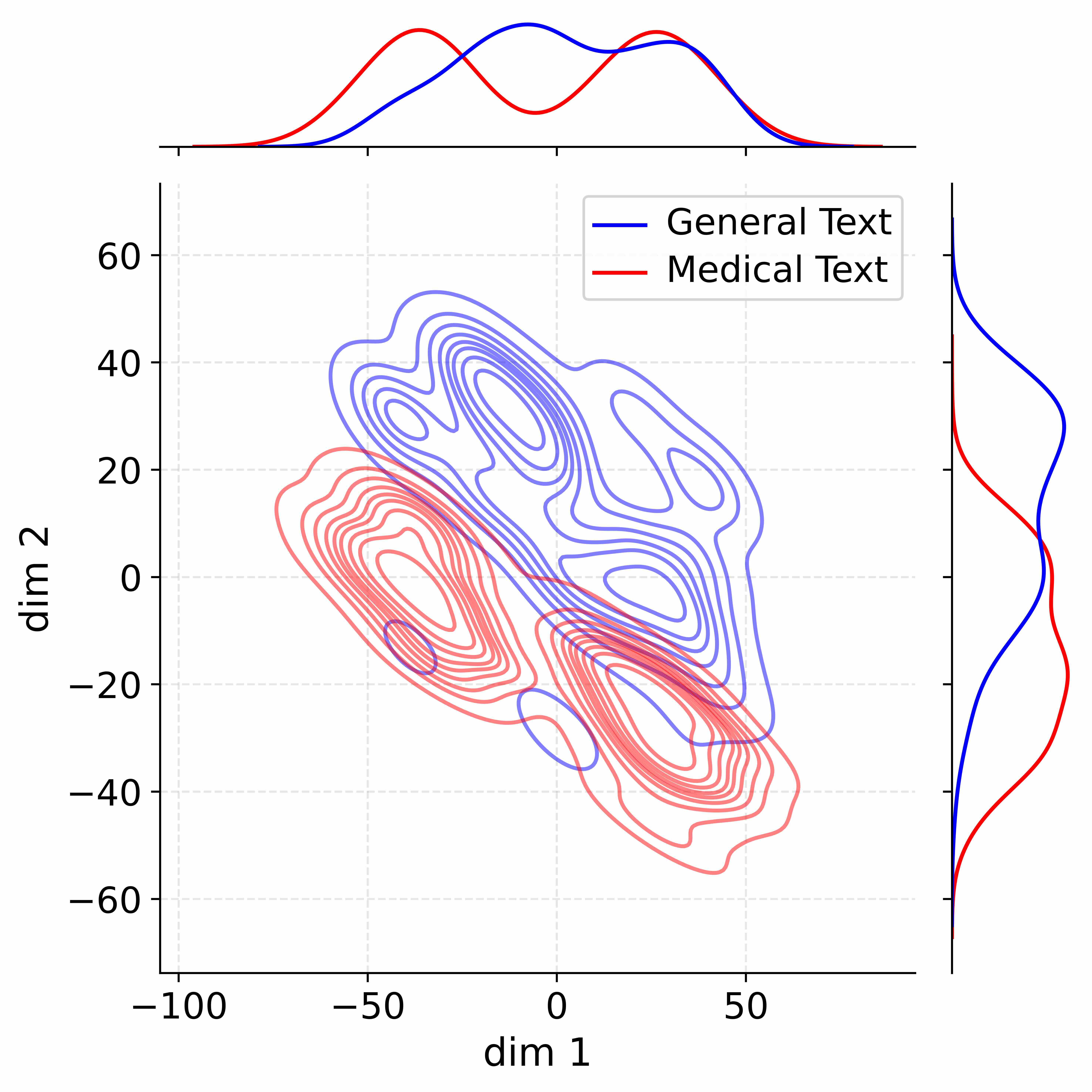
The image is a technical visualization comparing the distribution of two text corpora—"General Text" and "Medical Text"—in a two-dimensional latent space. It consists of a central 2D contour plot showing the joint density of the data points, accompanied by marginal density plots (1D distributions) along the top (for the x-axis) and right side (for the y-axis). The plot uses color coding to distinguish between the two text types.
### Components/Axes
* **Main Plot (Center):**
* **X-axis:** Labeled "dim 1". Ticks are at -100, -50, 0, and 50. The axis spans approximately from -100 to +75.
* **Y-axis:** Labeled "dim 2". Ticks are at -60, -40, -20, 0, 20, 40, and 60. The axis spans approximately from -70 to +70.
* **Data Series (Contour Lines):**
* **Blue Lines:** Represent "General Text" (as per legend). These contours are more spread out, covering a broad region from the lower-left to the upper-right of the plot.
* **Red Lines:** Represent "Medical Text" (as per legend). These contours are more concentrated, primarily in the lower-left quadrant, with a secondary cluster extending towards the lower-right.
* **Legend:** Located in the top-right corner of the main plot area. It contains:
* A blue line segment followed by the text "General Text".
* A red line segment followed by the text "Medical Text".
* **Marginal Distribution Plots:**
* **Top Marginal (for dim 1):** Positioned above the main plot, sharing the same x-axis scale. It shows two 1D density curves:
* A **blue curve** (General Text) with two distinct peaks: a smaller one near dim 1 ≈ -40 and a larger, broader peak centered near dim 1 ≈ +10.
* A **red curve** (Medical Text) with a single, prominent peak near dim 1 ≈ -30 and a smaller shoulder/peak near dim 1 ≈ +20.
* **Right Marginal (for dim 2):** Positioned to the right of the main plot, sharing the same y-axis scale. It shows two 1D density curves:
* A **blue curve** (General Text) with a broad, dominant peak centered near dim 2 ≈ +30 and a smaller peak near dim 2 ≈ -10.
* A **red curve** (Medical Text) with a sharp, dominant peak near dim 2 ≈ -30 and a smaller peak near dim 2 ≈ +10.
### Detailed Analysis
* **Spatial Distribution (Main Contour Plot):**
* **General Text (Blue):** The density is highest (innermost contours) in two main regions: one centered approximately at (dim 1: -20, dim 2: +30) and another near (dim 1: +20, dim 2: 0). The overall distribution forms a diagonal band from the lower-left to the upper-right, indicating a positive correlation between dim 1 and dim 2 for this corpus.
* **Medical Text (Red):** The highest density is concentrated in a tight cluster centered approximately at (dim 1: -40, dim 2: -20). A secondary, less dense cluster extends towards (dim 1: +20, dim 2: -40). The distribution is more compact and located primarily in the region where both dim 1 and dim 2 are negative.
* **Marginal Trends:**
* **dim 1 (Top Plot):** The General Text (blue) distribution is bimodal, suggesting two subpopulations or modes within the general text data along this dimension. The Medical Text (red) distribution is unimodal with a slight right skew, centered firmly in the negative range.
* **dim 2 (Right Plot):** The General Text (blue) distribution is again broad and centered in the positive range. The Medical Text (red) distribution is sharply peaked in the negative range, confirming its concentration in the lower part of the main plot.
### Key Observations
1. **Clear Separation:** The two text types occupy largely distinct regions of the 2D space. Medical Text is tightly clustered in the lower-left (negative dim 1, negative dim 2), while General Text is more diffuse and centered in the upper-right (positive dim 1, positive dim 2).
2. **Overlap Zone:** There is a region of moderate overlap between the contours of both distributions, roughly between dim 1: -10 to +30 and dim 2: -20 to +10. This suggests some texts from both corpora share similar characteristics in this latent space.
3. **Density Contrast:** The Medical Text contours are more tightly packed, indicating lower variance or higher consistency within that corpus along these dimensions. The General Text contours are more spread out, indicating greater diversity.
4. **Marginal Confirmation:** The marginal plots perfectly corroborate the spatial separation seen in the main plot. The peaks of the red and blue curves in both marginal plots are offset from each other.
### Interpretation
This visualization likely represents the output of a dimensionality reduction technique (like PCA, t-SNE, or UMAP) applied to text embeddings. The "dim 1" and "dim 2" are abstract axes capturing the most significant variance in the high-dimensional embedding space.
The data strongly suggests that **general-purpose text and specialized medical text have fundamentally different semantic or structural properties** that are captured by this embedding model. The tight clustering of medical text implies it uses a more specialized, consistent, and constrained vocabulary and syntax. In contrast, general text is more varied, leading to a broader distribution.
The positive correlation (diagonal trend) for General Text might reflect a common axis of variation in everyday language (e.g., from concrete to abstract topics). The Medical Text's concentration in the negative-negative quadrant could indicate it scores low on whatever abstract or general-language features define the positive ends of these dimensions.
The overlap region is particularly interesting from a Peircean investigative perspective—it represents the "ground" where medical and general discourse intersect. This could be text from patient education materials, health news articles, or medical narratives intended for a lay audience. The plot provides a quantitative map of linguistic domain separation, useful for tasks like domain adaptation in NLP, text classification, or analyzing the specificity of technical language.