## Diverging Stacked Bar Chart: FlowForge vs. Baseline User Survey
### Overview
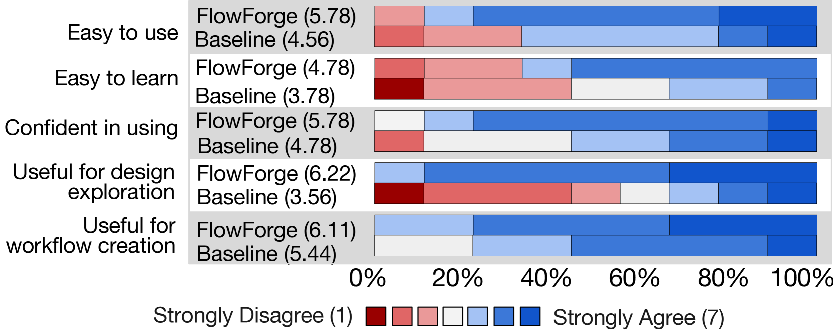
The image is a diverging stacked bar chart comparing user survey results for FlowForge and a Baseline across five different categories: Ease of Use, Ease of Learning, Confidence in Using, Usefulness for Design Exploration, and Usefulness for Workflow Creation. The chart visualizes the distribution of user opinions, ranging from "Strongly Disagree" to "Strongly Agree," and includes average scores for each category and system.
### Components/Axes
* **Y-Axis (Categories):**
* Easy to use
* Easy to learn
* Confident in using
* Useful for design exploration
* Useful for workflow creation
* **X-Axis (Percentage):** Ranges from 0% to 100% in increments of 20%.
* **Legend (Bottom):**
* Strongly Disagree (1): Dark Red
* Red
* Light Red
* White
* Light Blue
* Blue
* Strongly Agree (7): Dark Blue
* **Data Labels:** Each category has two labels: "FlowForge (score)" and "Baseline (score)". The scores are numerical values representing the average user rating on a scale of 1 to 7.
### Detailed Analysis
**1. Easy to Use:**
* FlowForge (5.78): The bar is primarily composed of light blue and blue segments, indicating a generally positive sentiment.
* Baseline (4.56): The bar is composed of red and light red segments, indicating a less positive sentiment compared to FlowForge.
**2. Easy to Learn:**
* FlowForge (4.78): The bar is composed of light red, white, light blue and blue segments, indicating a mixed sentiment.
* Baseline (3.78): The bar is primarily composed of red and light red segments, indicating a generally negative sentiment.
**3. Confident in Using:**
* FlowForge (5.78): The bar is primarily composed of light blue and blue segments, indicating a generally positive sentiment.
* Baseline (4.78): The bar is composed of red, light red, white, and light blue segments, indicating a mixed sentiment.
**4. Useful for Design Exploration:**
* FlowForge (6.22): The bar is primarily composed of blue and dark blue segments, indicating a very positive sentiment.
* Baseline (3.56): The bar is primarily composed of dark red, red, and light red segments, indicating a generally negative sentiment.
**5. Useful for Workflow Creation:**
* FlowForge (6.11): The bar is primarily composed of light blue, blue, and dark blue segments, indicating a very positive sentiment.
* Baseline (5.44): The bar is composed of white, light blue, blue, and dark blue segments, indicating a generally positive sentiment.
### Key Observations
* FlowForge consistently receives higher average scores than the Baseline across all categories.
* The largest difference in scores is in the "Useful for design exploration" category, where FlowForge scores significantly higher than the Baseline.
* The distribution of responses for FlowForge tends to lean towards "Strongly Agree," while the distribution for the Baseline is more varied, with a tendency towards "Strongly Disagree" in some categories.
### Interpretation
The data suggests that users generally perceive FlowForge more favorably than the Baseline in terms of ease of use, ease of learning, confidence in using, usefulness for design exploration, and usefulness for workflow creation. The most significant advantage of FlowForge appears to be its usefulness for design exploration. The diverging stacked bar chart effectively visualizes the distribution of user opinions, highlighting the differences in sentiment between FlowForge and the Baseline. The average scores provide a quantitative measure of these differences, reinforcing the qualitative insights gained from the visual representation.