\n
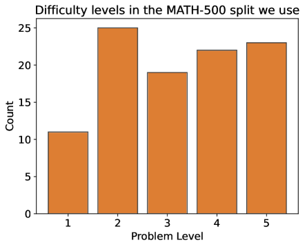
## Bar Chart: Difficulty Levels in MATH-500
### Overview
This is a bar chart illustrating the distribution of problem difficulty levels within the MATH-500 dataset split. The chart displays the count of problems for each difficulty level, ranging from 1 to 5.
### Components/Axes
* **Title:** "Difficulty levels in the MATH-500 split we use" (positioned at the top-center)
* **X-axis:** "Problem Level" (ranging from 1 to 5, with evenly spaced markers)
* **Y-axis:** "Count" (ranging from 0 to 25, with evenly spaced markers)
* **Bars:** Represent the count of problems for each difficulty level. All bars are the same orange color.
### Detailed Analysis
The chart shows the following counts for each problem level:
* **Problem Level 1:** Approximately 11-12 problems. The bar reaches slightly above the '10' mark on the Y-axis.
* **Problem Level 2:** Approximately 25 problems. The bar reaches the '25' mark on the Y-axis.
* **Problem Level 3:** Approximately 19 problems. The bar reaches slightly below the '20' mark on the Y-axis.
* **Problem Level 4:** Approximately 22 problems. The bar reaches slightly above the '20' mark on the Y-axis.
* **Problem Level 5:** Approximately 23 problems. The bar reaches slightly below the '25' mark on the Y-axis.
The bars generally increase in height from level 1 to level 2, then fluctuate between levels 3, 4, and 5.
### Key Observations
* Problem Level 2 has the highest count of problems (approximately 25).
* Problem Level 1 has the lowest count of problems (approximately 11-12).
* Levels 3, 4, and 5 have relatively similar counts, ranging from approximately 19 to 23.
* The distribution is not uniform, with a clear peak at difficulty level 2.
### Interpretation
The data suggests that the MATH-500 dataset split is not evenly distributed across difficulty levels. There is a concentration of problems at difficulty level 2, indicating that this level is well-represented in the dataset. The relatively lower number of problems at level 1 suggests that easier problems are less common in this split. The similar counts for levels 3, 4, and 5 indicate a more balanced representation of intermediate to difficult problems. This distribution could influence the performance of any models trained on this dataset, potentially leading to biases towards problems of difficulty level 2. The choice of this split may be intentional, perhaps to focus on a specific range of problem difficulties.