## Bar Chart: Percentage vs. Overlap Ratio
### Overview
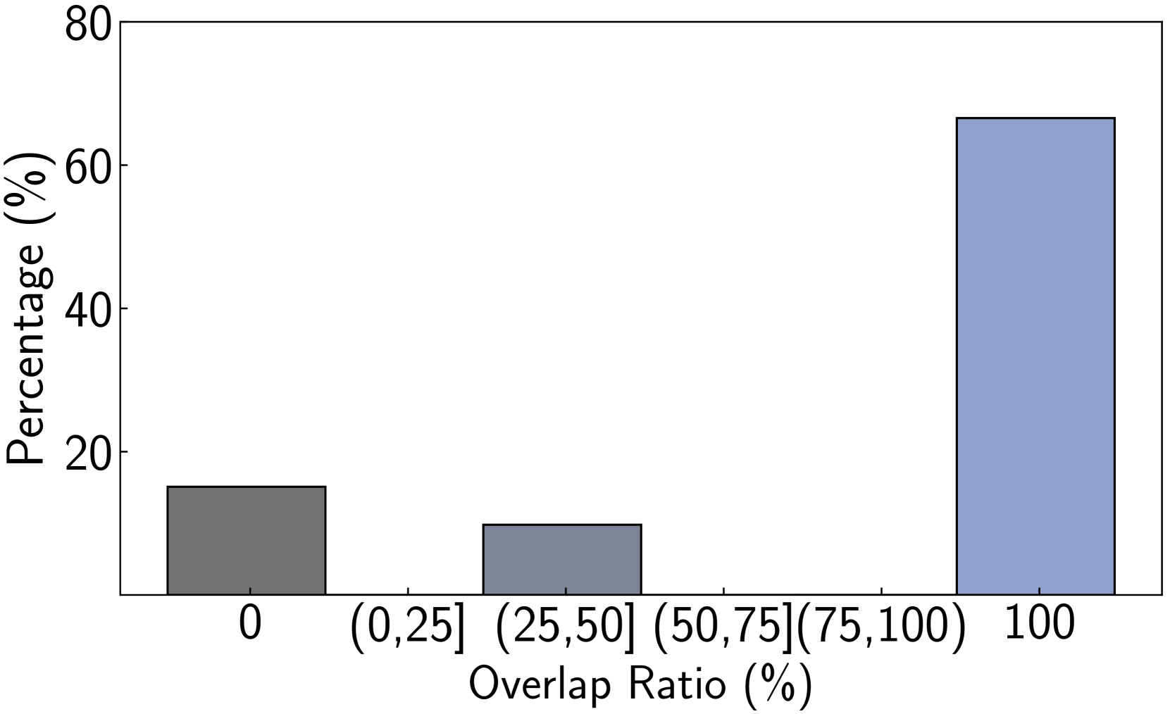
The image is a bar chart that displays the percentage of occurrences for different overlap ratio ranges. The x-axis represents the overlap ratio in percentage, and the y-axis represents the percentage of occurrences. There are three bars, each corresponding to a different overlap ratio range: 0, (0, 25], (25, 50], (50, 75](75, 100), and 100.
### Components/Axes
* **X-axis:** Overlap Ratio (%), with categories: 0, (0,25], (25,50], (50,75](75,100), 100
* **Y-axis:** Percentage (%), with scale markers at 20, 40, 60, and 80.
### Detailed Analysis
* **Category 0:** The bar is dark gray and reaches approximately 15%.
* **Category (0,25], (25,50], (50,75](75,100):** The bar is gray and reaches approximately 10%.
* **Category 100:** The bar is light blue and reaches approximately 67%.
### Key Observations
* The percentage is highest when the overlap ratio is 100%.
* The percentage is lowest when the overlap ratio is between (0,25], (25,50], (50,75](75,100).
* The percentage at 0 overlap ratio is higher than the percentage at (0,25], (25,50], (50,75](75,100) overlap ratio.
### Interpretation
The bar chart indicates a strong positive correlation between the overlap ratio and the percentage of occurrences. Specifically, a 100% overlap ratio is significantly more frequent than lower overlap ratios. This suggests that in the context from which this data was derived, perfect overlap is a common or desired outcome. The low percentages at other overlap ratios suggest that partial overlaps are relatively rare.