\n
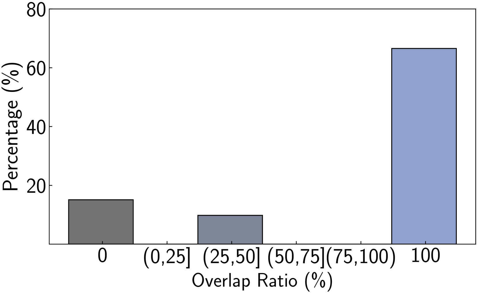
## Bar Chart: Overlap Ratio vs. Percentage
### Overview
This is a bar chart illustrating the distribution of percentages across different overlap ratio ranges. The x-axis represents the overlap ratio in percentage ranges, and the y-axis represents the corresponding percentage.
### Components/Axes
* **X-axis Title:** "Overlap Ratio (%)"
* **Y-axis Title:** "Percentage (%)"
* **X-axis Markers:** 0, (0,25], (25,50], (50,75], (75,100], 100
* **Bar Colors:** Dark Gray, Light Blue
* **Y-axis Scale:** 0 to 80, with increments of 10.
### Detailed Analysis
The chart displays the percentage of occurrences for each overlap ratio range.
* **Overlap Ratio 0:** The bar is dark gray and reaches approximately 18% on the y-axis.
* **Overlap Ratio (0,25]:** The bar is dark gray and reaches approximately 8% on the y-axis.
* **Overlap Ratio (25,50]:** The bar is dark gray and reaches approximately 10% on the y-axis.
* **Overlap Ratio (50,75]:** No bar is present, indicating a 0% percentage.
* **Overlap Ratio (75,100]:** No bar is present, indicating a 0% percentage.
* **Overlap Ratio 100:** The bar is light blue and reaches approximately 68% on the y-axis.
### Key Observations
* The majority of the data points (approximately 68%) fall within the 100% overlap ratio range.
* The next highest percentage is observed for the 0% overlap ratio range (approximately 18%).
* Overlap ratios between (0,25] and (25,50] have relatively low percentages (approximately 8% and 10% respectively).
* There are no data points for overlap ratios between (50,75] and (75,100].
### Interpretation
The data suggests a strong tendency towards complete overlap (100% overlap ratio). This could indicate that the analyzed phenomena are highly correlated or that the measurement process favors complete alignment. The relatively small percentages for lower overlap ratios suggest that partial overlaps are less common. The absence of data points for the (50,75]% and (75,100]% ranges could indicate a gap in the data or a genuine lack of occurrences within those ranges. Further investigation would be needed to understand the underlying reasons for this distribution. The two distinct colors (dark gray and light blue) may represent different categories or groups within the data, but without additional context, the meaning of this distinction remains unclear.