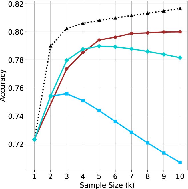
## Line Chart: Accuracy vs. Sample Size
### Overview
This image presents a line chart illustrating the relationship between sample size (in thousands) and accuracy. The chart displays three distinct data series, each represented by a different colored line, showing how accuracy changes as the sample size increases. The chart has a grid background for easier readability.
### Components/Axes
* **X-axis:** Labeled "Sample Size (k)", ranging from 1 to 10 (in thousands).
* **Y-axis:** Labeled "Accuracy", ranging from 0.72 to 0.82.
* **Data Series 1:** Black dotted line.
* **Data Series 2:** Red solid line.
* **Data Series 3:** Teal solid line.
* **Data Series 4:** Light blue solid line.
* **Grid:** A light gray grid is present to aid in reading values.
### Detailed Analysis
**Data Series 1 (Black Dotted Line):** This line exhibits a steep upward trend initially, then plateaus.
* At Sample Size = 1k, Accuracy ≈ 0.725
* At Sample Size = 2k, Accuracy ≈ 0.795
* At Sample Size = 3k, Accuracy ≈ 0.805
* At Sample Size = 4k, Accuracy ≈ 0.807
* At Sample Size = 5k, Accuracy ≈ 0.808
* At Sample Size = 6k, Accuracy ≈ 0.809
* At Sample Size = 7k, Accuracy ≈ 0.810
* At Sample Size = 8k, Accuracy ≈ 0.811
* At Sample Size = 9k, Accuracy ≈ 0.812
* At Sample Size = 10k, Accuracy ≈ 0.813
**Data Series 2 (Red Solid Line):** This line shows a moderate upward trend, leveling off after 4k.
* At Sample Size = 1k, Accuracy ≈ 0.76
* At Sample Size = 2k, Accuracy ≈ 0.775
* At Sample Size = 3k, Accuracy ≈ 0.785
* At Sample Size = 4k, Accuracy ≈ 0.795
* At Sample Size = 5k, Accuracy ≈ 0.797
* At Sample Size = 6k, Accuracy ≈ 0.798
* At Sample Size = 7k, Accuracy ≈ 0.798
* At Sample Size = 8k, Accuracy ≈ 0.798
* At Sample Size = 9k, Accuracy ≈ 0.798
* At Sample Size = 10k, Accuracy ≈ 0.798
**Data Series 3 (Teal Solid Line):** This line initially increases, reaches a peak around 5k, and then slightly declines.
* At Sample Size = 1k, Accuracy ≈ 0.76
* At Sample Size = 2k, Accuracy ≈ 0.77
* At Sample Size = 3k, Accuracy ≈ 0.78
* At Sample Size = 4k, Accuracy ≈ 0.79
* At Sample Size = 5k, Accuracy ≈ 0.795
* At Sample Size = 6k, Accuracy ≈ 0.794
* At Sample Size = 7k, Accuracy ≈ 0.793
* At Sample Size = 8k, Accuracy ≈ 0.792
* At Sample Size = 9k, Accuracy ≈ 0.791
* At Sample Size = 10k, Accuracy ≈ 0.790
**Data Series 4 (Light Blue Solid Line):** This line shows a clear downward trend.
* At Sample Size = 1k, Accuracy ≈ 0.745
* At Sample Size = 2k, Accuracy ≈ 0.735
* At Sample Size = 3k, Accuracy ≈ 0.725
* At Sample Size = 4k, Accuracy ≈ 0.715
* At Sample Size = 5k, Accuracy ≈ 0.705
* At Sample Size = 6k, Accuracy ≈ 0.695
* At Sample Size = 7k, Accuracy ≈ 0.685
* At Sample Size = 8k, Accuracy ≈ 0.675
* At Sample Size = 9k, Accuracy ≈ 0.665
* At Sample Size = 10k, Accuracy ≈ 0.655
### Key Observations
* The black dotted line consistently demonstrates the highest accuracy across all sample sizes.
* The light blue line shows a negative correlation between sample size and accuracy, which is unusual.
* The red and teal lines exhibit diminishing returns in accuracy as the sample size increases beyond 4k.
* The teal line peaks at 5k and then slightly decreases, suggesting an optimal sample size around that point.
### Interpretation
The chart suggests that increasing the sample size generally improves accuracy, but this improvement is not always linear and can plateau or even decrease under certain conditions. The black dotted line likely represents a highly effective method or model, as it consistently achieves the highest accuracy. The light blue line's decreasing accuracy with increasing sample size is a significant anomaly. This could indicate a problem with the data collection process, a flawed model, or a bias introduced by larger sample sizes. The red and teal lines demonstrate that there's a point of diminishing returns, where adding more data doesn't significantly improve accuracy. The optimal sample size for the teal line appears to be around 5k. This data could be used to inform decisions about resource allocation for data collection, balancing the cost of acquiring more data with the potential gains in accuracy. Further investigation is needed to understand the cause of the negative correlation observed in the light blue line.