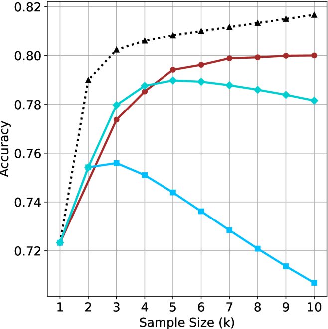
## Line Chart: Accuracy vs. Sample Size (k)
### Overview
The image displays a line chart plotting "Accuracy" on the y-axis against "Sample Size (k)" on the x-axis. It compares the performance of four distinct methods or models, represented by four lines with different colors and markers, as the sample size increases from 1 to 10.
### Components/Axes
* **X-Axis (Horizontal):** Labeled "Sample Size (k)". It has major tick marks and labels for integer values from 1 to 10.
* **Y-Axis (Vertical):** Labeled "Accuracy". It has major tick marks and labels at intervals of 0.02, ranging from 0.72 to 0.82.
* **Grid:** A light gray grid is present, with vertical lines at each integer x-value and horizontal lines at each 0.02 y-interval.
* **Data Series (Lines):** There are four distinct lines. No explicit legend is present within the chart area. The series are identified by their color, line style, and marker shape:
1. **Black, Dotted Line with Upward-Pointing Triangle Markers:** This is the top-most line for most of the chart.
2. **Red, Solid Line with Circle Markers:** This line is generally the second highest.
3. **Cyan (Light Blue), Solid Line with Diamond Markers:** This line starts near the red line but diverges downward after a certain point.
4. **Blue, Solid Line with Square Markers:** This is the lowest-performing line for most sample sizes greater than 2.
### Detailed Analysis
**Data Point Extraction (Approximate Values):**
* **Black Dotted Line (Triangles):**
* Trend: Shows a steep, consistent logarithmic-like increase, flattening slightly as k increases.
* Points: (1, ~0.725), (2, ~0.790), (3, ~0.802), (4, ~0.806), (5, ~0.808), (6, ~0.810), (7, ~0.812), (8, ~0.814), (9, ~0.816), (10, ~0.818).
* **Red Solid Line (Circles):**
* Trend: Shows a steady, near-linear increase that begins to plateau after k=6.
* Points: (1, ~0.723), (2, ~0.755), (3, ~0.774), (4, ~0.785), (5, ~0.794), (6, ~0.796), (7, ~0.799), (8, ~0.800), (9, ~0.800), (10, ~0.800).
* **Cyan Solid Line (Diamonds):**
* Trend: Increases to a peak, then shows a gradual decline.
* Points: (1, ~0.723), (2, ~0.755), (3, ~0.780), (4, ~0.788), (5, ~0.790 - **Peak**), (6, ~0.789), (7, ~0.788), (8, ~0.786), (9, ~0.784), (10, ~0.782).
* **Blue Solid Line (Squares):**
* Trend: Increases to an early peak, then declines sharply and consistently.
* Points: (1, ~0.723), (2, ~0.755), (3, ~0.756 - **Peak**), (4, ~0.751), (5, ~0.744), (6, ~0.736), (7, ~0.728), (8, ~0.721), (9, ~0.714), (10, ~0.708).
### Key Observations
1. **Convergence at k=1:** All four methods start at nearly the same accuracy point (~0.723-0.725) when the sample size is 1.
2. **Performance Hierarchy:** For k > 2, a clear and consistent performance hierarchy is established: Black > Red > Cyan > Blue.
3. **Divergent Behaviors:** The lines demonstrate fundamentally different responses to increasing sample size:
* **Black & Red:** Benefit from more data, showing monotonic improvement (though with diminishing returns).
* **Cyan:** Benefits up to a point (k=5), after which performance slightly degrades.
* **Blue:** Benefits only very slightly up to k=3, after which performance degrades significantly and linearly.
4. **Peak Performance:** The highest accuracy achieved by any method is approximately 0.818 (Black line at k=10). The lowest final accuracy is approximately 0.708 (Blue line at k=10).
### Interpretation
This chart likely compares different machine learning models, algorithms, or training strategies (e.g., different levels of regularization, model complexities, or data augmentation techniques) on a specific task.
* **The Black Dotted Line** represents the most robust and effective method. Its steep initial rise and sustained improvement suggest a model that generalizes well and effectively leverages additional data without overfitting. It may represent a well-regularized complex model or an ensemble method.
* **The Red Solid Line** shows a stable, reliable method that improves predictably but has a lower performance ceiling than the black line. It could be a simpler, well-tuned model.
* **The Cyan and Blue Lines** demonstrate classic signs of **overfitting**. Their performance peaks at low sample sizes (k=5 and k=3, respectively) and then deteriorates as more data is added. This is counter-intuitive but can happen if the additional data introduces noise the model cannot handle, or if the model is too complex and starts fitting to irrelevant patterns. The blue method is particularly unstable, showing a severe and continuous decline. These lines might represent highly complex models trained without proper regularization or with flawed assumptions.
**Conclusion:** The data suggests that for this specific task, method "Black" is superior, especially as more data becomes available. Methods "Cyan" and "Blue" are unreliable and perform worse with more data beyond a very small sample, indicating a fundamental flaw in their approach for this problem domain. The chart effectively argues for the importance of selecting a model that scales well with data size.