## Combined Image Analysis: Network Diagram, Variable Importance Chart, and CoreInfogram
### Overview
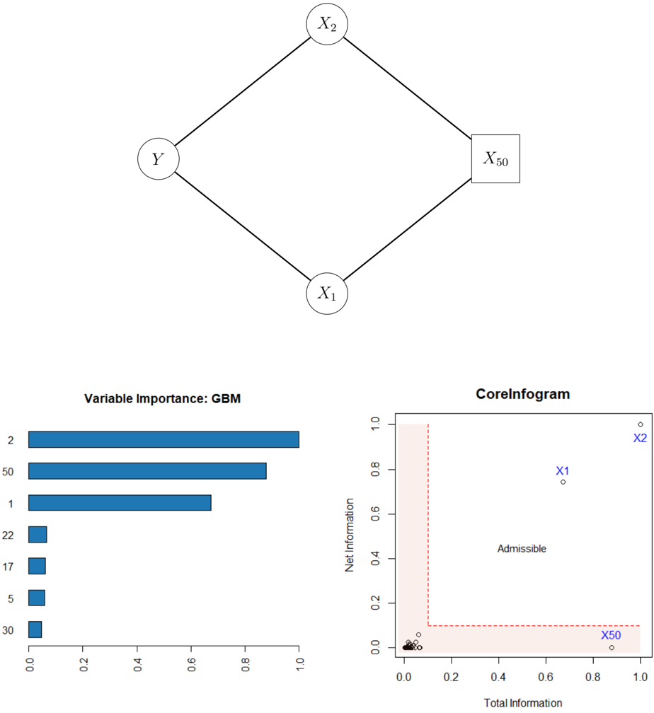
The image presents three distinct visual elements: a network diagram illustrating relationships between variables, a horizontal bar chart showing variable importance based on a Gradient Boosting Machine (GBM) model, and a CoreInfogram plotting net information against total information.
### Components/Axes
**1. Network Diagram:**
* Nodes: Labeled as Y, X1, X2, and X50. Y, X1, and X2 are represented as circles, while X50 is represented as a square.
* Edges: Lines connecting the nodes, indicating relationships between them. The network forms a diamond shape.
**2. Variable Importance Chart:**
* Title: "Variable Importance: GBM"
* Y-axis: Represents the variables: 2, 50, 1, 22, 17, 5, 30.
* X-axis: Ranges from 0.0 to 1.0, representing the importance score.
**3. CoreInfogram:**
* Title: "CoreInfogram"
* X-axis: "Total Information," ranging from 0.0 to 1.0.
* Y-axis: "Net Information," ranging from 0.0 to 1.0.
* Admissibility Region: A shaded area (light red) defined by the points (0,0), (0.2, 0), (0.2, 1), (0, 1).
* Data Points: Several small black circles clustered near the origin (0,0), and three labeled points: X1 (blue), X2 (blue), and X50 (blue).
### Detailed Analysis
**1. Network Diagram:**
* Y is connected to X1 and X2.
* X1 is connected to X50.
* X2 is connected to X50.
**2. Variable Importance Chart:**
* Variable 2 has an importance score of approximately 0.9.
* Variable 50 has an importance score of approximately 0.8.
* Variable 1 has an importance score of approximately 0.7.
* Variable 22 has an importance score of approximately 0.2.
* Variable 17 has an importance score of approximately 0.15.
* Variable 5 has an importance score of approximately 0.08.
* Variable 30 has an importance score of approximately 0.03.
* Trend: The variable importance decreases from variable 2 to variable 30.
**3. CoreInfogram:**
* The majority of data points (small black circles) are clustered near the origin, indicating low total and net information.
* X1 is located at approximately (0.6, 0.7).
* X2 is located at approximately (0.95, 0.95).
* X50 is located at approximately (0.9, 0.05).
* The "Admissible" label is placed within the shaded region.
### Key Observations
* In the Variable Importance Chart, variables 2, 50, and 1 are significantly more important than the other variables.
* In the CoreInfogram, X2 has the highest total and net information, while X50 has high total information but very low net information. X1 has moderate total and net information.
* The network diagram visually represents the relationships between the variables, which may influence their importance and information content.
### Interpretation
The image combines three different visualizations to provide a comprehensive view of variable relationships, importance, and information content. The network diagram shows the connections between variables, which may explain why some variables are more important than others in the GBM model. The CoreInfogram provides insights into the information content of each variable, with X2 being the most informative and X50 having high total information but low net information, suggesting it might be redundant or noisy. The "Admissible" region in the CoreInfogram likely represents a threshold for acceptable information content.