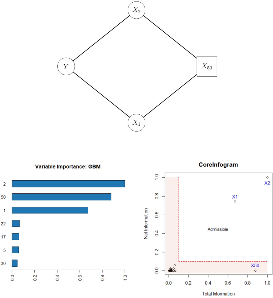
## Diagram: Causal Diagram with Variable Importance and Corelnfogam
### Overview
The image presents a combination of a causal diagram, a bar chart representing variable importance from a Gradient Boosting Machine (GBM) model, and a scatter plot labeled "Corelnfogam". The causal diagram depicts relationships between variables X₁, X₂, X₅₀, and Y. The bar chart shows the relative importance of different variables, and the Corelnfogam plot visualizes total and net information.
### Components/Axes
* **Causal Diagram:** Nodes representing variables (X₁, X₂, X₅₀, Y) connected by directed edges.
* **Variable Importance (GBM) Bar Chart:**
* X-axis: Variable Importance (scale from 0.0 to 1.0, with markers at 0.0, 0.2, 0.4, 0.6, 0.8, 1.0).
* Y-axis: Variable names (2, 50, 1, 22, 17, 5, 30).
* **Corelnfogam Scatter Plot:**
* X-axis: Total Information (scale from 0.0 to 1.0, with markers at 0.0, 0.2, 0.4, 0.6, 0.8, 1.0).
* Y-axis: Net Information (scale from 0.0 to 1.0, with markers at 0.0, 0.2, 0.4, 0.6, 0.8, 1.0).
* Background shading indicating an "Admissible" region.
### Detailed Analysis or Content Details
**Causal Diagram:**
The diagram shows a directed acyclic graph (DAG).
* Y has incoming edges from X₁ and X₂.
* X₁ has an incoming edge from X₅₀.
* X₂ has an incoming edge from X₅₀.
* X₅₀ has no incoming edges.
**Variable Importance (GBM) Bar Chart:**
The bars are horizontally oriented. The variable "2" has the highest importance, followed by "50", then "1", "22", "17", "5", and finally "30".
* Variable 2: Approximately 0.95 importance.
* Variable 50: Approximately 0.85 importance.
* Variable 1: Approximately 0.75 importance.
* Variable 22: Approximately 0.60 importance.
* Variable 17: Approximately 0.50 importance.
* Variable 5: Approximately 0.35 importance.
* Variable 30: Approximately 0.10 importance.
**Corelnfogam Scatter Plot:**
The plot shows several points scattered within the defined area. The background is shaded in a light red color, labeled "Admissible".
* X₁: Total Information ≈ 0.2, Net Information ≈ 0.8.
* X₂: Total Information ≈ 0.9, Net Information ≈ 0.8.
* X₅₀: Total Information ≈ 0.8, Net Information ≈ 0.1.
There are several other points clustered near the origin (Total Information ≈ 0.0, Net Information ≈ 0.0).
### Key Observations
* The variable "2" is significantly more important than all other variables according to the GBM model.
* The Corelnfogam plot suggests that X₁ and X₂ have high net information, while X₅₀ has low net information.
* The "Admissible" region in the Corelnfogam plot defines a space where combinations of total and net information are considered acceptable.
### Interpretation
The causal diagram illustrates hypothesized relationships between variables. The GBM variable importance plot suggests that variable "2" is the strongest predictor in the model, while variable "30" is the weakest. The Corelnfogam plot provides insights into the information content of each variable, with X₁ and X₂ contributing more net information than X₅₀. The "Admissible" region in the Corelnfogam plot likely represents a constraint or threshold for acceptable information levels.
The combination of these visualizations suggests a system where variable "2" plays a crucial role in predicting the outcome (Y), and the information provided by X₁ and X₂ is more valuable than that provided by X₅₀. The causal diagram provides the structure, the GBM plot quantifies variable influence, and the Corelnfogam plot assesses information characteristics. The relationships between these elements suggest a model where the influence of X₅₀ is mediated through X₁ and X₂ and is less directly impactful on Y.