\n
## Scatter Plot: Distribution of Data Points
### Overview
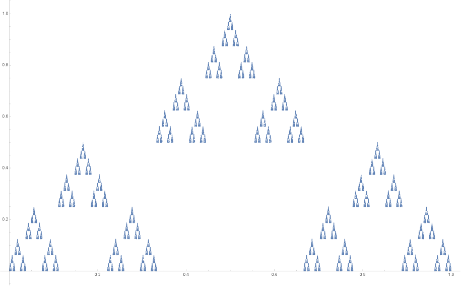
The image presents a scatter plot displaying a distribution of data points. The points are clustered into several distinct peaks, suggesting a multi-modal distribution. The plot lacks explicit axis labels or a title, making a precise interpretation challenging. The background is a light gray.
### Components/Axes
* **X-axis:** Ranges approximately from 0.0 to 1.0, with tick marks at 0.1 intervals.
* **Y-axis:** Ranges approximately from 0.0 to 1.0, with tick marks at 0.1 intervals.
* **Data Points:** Numerous small, triangular-shaped points are scattered across the plot. All points appear to be the same color (a light blue).
* **No Legend:** There is no legend present to identify different data series or categories.
### Detailed Analysis
The data points are not randomly distributed. Instead, they form several distinct clusters or peaks.
* **Peak 1:** Located around x = 0.15, with y-values ranging from approximately 0.1 to 0.3.
* **Peak 2:** Located around x = 0.3, with y-values ranging from approximately 0.3 to 0.7.
* **Peak 3:** Located around x = 0.45, with y-values ranging from approximately 0.6 to 0.9. This is the highest peak.
* **Peak 4:** Located around x = 0.6, with y-values ranging from approximately 0.4 to 0.8.
* **Peak 5:** Located around x = 0.75, with y-values ranging from approximately 0.2 to 0.6.
* **Peak 6:** Located around x = 0.9, with y-values ranging from approximately 0.1 to 0.4.
The density of points appears to decrease as you move away from the peaks. There are relatively few points with y-values close to 0 or 1, except within the peaks. The points are relatively evenly distributed within each peak.
### Key Observations
* The distribution is multi-modal, with six prominent peaks.
* The peak at x = 0.45 has the highest density of points.
* The distribution appears roughly symmetrical around x = 0.5, although this is not perfectly precise.
* There are no obvious outliers.
### Interpretation
Without axis labels, it's difficult to definitively interpret the meaning of this data. However, the multi-modal distribution suggests that the underlying variable being measured has several preferred or common values. The peaks could represent different categories, states, or outcomes.
The symmetrical nature of the distribution (approximately) suggests that the variable is centered around a value of 0.5 on the x-axis. The peaks could represent different modes or clusters within the data.
The lack of labels and context makes it impossible to determine the specific meaning of the data. It could represent anything from the distribution of scores on a test to the frequency of events occurring at different times. Further information is needed to provide a more meaningful interpretation. The data suggests a discrete or quantized variable, as the points cluster around specific x-values rather than being continuously distributed.