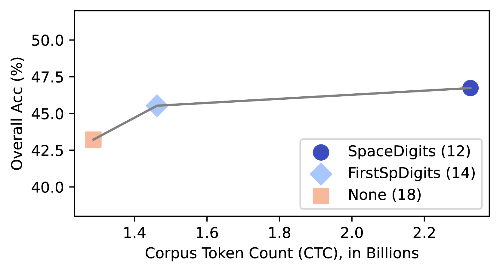
## Line Graph: Overall Accuracy vs. Corpus Token Count
### Overview
The image depicts a line graph illustrating the relationship between corpus token count (in billions) and overall accuracy (in percentage). Three data points are connected by a gray line, with markers differentiated by color and shape. The graph suggests a positive correlation between token count and accuracy.
### Components/Axes
- **X-axis**: Corpus Token Count (CTC), in Billions (ranging from 1.4 to 2.3)
- **Y-axis**: Overall Accuracy (%), ranging from 40.0 to 50.0
- **Legend**: Located in the bottom-right corner, with three entries:
- **Blue Circle**: SpaceDigits (12)
- **Light Blue Diamond**: FirstSpDigits (14)
- **Peach Square**: None (18)
### Detailed Analysis
1. **Data Points**:
- **Peach Square (None, 18)**: Positioned at (1.4, 43.0)
- **Light Blue Diamond (FirstSpDigits, 14)**: Positioned at (1.5, 45.0)
- **Blue Circle (SpaceDigits, 12)**: Positioned at (2.3, 47.0)
2. **Line Trend**: A straight gray line connects the points, showing a consistent upward slope from left to right.
3. **Spatial Grounding**:
- Legend: Bottom-right corner
- Data Points: Aligned with their respective x-axis values (1.4, 1.5, 2.3)
- Line: Connects all points in order of increasing x-values
### Key Observations
- Accuracy increases linearly with token count: 43% → 45% → 47%.
- The largest token count (2.3B) corresponds to the highest accuracy (47%).
- The "None" condition (18) has the lowest token count and accuracy.
### Interpretation
The graph demonstrates that increasing corpus token count improves model performance, with the "SpaceDigits" condition achieving the best results. The linear trend implies a predictable relationship between token quantity and accuracy. The legend’s color coding confirms the association between marker types and conditions. No anomalies are observed, as all data points follow the expected upward trajectory.