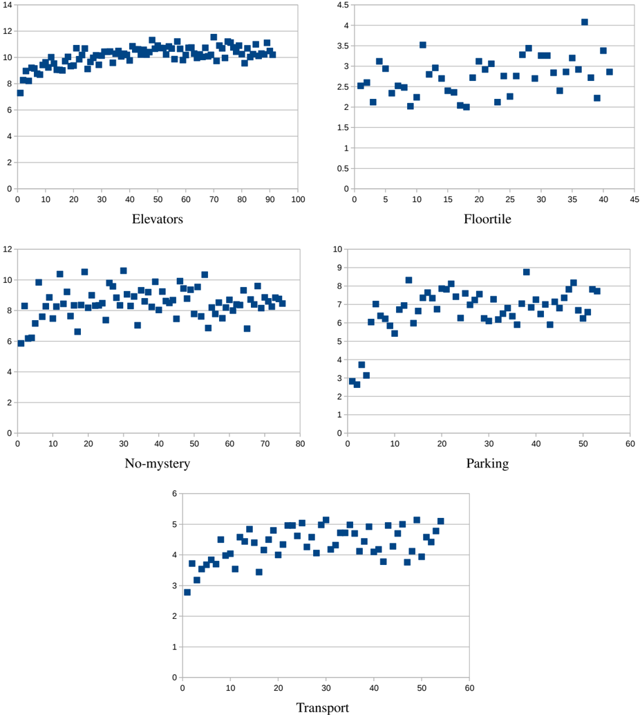
## Scatter Plot Grid: Feature Performance
### Overview
The image presents a grid of five scatter plots, each displaying the performance of a different feature: "Elevators", "Floortile", "No-mystery", "Parking", and "Transport". The x-axis represents an unspecified variable (likely time or iterations), while the y-axis represents a performance metric. Each plot shows the distribution of data points for its respective feature.
### Components/Axes
* **General Structure:** Each plot has an x-axis and a y-axis. The data points are represented by blue squares.
* **Elevators (Top-Left):**
* X-axis: Ranges from 0 to 100, with tick marks every 10 units.
* Y-axis: Ranges from 0 to 14, with tick marks every 2 units.
* Label: "Elevators"
* **Floortile (Top-Right):**
* X-axis: Ranges from 0 to 45, with tick marks every 5 units.
* Y-axis: Ranges from 0 to 4.5, with tick marks every 0.5 units.
* Label: "Floortile"
* **No-mystery (Middle-Left):**
* X-axis: Ranges from 0 to 80, with tick marks every 10 units.
* Y-axis: Ranges from 0 to 12, with tick marks every 2 units.
* Label: "No-mystery"
* **Parking (Middle-Right):**
* X-axis: Ranges from 0 to 60, with tick marks every 10 units.
* Y-axis: Ranges from 0 to 10, with tick marks every 1 unit.
* Label: "Parking"
* **Transport (Bottom-Center):**
* X-axis: Ranges from 0 to 60, with tick marks every 10 units.
* Y-axis: Ranges from 0 to 6, with tick marks every 1 unit.
* Label: "Transport"
### Detailed Analysis
* **Elevators:**
* Trend: The data points generally cluster between y=8 and y=12. There is a slight upward trend from x=0 to x=30, after which the data stabilizes.
* Approximate Values: At x=0, y is approximately 8. At x=30, y is approximately 11.
* **Floortile:**
* Trend: The data points are scattered between y=2 and y=3.5. There is no clear trend.
* Approximate Values: Data points range from approximately 2 to 3.5.
* **No-mystery:**
* Trend: The data points are scattered between y=6 and y=10. There is no clear trend.
* Approximate Values: Data points range from approximately 6 to 10.
* **Parking:**
* Trend: The data points are scattered between y=6 and y=8. There is a slight upward trend from x=0 to x=10, after which the data stabilizes.
* Approximate Values: At x=0, y is approximately 3.5. At x=10, y is approximately 7.
* **Transport:**
* Trend: The data points show an upward trend from x=0 to x=30, after which the data stabilizes.
* Approximate Values: At x=0, y is approximately 3. At x=30, y is approximately 5.
### Key Observations
* "Elevators" and "Transport" show an initial upward trend, suggesting an improvement in performance early on.
* "Floortile" shows the least variation and no clear trend.
* "No-mystery" and "Parking" show some variation but no strong trends.
### Interpretation
The scatter plots provide a visual representation of the performance of different features over time or iterations. The "Elevators" and "Transport" features seem to improve initially before plateauing, suggesting that early optimization efforts were effective. "Floortile" appears to have consistent performance with little variation. "No-mystery" and "Parking" show some variability, which could indicate inconsistent performance or sensitivity to other factors. The x-axis likely represents time or iterations, and the y-axis represents a performance metric relevant to each feature. Without knowing the specific metric, it's difficult to draw definitive conclusions, but the plots offer a comparative view of feature performance.