## Scatter Plots: Feature Importance Analysis
### Overview
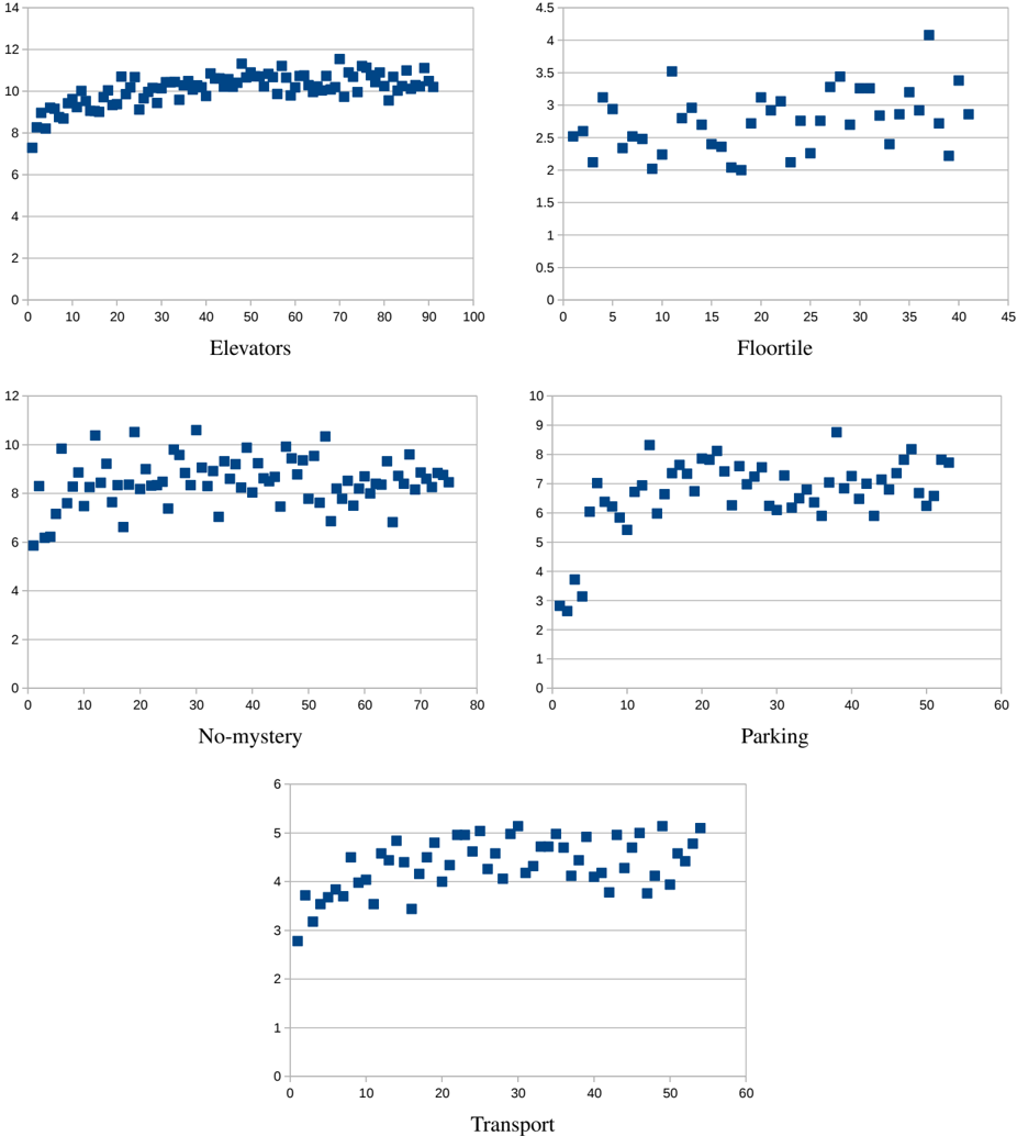
The image presents a 2x3 grid of scatter plots, each visualizing the relationship between a feature (Elevators, Floortile, No-mystery, Parking, Transport) and a target variable (likely a performance metric). Each plot displays data points as blue squares. The x-axis represents the feature value, and the y-axis represents the corresponding target variable value.
### Components/Axes
Each scatter plot shares the following components:
* **X-axis:** Represents the feature value. The scale varies for each plot.
* **Y-axis:** Represents the target variable value. The scale varies for each plot.
* **Data Points:** Blue square markers representing individual data instances.
* **Axis Labels:** Each plot has a label indicating the feature being plotted (Elevators, Floortile, No-mystery, Parking, Transport).
Specific axis ranges:
* **Elevators:** X-axis from 0 to 100, Y-axis from 2 to 14.
* **Floortile:** X-axis from 0 to 45, Y-axis from 0.5 to 4.5.
* **No-mystery:** X-axis from 0 to 80, Y-axis from 2 to 12.
* **Parking:** X-axis from 0 to 60, Y-axis from 1 to 10.
* **Transport:** X-axis from 0 to 60, Y-axis from 2 to 6.
### Detailed Analysis or Content Details
**1. Elevators:**
The data points are clustered between y=6 and y=12. There's a slight upward trend initially, followed by a relatively stable distribution.
* At x=0, y ≈ 7.
* At x=10, y ≈ 7.5.
* At x=20, y ≈ 8.
* At x=30, y ≈ 9.
* At x=40, y ≈ 9.5.
* At x=50, y ≈ 10.
* At x=60, y ≈ 10.
* At x=70, y ≈ 10.
* At x=80, y ≈ 10.
* At x=90, y ≈ 10.
* At x=100, y ≈ 10.
**2. Floortile:**
The data points show a decreasing trend from x=0 to x=20, then stabilize.
* At x=0, y ≈ 3.5.
* At x=5, y ≈ 3.
* At x=10, y ≈ 2.5.
* At x=15, y ≈ 2.2.
* At x=20, y ≈ 2.
* At x=25, y ≈ 2.2.
* At x=30, y ≈ 2.5.
* At x=35, y ≈ 2.
* At x=40, y ≈ 1.8.
**3. No-mystery:**
The data points are relatively evenly distributed between y=6 and y=10. There is no clear trend.
* At x=0, y ≈ 8.
* At x=10, y ≈ 7.5.
* At x=20, y ≈ 8.
* At x=30, y ≈ 7.
* At x=40, y ≈ 8.
* At x=50, y ≈ 8.
* At x=60, y ≈ 7.
* At x=70, y ≈ 8.
* At x=80, y ≈ 7.
**4. Parking:**
The data points show an increasing trend from x=0 to x=20, then stabilize.
* At x=0, y ≈ 1.
* At x=10, y ≈ 3.
* At x=20, y ≈ 5.
* At x=30, y ≈ 6.
* At x=40, y ≈ 7.
* At x=50, y ≈ 7.
* At x=60, y ≈ 7.
**5. Transport:**
The data points show an increasing trend from x=0 to x=40, then stabilize.
* At x=0, y ≈ 3.
* At x=10, y ≈ 3.5.
* At x=20, y ≈ 4.
* At x=30, y ≈ 4.5.
* At x=40, y ≈ 5.
* At x=50, y ≈ 5.
* At x=60, y ≈ 4.5.
### Key Observations
* **Floortile** exhibits a negative correlation with the target variable, decreasing as the feature value increases.
* **Elevators, No-mystery, Parking, and Transport** show varying degrees of positive correlation or no clear correlation.
* The scatter plots suggest that some features may have a stronger influence on the target variable than others.
* The data appears to be somewhat noisy, with considerable scatter around any potential trends.
### Interpretation
The image presents a feature importance analysis, likely used in a machine learning context to understand the relationship between different features and a target variable. The scatter plots visualize these relationships, allowing for a quick assessment of the strength and direction of correlation.
The negative correlation observed in the **Floortile** plot suggests that higher floortile values are associated with lower target variable values. This could indicate that buildings with more floors have a different performance characteristic.
The other features (**Elevators, No-mystery, Parking, Transport**) show less clear relationships, suggesting that their influence on the target variable may be more complex or weaker. The lack of a strong trend in these plots could indicate that these features interact with other variables or that their effect is non-linear.
The overall analysis suggests that **Floortile** is the most important feature among those presented, while the others may require further investigation to understand their individual contributions. The scatter plots provide a valuable starting point for feature selection and model building. The data is not particularly dense, and the scatter suggests that other features may be at play.