## Scatter Plots: Distribution of Metrics Across Categories
### Overview
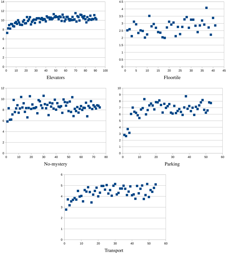
The image contains five scatter plots arranged in a 2x2 grid with a fifth plot below, each representing a distinct category: Elevators, Floortile, No-mystery, Parking, and Transport. All plots use blue square markers to represent data points, with no explicit legend or color differentiation. The axes are labeled with numerical ranges, and the x-axis categories vary per plot.
---
### Components/Axes
1. **Elevators**
- **X-axis**: Labeled "Elevators" with values from 0 to 100 (intervals of 10).
- **Y-axis**: Unlabeled numerical scale from 0 to 14 (intervals of 2).
- **Data Points**: Blue squares densely clustered between y=8 and y=12, with outliers up to y=14.
2. **Floortile**
- **X-axis**: Labeled "Floortile" with values from 0 to 45 (intervals of 5).
- **Y-axis**: Unlabeled numerical scale from 0 to 4.5 (intervals of 0.5).
- **Data Points**: Blue squares spread between y=2 and y=4.5, with sparse points near y=0.
3. **No-mystery**
- **X-axis**: Labeled "No-mystery" with values from 0 to 80 (intervals of 10).
- **Y-axis**: Unlabeled numerical scale from 0 to 10 (intervals of 2).
- **Data Points**: Blue squares clustered between y=6 and y=10, with some outliers near y=4.
4. **Parking**
- **X-axis**: Labeled "Parking" with values from 0 to 60 (intervals of 10).
- **Y-axis**: Unlabeled numerical scale from 0 to 10 (intervals of 1).
- **Data Points**: Blue squares spread between y=2 and y=10, with a notable outlier at y=10.
5. **Transport**
- **X-axis**: Labeled "Transport" with values from 0 to 60 (intervals of 10).
- **Y-axis**: Unlabeled numerical scale from 0 to 6 (intervals of 1).
- **Data Points**: Blue squares showing an upward trend from y=3 to y=6 as x increases.
---
### Detailed Analysis
- **Elevators**: Data points are tightly grouped around y=10, suggesting a stable metric (e.g., usage frequency) with minor variability.
- **Floortile**: Lower y-values (2–4.5) indicate a smaller range of the measured metric, possibly related to material usage or defects.
- **No-mystery**: Similar to Elevators but with a slightly lower central tendency (y=6–10), hinting at a different operational parameter.
- **Parking**: Wider spread (y=2–10) suggests greater variability, potentially due to external factors like occupancy rates.
- **Transport**: Clear upward trend (y=3→6) implies a positive correlation between x and y, such as increased efficiency or demand over time.
---
### Key Observations
1. **No-mystery vs. Elevators**: Both show clustering but differ in y-axis ranges, indicating distinct metrics (e.g., Elevators: usage, No-mystery: incident frequency).
2. **Floortile Outliers**: Sparse points near y=0 may represent rare events (e.g., flooring replacements).
3. **Transport Trend**: The only plot with a directional trend, suggesting a time-based or causal relationship.
4. **Parking Variability**: Highest y-value (10) could indicate peak demand or capacity limits.
---
### Interpretation
The data likely represents operational metrics (e.g., usage, incidents, efficiency) across different facility categories. The Transport plot’s upward trend suggests improvement or growth, while the others reflect static or variable conditions. The absence of legends or axis labels complicates interpretation, but the spatial distribution of points implies:
- **Elevators/Floortile**: Stable systems with minor fluctuations.
- **No-mystery/Parking**: Higher variability, possibly due to external influences.
- **Transport**: A measurable improvement over time or usage.
The lack of explicit units or context limits quantitative conclusions, but the visual patterns highlight priorities for further investigation (e.g., why Transport shows growth while others remain flat).