## Box Plot: Measurements by Day
### Overview
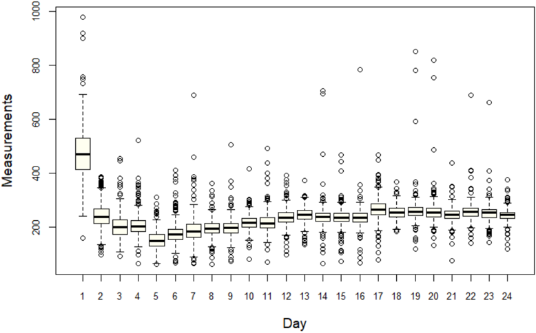
The image is a box plot showing the distribution of measurements taken over 24 days. Each day has its own box plot, displaying the median, quartiles, and outliers of the measurements for that day.
### Components/Axes
* **Y-axis:** "Measurements", ranging from 0 to 1000.
* **X-axis:** "Day", ranging from 1 to 24.
* **Box Plot Components:** Each box plot consists of a box representing the interquartile range (IQR), a line inside the box indicating the median, whiskers extending from the box to the furthest data point within 1.5 times the IQR, and circles representing outliers beyond the whiskers.
### Detailed Analysis
The box plots show the distribution of measurements for each day. The median measurement for each day is represented by the horizontal line within each box. The box represents the interquartile range (IQR), which contains the middle 50% of the data. The whiskers extend to the most extreme data point which is no more than 1.5 times the IQR from the box. Data points outside the whiskers are considered outliers and are plotted as individual circles.
Here's a breakdown of the key trends and data points:
* **Day 1:** The median is approximately 480. The IQR extends from roughly 420 to 540. There are several outliers, including one near 1000.
* **Day 2:** The median is around 240. The IQR is approximately 200 to 260. There are outliers both above and below the whiskers.
* **Days 3-24:** The median measurements appear relatively stable, generally fluctuating between 220 and 260. The IQR for these days is consistently narrow, typically spanning 20-40 units. Outliers are present on most days, both above and below the main distribution.
### Key Observations
* Day 1 has significantly higher measurements compared to all other days.
* The measurements stabilize after Day 1, with relatively consistent distributions across Days 2-24.
* Outliers are present on almost every day, indicating occasional extreme measurement values.
### Interpretation
The box plot suggests that there was a significant difference in measurements on Day 1 compared to the subsequent days. The data indicates a potential change in the measurement process or the underlying phenomenon being measured after Day 1. The consistent distributions from Day 2 onwards suggest a stable state after the initial change. The presence of outliers indicates that extreme values are possible, but relatively infrequent. Further investigation would be needed to understand the cause of the high measurements on Day 1 and the nature of the outliers.