\n
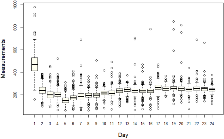
## Box Plot: Measurements vs. Day
### Overview
The image presents a box plot visualizing the distribution of "Measurements" across 24 "Days". The plot displays the median, quartiles, and outliers for each day's measurements. Individual data points are also plotted on top of the box plots.
### Components/Axes
* **X-axis:** "Day", ranging from 1 to 24. The axis is labeled at each integer value.
* **Y-axis:** "Measurements", ranging from 0 to 1000, with markings at 100-unit intervals.
* **Box Plots:** Each day (1-24) has a corresponding box plot representing the distribution of measurements for that day.
* **Data Points:** Individual circles represent individual measurement values for each day.
* **Outliers:** Data points falling outside the "whiskers" of the box plots are considered outliers and are plotted as individual circles.
### Detailed Analysis
The box plots show the following approximate characteristics for each day:
* **Day 1:** The median is approximately 240. The interquartile range (IQR) extends from roughly 180 to 320. There are several outliers, with the highest measurement reaching approximately 800.
* **Day 2:** The median is approximately 220. The IQR extends from roughly 160 to 280. There are several outliers, with the highest measurement reaching approximately 700.
* **Day 3:** The median is approximately 200. The IQR extends from roughly 140 to 260. There are several outliers, with the highest measurement reaching approximately 600.
* **Days 4-24:** The median values generally hover around 180-220. The IQR is relatively consistent across these days, ranging from approximately 140 to 260. Outliers are present on most days, but their frequency and magnitude vary. Days 19 and 22 show a higher concentration of outliers, with some values exceeding 700.
**Specific Data Points (Approximate):**
* Day 7: Median ~ 190, IQR ~ 150-250
* Day 10: Median ~ 180, IQR ~ 140-240
* Day 14: Median ~ 190, IQR ~ 150-260
* Day 18: Median ~ 200, IQR ~ 160-280
* Day 21: Median ~ 190, IQR ~ 150-260
The box plots for days 1-3 are noticeably taller than those for days 4-24, indicating greater variability in measurements during the first three days.
### Key Observations
* **Higher Variability Early On:** The first three days exhibit significantly higher variability in measurements compared to the rest of the period.
* **Outlier Presence:** Outliers are consistently present throughout the 24-day period, suggesting that extreme measurement values occur regularly.
* **Stable Median:** The median measurement remains relatively stable across all days, fluctuating within a narrow range of approximately 180-240.
* **Days 19 & 22:** These days show a higher concentration of outliers, suggesting potentially unusual events or conditions on those days.
### Interpretation
The data suggests a period of initial instability or adjustment (days 1-3) followed by a more stable measurement pattern (days 4-24). The consistent presence of outliers indicates that while the central tendency of the measurements remains relatively constant, there are occasional extreme values that deviate significantly from the norm. The higher outlier frequency on days 19 and 22 warrants further investigation to determine the underlying causes.
The box plot effectively visualizes the distribution of measurements, highlighting the central tendency, spread, and presence of outliers for each day. This type of visualization is useful for identifying patterns, comparing distributions, and detecting anomalies in the data. The data could represent any time-series measurement, such as daily temperature, stock prices, or sensor readings. The initial high variability could indicate a system settling into a stable state, or the influence of external factors that diminish over time.