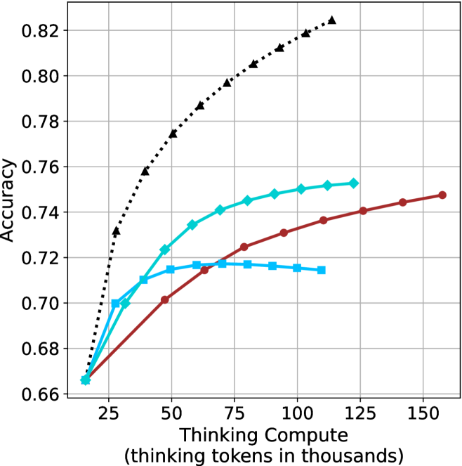
## Line Chart: Accuracy vs. Thinking Compute
### Overview
The image presents a line chart illustrating the relationship between "Thinking Compute" (measured in thousands of tokens) and "Accuracy". Four distinct data series are plotted, each represented by a different colored line. The chart appears to demonstrate how accuracy improves with increased computational effort (thinking tokens).
### Components/Axes
* **X-axis:** "Thinking Compute (thinking tokens in thousands)". The scale ranges from approximately 0 to 150, with markers at 25, 50, 75, 100, 125, and 150.
* **Y-axis:** "Accuracy". The scale ranges from approximately 0.66 to 0.82, with markers at 0.66, 0.68, 0.70, 0.72, 0.74, 0.76, 0.78, 0.80, and 0.82.
* **Data Series:** Four lines are present, each with a distinct color and pattern:
* Black dotted line
* Cyan solid line
* Red solid line
* Orange dashed line
### Detailed Analysis
Let's analyze each line individually, noting trends and approximate data points.
* **Black Dotted Line:** This line exhibits the steepest upward slope, indicating the fastest increase in accuracy with increasing thinking compute.
* At 25 (Thinking Compute), Accuracy is approximately 0.72.
* At 50, Accuracy is approximately 0.77.
* At 75, Accuracy is approximately 0.795.
* At 100, Accuracy is approximately 0.81.
* At 125, Accuracy is approximately 0.818.
* At 150, Accuracy is approximately 0.822.
* **Cyan Solid Line:** This line shows a moderate upward slope, with a diminishing rate of increase as thinking compute increases.
* At 25, Accuracy is approximately 0.685.
* At 50, Accuracy is approximately 0.72.
* At 75, Accuracy is approximately 0.74.
* At 100, Accuracy is approximately 0.748.
* At 125, Accuracy is approximately 0.75.
* At 150, Accuracy is approximately 0.752.
* **Red Solid Line:** This line demonstrates a slow, but steady, increase in accuracy.
* At 25, Accuracy is approximately 0.67.
* At 50, Accuracy is approximately 0.695.
* At 75, Accuracy is approximately 0.71.
* At 100, Accuracy is approximately 0.725.
* At 125, Accuracy is approximately 0.735.
* At 150, Accuracy is approximately 0.74.
* **Orange Dashed Line:** This line initially increases rapidly, then plateaus.
* At 25, Accuracy is approximately 0.69.
* At 50, Accuracy is approximately 0.71.
* At 75, Accuracy is approximately 0.715.
* At 100, Accuracy is approximately 0.718.
* At 125, Accuracy is approximately 0.72.
* At 150, Accuracy is approximately 0.722.
### Key Observations
* The black dotted line consistently outperforms the other three lines across all values of "Thinking Compute".
* The red solid line exhibits the slowest rate of improvement in accuracy.
* The orange dashed line shows initial gains, but quickly reaches a point of diminishing returns.
* All lines demonstrate an overall positive correlation between "Thinking Compute" and "Accuracy", but the strength of this correlation varies significantly.
### Interpretation
The chart suggests that increasing "Thinking Compute" generally leads to improved accuracy, but the effectiveness of this approach depends on the specific method or model being used (represented by the different lines). The black dotted line likely represents a highly efficient method, achieving substantial accuracy gains with relatively little computational effort. Conversely, the red solid line represents a less efficient method, requiring significantly more compute to achieve comparable accuracy. The orange dashed line suggests a method that quickly reaches its performance limit.
The diminishing returns observed in the cyan and orange lines indicate that there is a point at which further investment in "Thinking Compute" yields only marginal improvements in accuracy. This highlights the importance of optimizing computational resources and potentially exploring alternative approaches to achieve higher accuracy. The chart provides valuable insights into the trade-offs between computational cost and performance, which is crucial for practical applications of these models.