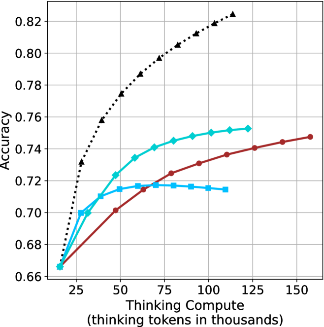
## Line Chart: Accuracy vs. Thinking Compute
### Overview
The image is a line chart plotting model accuracy against computational effort, measured in thinking tokens. It compares the performance of four distinct methods or models, showing how their accuracy scales with increased compute. The chart demonstrates a clear positive correlation between thinking compute and accuracy for all series, though with varying rates of improvement and saturation points.
### Components/Axes
* **X-Axis (Horizontal):** Labeled "Thinking Compute (thinking tokens in thousands)". The scale runs from approximately 15 to 160, with major tick marks at 25, 50, 75, 100, 125, and 150.
* **Y-Axis (Vertical):** Labeled "Accuracy". The scale runs from 0.66 to 0.82, with major tick marks at 0.02 intervals (0.66, 0.68, 0.70, ..., 0.82).
* **Legend:** Positioned in the top-left corner of the chart area. It contains four entries, each with a colored line segment and a marker symbol:
1. **Black dotted line with upward-pointing triangle markers (▲)**
2. **Cyan solid line with diamond markers (◆)**
3. **Red solid line with circle markers (●)**
4. **Cyan solid line with square markers (■)**
* **Grid:** A light gray grid is present, with vertical lines at each major x-axis tick and horizontal lines at each major y-axis tick.
### Detailed Analysis
The chart displays four data series. Below is an analysis of each, including approximate data points extracted from the visual plot.
**1. Black Dotted Line (▲)**
* **Trend:** Shows the steepest and most consistent upward slope across the entire range. It demonstrates the highest accuracy at every compute level beyond the initial point.
* **Approximate Data Points:**
* ~15k tokens: Accuracy ≈ 0.665
* ~25k tokens: Accuracy ≈ 0.73
* ~50k tokens: Accuracy ≈ 0.775
* ~75k tokens: Accuracy ≈ 0.80
* ~100k tokens: Accuracy ≈ 0.815
* ~115k tokens: Accuracy ≈ 0.825 (highest point on the chart)
**2. Cyan Solid Line (◆)**
* **Trend:** Increases steadily but begins to show signs of diminishing returns (flattening) after approximately 75k tokens. It is the second-highest performing series.
* **Approximate Data Points:**
* ~15k tokens: Accuracy ≈ 0.665
* ~25k tokens: Accuracy ≈ 0.70
* ~50k tokens: Accuracy ≈ 0.735
* ~75k tokens: Accuracy ≈ 0.745
* ~100k tokens: Accuracy ≈ 0.75
* ~120k tokens: Accuracy ≈ 0.752
**3. Red Solid Line (●)**
* **Trend:** Shows a steady, nearly linear increase throughout the plotted range. Its slope is less steep than the black or cyan (◆) lines but remains consistently positive.
* **Approximate Data Points:**
* ~15k tokens: Accuracy ≈ 0.665
* ~50k tokens: Accuracy ≈ 0.70
* ~75k tokens: Accuracy ≈ 0.725
* ~100k tokens: Accuracy ≈ 0.735
* ~125k tokens: Accuracy ≈ 0.74
* ~155k tokens: Accuracy ≈ 0.748
**4. Cyan Solid Line (■)**
* **Trend:** Increases initially but plateaus very early, showing almost no improvement after approximately 50k tokens. It has the lowest performance ceiling.
* **Approximate Data Points:**
* ~15k tokens: Accuracy ≈ 0.665
* ~25k tokens: Accuracy ≈ 0.70
* ~50k tokens: Accuracy ≈ 0.715
* ~75k tokens: Accuracy ≈ 0.718
* ~100k tokens: Accuracy ≈ 0.715 (slight decline visible)
* ~110k tokens: Accuracy ≈ 0.714
### Summary of Approximate Data Points
| Thinking Compute (k tokens) | Black (▲) Accuracy | Cyan (◆) Accuracy | Red (●) Accuracy | Cyan (■) Accuracy |
| :--- | :--- | :--- | :--- | :--- |
| ~15 | 0.665 | 0.665 | 0.665 | 0.665 |
| ~25 | 0.73 | 0.70 | - | 0.70 |
| ~50 | 0.775 | 0.735 | 0.70 | 0.715 |
| ~75 | 0.80 | 0.745 | 0.725 | 0.718 |
| ~100 | 0.815 | 0.75 | 0.735 | 0.715 |
| ~115 | 0.825 | - | - | - |
| ~120 | - | 0.752 | - | - |
| ~125 | - | - | 0.74 | - |
| ~155 | - | - | 0.748 | - |
### Key Observations
1. **Common Starting Point:** All four methods begin at nearly the same accuracy (~0.665) at the lowest compute level (~15k tokens).
2. **Performance Hierarchy:** A clear performance hierarchy is established quickly and maintained: Black (▲) > Cyan (◆) > Red (●) > Cyan (■).
3. **Saturation Points:** The methods exhibit different saturation behaviors. The Cyan (■) line saturates earliest (~50k tokens). The Cyan (◆) line begins to saturate around 75-100k tokens. The Black (▲) and Red (●) lines show no clear signs of saturation within the plotted range.
4. **Efficiency:** The Black (▲) method is the most compute-efficient, achieving higher accuracy with fewer tokens than any other method. For example, it reaches 0.75 accuracy at ~40k tokens, a level the Cyan (◆) method only approaches at ~100k tokens.
### Interpretation
This chart illustrates the scaling law relationship between computational resources ("thinking tokens") and model performance (accuracy) for different approaches. The data suggests:
* **Investment Pays Off:** For all tested methods, allocating more compute for "thinking" leads to better accuracy, validating the core premise of scaling inference-time computation.
* **Methodological Superiority:** The method represented by the black dotted line (▲) is fundamentally more efficient and effective. It extracts more accuracy per thinking token and has a higher performance ceiling. This could indicate a superior architecture, training technique, or reasoning algorithm.
* **The Plateau Problem:** The early plateau of the Cyan (■) line indicates a method that hits a fundamental limit; throwing more compute at it yields negligible gains. This is a critical insight for resource allocation.
* **Strategic Implications:** The choice of method involves a trade-off. If maximum accuracy is the goal and compute is available, the Black (▲) method is the clear choice. If compute is constrained, the relative efficiency of each method at different budget levels (e.g., Red (●) may be preferable to Cyan (◆) at very high compute budgets due to its continued, albeit slower, improvement) becomes the key decision factor. The chart provides the empirical data needed to make that cost-benefit analysis.