## Pie Chart: Failure Modes Distribution
### Overview
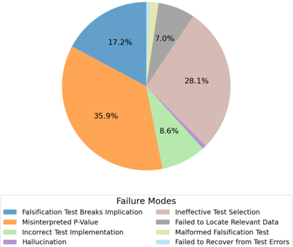
The image displays a pie chart titled "Failure Modes," illustrating the proportional distribution of eight distinct categories of failures. The chart is presented against a plain white background, with a legend positioned directly below the circular graphic. The data appears to quantify the frequency or occurrence of different types of errors, likely within a technical testing, data analysis, or machine learning context.
### Components/Axes
* **Chart Type:** Pie Chart.
* **Title:** "Failure Modes" (located below the chart, above the legend).
* **Legend:** Positioned at the bottom of the image, centered horizontally. It contains eight color-coded entries, each with a descriptive label.
* **Data Labels:** Percentage values are printed directly on each corresponding pie segment.
* **Language:** All text is in English.
### Detailed Analysis
The chart is divided into eight segments, each representing a specific failure mode. The legend and corresponding segments are as follows, listed in the order they appear in the legend (left to right, top to bottom):
1. **Falsification Test Breaks Implication** (Blue segment, top-left): **17.2%**
2. **Misinterpreted P-Value** (Orange segment, left): **35.9%**
3. **Incorrect Test Implementation** (Light Green segment, bottom-left): **8.6%**
4. **Hallucination** (Purple segment, bottom): A very thin sliver. The percentage is not labeled on the segment due to its small size. Visually, it is the smallest category.
5. **Ineffective Test Selection** (Pinkish-Brown segment, right): **28.1%**
6. **Failed to Locate Relevant Data** (Grey segment, top-right): **7.0%**
7. **Malformed Falsification Test** (Yellow segment, top): A very thin sliver. The percentage is not labeled on the segment due to its small size. It is the second-smallest category.
8. **Failed to Recover from Test Errors** (Light Blue segment, top): A very thin sliver. The percentage is not labeled on the segment due to its small size. It is the third-smallest category.
**Spatial Grounding & Trend Verification:**
* The largest segment by a significant margin is **Misinterpreted P-Value (35.9%)**, occupying the left portion of the chart.
* The second-largest is **Ineffective Test Selection (28.1%)**, on the right side.
* The third-largest is **Falsification Test Breaks Implication (17.2%)**, in the upper-left quadrant.
* The remaining labeled segments are **Incorrect Test Implementation (8.6%)** and **Failed to Locate Relevant Data (7.0%)**.
* The three smallest categories (**Hallucination, Malformed Falsification Test, Failed to Recover from Test Errors**) are represented by very narrow slices at the top and bottom of the chart, with no numerical labels, indicating their individual contributions are minimal (likely each below 5%).
### Key Observations
1. **Dominant Failure Modes:** Two categories, **Misinterpreted P-Value** and **Ineffective Test Selection**, together account for nearly two-thirds (64.0%) of all failures shown.
2. **Significant Contributor:** **Falsification Test Breaks Implication** is a substantial third category at 17.2%.
3. **Long Tail of Minor Issues:** Five of the eight categories (Incorrect Test Implementation, Failed to Locate Relevant Data, and the three unlabeled slivers) represent the "long tail" of less frequent failure modes, collectively making up about 18.8% of the total.
4. **Visual Anomaly:** The three smallest segments lack percentage labels, which is a common practice in pie charts to avoid clutter but requires the viewer to infer their relative sizes visually.
### Interpretation
This chart provides a diagnostic breakdown of what goes wrong in a specific process, most likely related to statistical testing, hypothesis validation, or AI model evaluation (given terms like "Falsification Test," "P-Value," and "Hallucination").
* **Primary Insight:** The data suggests that **human or procedural error in interpreting results** ("Misinterpreted P-Value") and **flaws in the initial test design** ("Ineffective Test Selection") are the most critical areas for improvement. These are foundational, conceptual errors rather than simple execution mistakes.
* **Process Relationship:** The failure modes can be seen as stages in a pipeline: selecting a test, implementing it, running it, interpreting the result, and handling errors. The chart shows that failures are most concentrated at the beginning (selection) and end (interpretation) of this pipeline.
* **Notable Implication:** The presence of "Hallucination" as a category strongly implies this data may be from a context involving generative AI or large language models, where fabricating information is a known failure mode. Its small size here suggests it is a rare but recognized issue within this specific dataset.
* **Actionable Conclusion:** To significantly reduce the overall failure rate, efforts should be prioritized on training and safeguards to prevent the misinterpretation of statistical results and to improve the methodology for selecting which tests to run in the first place. Addressing the numerous smaller, technical issues would yield diminishing returns by comparison.