\n
## Pie Chart: Failure Modes
### Overview
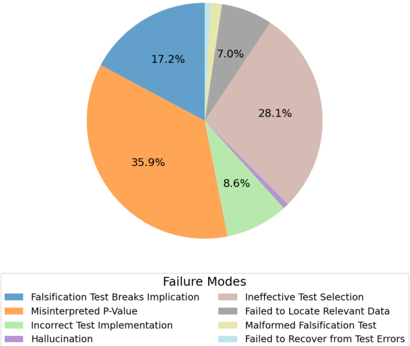
This image presents a pie chart illustrating the distribution of different failure modes. The chart is segmented into seven categories, each representing a type of failure, with percentages indicating their relative frequency. The legend is positioned at the bottom of the chart.
### Components/Axes
* **Title:** "Failure Modes" (located at the bottom center)
* **Categories (Legend):**
* Falsification Test Breaks Implication (Blue)
* Misinterpreted P-Value (Orange)
* Incorrect Test Implementation (Yellow)
* Hallucination (Purple)
* Ineffective Test Selection (Gray)
* Failed to Locate Relevant Data (Light Green)
* Malformed Falsification Test (Light Blue)
* Failed to Recover from Test Errors (Tan)
* **Values:** Percentages representing the proportion of each failure mode.
### Detailed Analysis
The pie chart segments are as follows (values are approximate, based on visual estimation):
* **Falsification Test Breaks Implication (Blue):** 17.2% - This segment is located in the top-left quadrant of the chart.
* **Misinterpreted P-Value (Orange):** 35.9% - This is the largest segment, positioned in the bottom-right quadrant.
* **Incorrect Test Implementation (Yellow):** 8.6% - This segment is located in the bottom-center of the chart.
* **Hallucination (Purple):** 7.0% - This segment is located between the gray and orange segments.
* **Ineffective Test Selection (Gray):** 28.1% - This is the second largest segment, positioned in the top-right quadrant.
* **Failed to Locate Relevant Data (Light Green):** 8.6% - This segment is located near the yellow segment.
* **Malformed Falsification Test (Light Blue):** 1.7% - This is the smallest segment, positioned between the blue and gray segments.
* **Failed to Recover from Test Errors (Tan):** 3.0% - This segment is located between the light green and gray segments.
### Key Observations
* "Misinterpreted P-Value" is the most frequent failure mode, accounting for 35.9% of all failures.
* "Ineffective Test Selection" is the second most frequent failure mode, accounting for 28.1% of all failures.
* "Malformed Falsification Test" and "Failed to Recover from Test Errors" are the least frequent failure modes, representing only 1.7% and 3.0% of failures, respectively.
* "Incorrect Test Implementation" and "Failed to Locate Relevant Data" have the same percentage of 8.6%.
### Interpretation
The data suggests that issues related to statistical interpretation ("Misinterpreted P-Value") and test design ("Ineffective Test Selection") are the primary sources of failure. The relatively low percentages for "Malformed Falsification Test" and "Failed to Recover from Test Errors" indicate that these are less common issues. The chart highlights the importance of careful statistical analysis and robust test selection in ensuring reliable results. The presence of "Hallucination" as a failure mode suggests the use of AI or machine learning models where unexpected or nonsensical outputs can occur. The overall distribution indicates a need for improved training and quality control in both statistical methods and testing procedures. The chart provides a clear visual representation of the relative importance of different failure modes, allowing for targeted efforts to improve the reliability of the testing process.