## Pie Chart: Failure Modes
### Overview
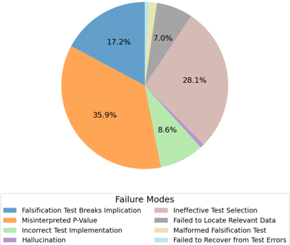
The pie chart illustrates the distribution of failure modes in a testing process. It is divided into six segments, each representing a different type of failure mode.
### Components/Axes
- **Title**: Failure Modes
- **Legend**:
- Falsification Test Breaks Implication (17.2%)
- Ineffective Test Selection (28.1%)
- Misinterpreted P-Value (35.9%)
- Failed to Locate Relevant Data (8.6%)
- Hallucination (7.0%)
- Failed to Recover from Test Errors (1.0%)
- **Axes**:
- No visible axes in the image.
### Detailed Analysis or ### Content Details
The chart shows that the majority of failures (35.9%) are due to misinterpreting the P-value. This is followed by ineffective test selection (28.1%), and falsification test breaks implication (17.2%). The remaining failure modes are relatively small in proportion, with failed to locate relevant data (8.6%), hallucination (7.0%), and failed to recover from test errors (1.0%).
### Key Observations
The chart highlights that misinterpreting the P-value is the most common failure mode, suggesting that there may be a need for better training or clearer guidelines for interpreting statistical results in testing processes. The ineffective test selection and falsification test breaks implication are also significant, indicating that there may be issues with the testing methodology or the selection of tests.
### Interpretation
The data suggests that there are significant issues with the testing process, particularly in terms of misinterpreting statistical results and ineffective test selection. These issues may be contributing to the high rate of failures in the testing process. The need for better training and clearer guidelines for interpreting statistical results in testing processes is emphasized. Additionally, the need for better testing methodology and the selection of tests is highlighted.