## Pie Chart: Failure Modes Distribution
### Overview
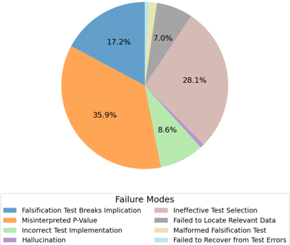
The image is a pie chart illustrating the distribution of failure modes in a technical context. The chart is divided into six segments, each representing a specific failure mode with a percentage and color-coded label. A legend at the bottom maps colors to failure modes.
### Components/Axes
- **Legend**: Located at the bottom of the chart, it associates colors with failure modes:
- **Blue**: Falsification Test Breaks Implication
- **Orange**: Misinterpreted P-Value
- **Green**: Incorrect Test Implementation
- **Gray**: Ineffective Test Selection
- **Yellow**: Failed to Locate Relevant Data
- **Light Blue**: Malformed Falsification Test
- **Purple**: Failed to Recover from Test Errors
- **Segments**: Six color-coded sections with percentages and labels:
- **Blue (17.2%)**: Falsification Test Breaks Implication
- **Orange (35.9%)**: Misinterpreted P-Value
- **Green (8.6%)**: Incorrect Test Implementation
- **Gray (28.1%)**: Ineffective Test Selection
- **Yellow (7.0%)**: Failed to Locate Relevant Data
- **Light Blue (1.4%)**: Malformed Falsification Test
- **Purple (1.4%)**: Failed to Recover from Test Errors
### Detailed Analysis
- **Largest Segment**: "Misinterpreted P-Value" (35.9%) dominates the chart, suggesting it is the most frequent failure mode.
- **Second-Largest Segment**: "Ineffective Test Selection" (28.1%) follows closely, indicating a significant secondary issue.
- **Smaller Segments**:
- "Falsification Test Breaks Implication" (17.2%) and "Incorrect Test Implementation" (8.6%) are moderate contributors.
- "Failed to Locate Relevant Data" (7.0%) is the smallest among the larger segments.
- "Malformed Falsification Test" (1.4%) and "Failed to Recover from Test Errors" (1.4%) are the smallest, each accounting for 1.4% of the total.
### Key Observations
1. **Dominance of Misinterpreted P-Value**: The orange segment (35.9%) is the largest, highlighting a critical issue in statistical interpretation.
2. **High Frequency of Ineffective Test Selection**: The gray segment (28.1%) underscores systemic problems in test design or selection.
3. **Discrepancy in Total Percentage**: The sum of all segments is 98.2%, leaving a 1.8% unaccounted for. This could be due to rounding or an omitted category.
4. **Minor Failures**: The light blue and purple segments (1.4% each) represent rare but notable edge cases.
### Interpretation
The chart reveals that **misinterpreted P-values** and **ineffective test selection** are the primary failure modes, accounting for over 64% of all issues. This suggests a need for improved statistical training and test design protocols. The smaller segments indicate less frequent but still critical issues, such as data localization failures and test implementation errors. The 1.8% discrepancy may reflect rounding or an unlisted category, warranting further investigation. The data emphasizes the importance of addressing foundational statistical and methodological practices to reduce failure rates.