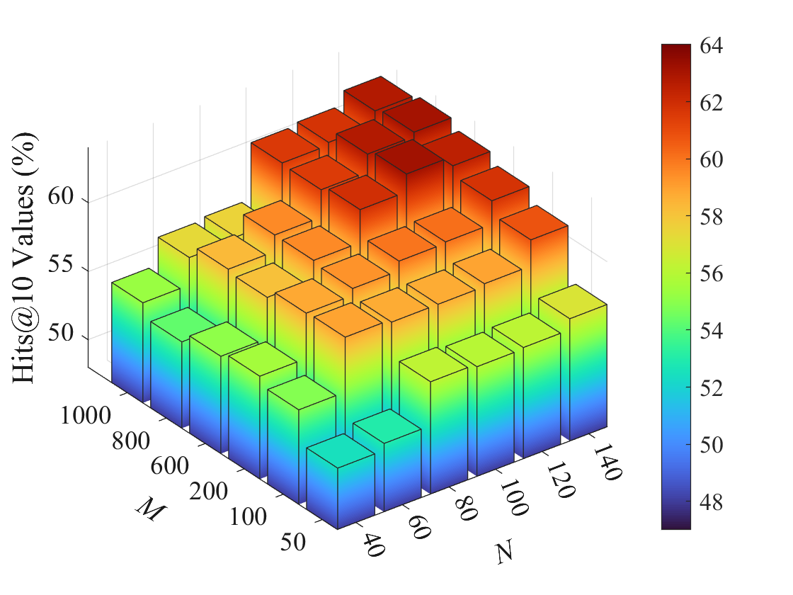
## 3D Bar Chart: Hits@10 Values (%) vs. M and N
### Overview
The image is a 3D bar chart visualizing the relationship between two variables, M and N, and their impact on "Hits@10 Values (%)". The chart uses a color gradient to represent the magnitude of the "Hits@10 Values (%)", with blue indicating lower values and red indicating higher values. The chart shows a general trend of increasing "Hits@10 Values (%)" as both M and N increase.
### Components/Axes
* **X-axis (M):** Represents the variable M, with values ranging from 50 to 1000. The specific values marked are 50, 100, 200, 600, 800, and 1000.
* **Y-axis (N):** Represents the variable N, with values ranging from 40 to 140. The specific values marked are 40, 60, 80, 100, 120, and 140.
* **Z-axis (Hits@10 Values (%)):** Represents the "Hits@10 Values (%)", ranging from 48% to 64%. The specific values marked are 50%, 55%, and 60%.
* **Colorbar:** A vertical colorbar on the right side of the chart maps the color gradient to the "Hits@10 Values (%)". The colorbar ranges from 48 (dark blue) to 64 (dark red), with intermediate values marked at 50, 52, 54, 56, 58, 60, and 62.
### Detailed Analysis
The chart presents data points for each combination of M and N values. The height and color of each bar indicate the corresponding "Hits@10 Values (%)".
* **Trend:** As both M and N increase, the "Hits@10 Values (%)" generally increases. The bars transition from blue/green to yellow/orange/red, indicating higher values.
* **Specific Data Points (Approximate):**
* M=50, N=40: Hits@10 Values (%) ≈ 49% (Dark Blue)
* M=1000, N=140: Hits@10 Values (%) ≈ 63% (Dark Red)
* M=1000, N=40: Hits@10 Values (%) ≈ 54% (Green/Yellow)
* M=50, N=140: Hits@10 Values (%) ≈ 55% (Green/Yellow)
* **Color Mapping Verification:**
* Dark Blue corresponds to values around 48-50%.
* Green corresponds to values around 52-54%.
* Yellow corresponds to values around 56-58%.
* Orange corresponds to values around 60-62%.
* Red corresponds to values around 62-64%.
### Key Observations
* The highest "Hits@10 Values (%)" are achieved when both M and N are at their maximum values (M=1000, N=140).
* The lowest "Hits@10 Values (%)" are observed when both M and N are at their minimum values (M=50, N=40).
* The chart shows a clear positive correlation between M, N, and "Hits@10 Values (%)".
### Interpretation
The chart suggests that increasing both M and N leads to a higher "Hits@10 Values (%)". This indicates that these two variables have a significant positive impact on the performance metric being measured. The relationship appears to be roughly linear, with a consistent increase in "Hits@10 Values (%)" as M and N increase. The data implies that optimizing both M and N is crucial for maximizing the "Hits@10 Values (%)". Further analysis could involve determining the specific functional relationship between M, N, and "Hits@10 Values (%)" to identify the optimal values for M and N.