## 3D Bar Chart: Hits@10 Values vs. Parameters M and N
### Overview
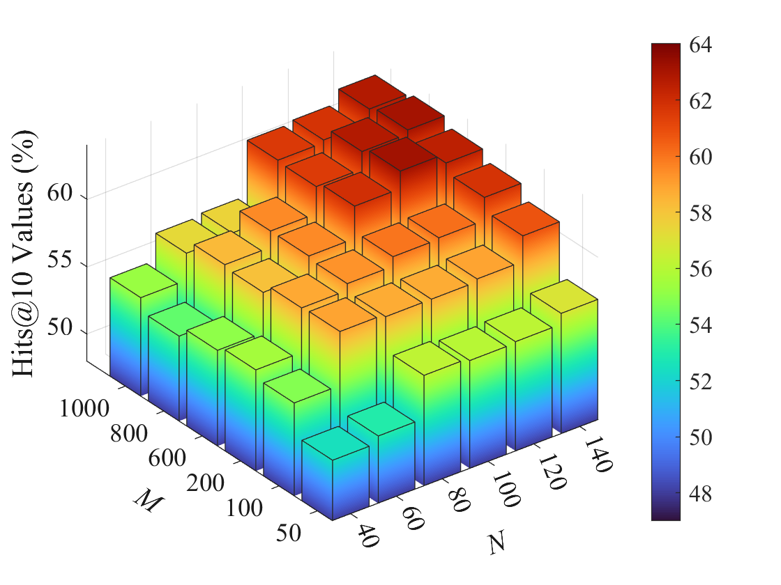
This image is a 3D bar chart visualizing the relationship between two parameters, **M** and **N**, and a performance metric called **Hits@10 Values (%)**. The chart uses both bar height and a color gradient to represent the metric's value. The overall trend shows that Hits@10 increases as both M and N increase.
### Components/Axes
* **Vertical Axis (Z-axis):** Labeled **"Hits@10 Values (%)"**. The scale runs from 50 to 60, with major tick marks at 50, 55, and 60.
* **Horizontal Axis 1 (X-axis, front-left):** Labeled **"M"**. The discrete values marked are: 50, 100, 200, 600, 800, 1000.
* **Horizontal Axis 2 (Y-axis, front-right):** Labeled **"N"**. The discrete values marked are: 40, 60, 80, 100, 120, 140.
* **Color Bar/Legend (Right side):** A vertical gradient bar mapping color to the Hits@10 value. The scale ranges from **48** (dark blue) to **64** (dark red), with labeled ticks at 48, 50, 52, 54, 56, 58, 60, 62, 64. This color scale is used to fill the bars, providing a secondary visual cue for the value.
### Detailed Analysis
The chart contains a 6x6 grid of bars, one for each combination of M and N. The value for each bar is estimated based on its height relative to the Z-axis and its color relative to the color bar. Values are approximate.
**Data Table (Estimated Hits@10 Values in %):**
| M \ N | 40 | 60 | 80 | 100 | 120 | 140 |
| :--- | :--- | :--- | :--- | :--- | :--- | :--- |
| **50** | ~50 (Blue) | ~51 (Light Blue) | ~52 (Cyan) | ~53 (Green-Cyan) | ~54 (Green) | ~55 (Yellow-Green) |
| **100** | ~51 (Light Blue) | ~52 (Cyan) | ~53 (Green-Cyan) | ~54 (Green) | ~55 (Yellow-Green) | ~56 (Yellow) |
| **200** | ~52 (Cyan) | ~53 (Green-Cyan) | ~54 (Green) | ~55 (Yellow-Green) | ~56 (Yellow) | ~57 (Light Orange) |
| **600** | ~54 (Green) | ~55 (Yellow-Green) | ~56 (Yellow) | ~57 (Light Orange) | ~58 (Orange) | ~59 (Dark Orange) |
| **800** | ~55 (Yellow-Green) | ~56 (Yellow) | ~57 (Light Orange) | ~58 (Orange) | ~59 (Dark Orange) | ~60 (Red-Orange) |
| **1000** | ~56 (Yellow) | ~57 (Light Orange) | ~58 (Orange) | ~59 (Dark Orange) | ~60 (Red-Orange) | ~61 (Red) |
**Trend Verification:**
* **For a fixed M (moving along an N-row):** The bar heights and colors consistently shift from blue/green towards yellow/orange/red as N increases from 40 to 140. This indicates a positive correlation between N and Hits@10.
* **For a fixed N (moving along an M-row):** The bar heights and colors consistently shift from blue/green towards yellow/orange/red as M increases from 50 to 1000. This indicates a positive correlation between M and Hits@10.
* **Overall Gradient:** The lowest values (~50%) are at the front corner (M=50, N=40). The highest values (~61-64%) are at the back corner (M=1000, N=140). The color gradient flows diagonally from the front-left (blue) to the back-right (red).
### Key Observations
1. **Monotonic Increase:** The performance metric (Hits@10) increases monotonically with both parameters M and N across the entire observed range. There are no visible dips or outliers where increasing a parameter leads to a decrease in value.
2. **Interaction Effect:** The increase appears synergistic. The gain from increasing M is more pronounced at higher values of N, and vice-versa. The steepest gradient (fastest color change) is along the diagonal from (M=50, N=40) to (M=1000, N=140).
3. **Value Range:** The observed Hits@10 values in this grid range from approximately **50%** to **64%**, as indicated by the color bar. The highest bars in the back corner approach the top of the color scale (dark red, ~64%).
### Interpretation
This chart likely presents the results of a parameter sensitivity analysis for a system where "Hits@10" is a key performance metric (common in information retrieval, recommendation systems, or machine learning evaluation). The parameters M and N could represent dimensions like model size, number of features, training iterations, or dataset characteristics.
The data suggests that **performance improves with larger values of both M and N**. The absence of a plateau or decline indicates that, within the tested ranges, the system has not yet reached a point of diminishing returns or overfitting for these parameters. The strongest performance is achieved by maximizing both parameters simultaneously. A decision-maker would use this chart to understand the trade-off: if computational resources are limited, they might choose a combination of M and N that meets a minimum acceptable Hits@10 threshold (e.g., 58%) while balancing cost. The clear, positive trend provides strong evidence for scaling up M and N to improve results.