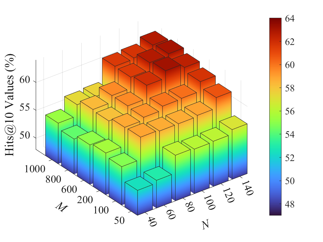
## 3D Bar Chart: Hits@10 Values vs. M and N Parameters
### Overview
The image depicts a 3D bar chart visualizing the relationship between two parameters (M and N) and their impact on Hits@10 Values (%). The chart uses a color gradient to represent value ranges, with bars arranged in a grid-like structure across the M and N axes.
### Components/Axes
- **X-axis (M)**: Labeled "M" with values ranging from 40 to 1000 in increments of 200 (40, 60, 80, 100, 120, 140, 200, 400, 600, 800, 1000).
- **Y-axis (N)**: Labeled "N" with values ranging from 50 to 140 in increments of 20 (50, 60, 80, 100, 120, 140).
- **Z-axis**: Represents "Hits@10 Values (%)" with a color-coded legend on the right:
- **Color Scale**: Blue (48%) → Green (54%) → Yellow (56%) → Orange (58%) → Red (64%).
- **Legend**: Positioned vertically on the right side of the chart, with a gradient from dark blue (48%) to dark red (64%).
### Detailed Analysis
- **Bar Structure**:
- Bars are grouped in clusters along the M and N axes, with heights corresponding to Hits@10 Values.
- Colors transition from blue (low values) at the base to red (high values) at the top.
- **Key Data Points**:
- **Highest Values**: Dark red bars (64%) are concentrated at the top-right corner (M=1000, N=140).
- **Lowest Values**: Dark blue bars (48%) are clustered at the bottom-left corner (M=40, N=50).
- **Mid-Range Values**: Yellow/orange bars (54–58%) dominate the central region (M=200–600, N=80–120).
- **Spatial Grounding**:
- Legend is positioned to the right of the chart, aligned with the Z-axis.
- Axis labels are placed at the base of each axis, with gridlines extending into the 3D space.
### Key Observations
1. **Positive Correlation**: Higher M and N values generally correspond to higher Hits@10 Values, with the strongest performance at M=1000 and N=140.
2. **Diminishing Returns**: The plateau in values (54–58%) at mid-range M and N suggests limited improvement beyond certain thresholds.
3. **Outliers**: No significant outliers; the gradient is consistent across the dataset.
### Interpretation
The chart demonstrates that increasing both M and N parameters improves Hits@10 performance, with the most substantial gains observed at the upper bounds of the axes. The plateau in mid-range values implies that optimizing M and N beyond specific thresholds may not yield proportional benefits. This could inform resource allocation strategies, where prioritizing extreme parameter values might be more effective than incremental adjustments. The color gradient provides an intuitive visual cue for performance tiers, aiding in rapid identification of high-performing configurations.