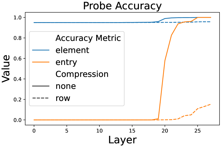
## Line Graph: Probe Accuracy
### Overview
The image is a line graph titled "Probe Accuracy," comparing the performance of four metrics ("element," "entry," "compression," "row") across 25 layers. The y-axis represents accuracy values (0.0–1.0), while the x-axis represents layers (0–25). The graph includes a legend on the left, with distinct line styles and colors for each metric.
### Components/Axes
- **Title**: "Probe Accuracy"
- **X-axis (Layer)**: Ranges from 0 to 25, labeled "Layer."
- **Y-axis (Value)**: Ranges from 0.0 to 1.0, labeled "Value."
- **Legend**:
- **element**: Solid blue line (flat at 1.0).
- **entry**: Solid orange line (spikes at layer 20).
- **compression**: Dashed black line (flat at 0.0).
- **row**: Dashed orange line (gradual increase after layer 20).
### Detailed Analysis
1. **element (blue solid line)**:
- Remains constant at **1.0** across all layers.
- No variation observed.
2. **entry (solid orange line)**:
- Stays at **0.0** until layer 20.
- Sharp increase to **1.0** between layers 20 and 25.
3. **compression (dashed black line)**:
- Remains constant at **0.0** across all layers.
4. **row (dashed orange line)**:
- Stays at **0.0** until layer 20.
- Gradual increase to **~0.2** between layers 20 and 25.
### Key Observations
- **element** and **compression** metrics are static, suggesting no dependency on layer depth.
- **entry** exhibits a discontinuous jump at layer 20, indicating a potential threshold or phase change.
- **row** shows a slow, linear increase post-layer 20, contrasting with the abrupt rise of **entry**.
- **entry** and **row** share the same base color (orange) but differ in line style (solid vs. dashed), which may aid differentiation but requires careful legend interpretation.
### Interpretation
The graph highlights distinct behaviors in probe accuracy metrics:
- **element**'s constant 1.0 accuracy implies perfect performance, possibly representing a baseline or idealized metric.
- **compression**'s flat 0.0 line suggests no compression effect or a non-functional metric in this context.
- The **entry** metric's sharp rise at layer 20 could indicate a critical layer where data processing or model architecture changes (e.g., activation function, layer type).
- **row**'s gradual increase might reflect cumulative improvements or dependencies on prior layers, though its slower growth compared to **entry** suggests differing optimization dynamics.
The use of shared colors (orange) for **entry** and **row** with differing line styles emphasizes the need for precise legend interpretation. The abrupt changes in **entry** and **row** at layer 20 warrant further investigation into the underlying system's design or data handling at that layer.