\n
## Charts: Optimization Loss and Domain Weights during Training
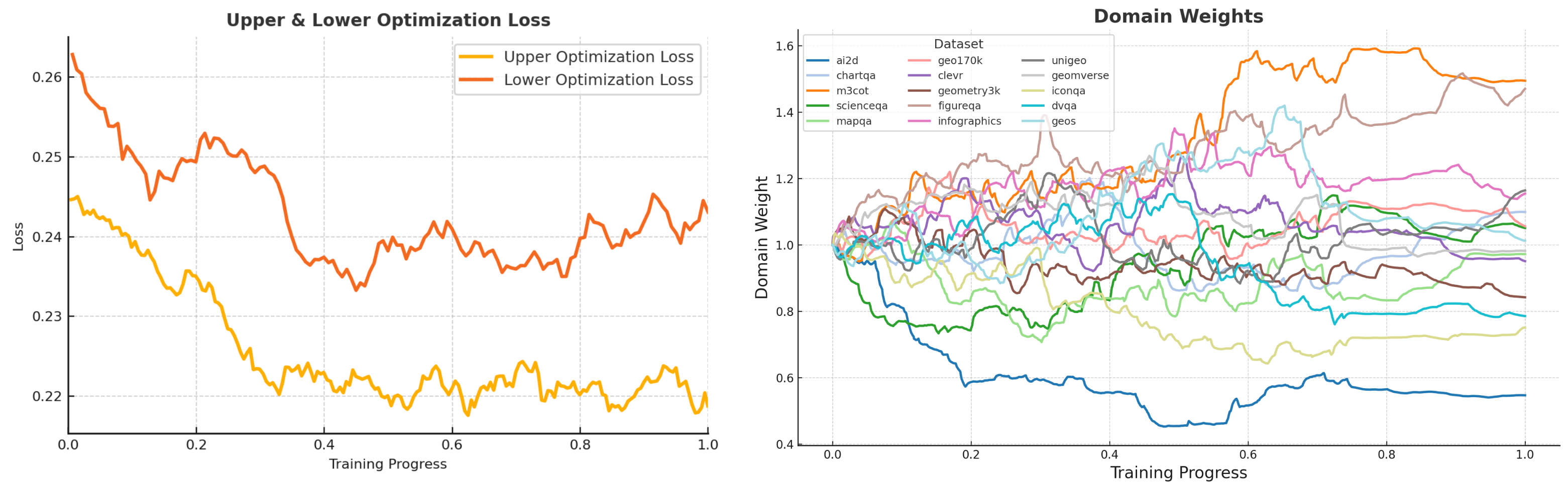
### Overview
The image presents two line charts visualizing the training process of a model. The left chart shows the Upper and Lower Optimization Loss over Training Progress. The right chart displays the Domain Weights for various datasets over the same Training Progress. Both charts share a common x-axis representing Training Progress from 0.0 to 1.0.
### Components/Axes
**Left Chart (Upper & Lower Optimization Loss):**
* **X-axis:** Training Progress (0.0 to 1.0)
* **Y-axis:** Loss (approximately 0.21 to 0.26)
* **Legend:**
* Upper Optimization Loss (Orange)
* Lower Optimization Loss (Yellow)
**Right Chart (Domain Weights):**
* **X-axis:** Training Progress (0.0 to 1.0)
* **Y-axis:** Domain Weight (approximately 0.4 to 1.6)
* **Legend:**
* a2d (Red)
* chart2a (Orange)
* m3ot (Green)
* scienceqa (Light Blue)
* mapqa (Yellow)
* unigeo (Purple)
* geomverse (Dark Blue)
* iconqa (Pink)
* dvoqa (Brown)
* figureqa (Teal)
* infographics (Gray)
* geoss (Cyan)
### Detailed Analysis or Content Details
**Left Chart (Optimization Loss):**
* **Upper Optimization Loss (Orange):** The line starts at approximately 0.255 at Training Progress 0.0, fluctuates significantly, reaching a peak around 0.258 at approximately 0.15, and generally decreases to around 0.235 at Training Progress 1.0. There are numerous oscillations throughout the training process.
* **Lower Optimization Loss (Yellow):** The line begins at approximately 0.225 at Training Progress 0.0, exhibits fluctuations, reaching a minimum around 0.218 at approximately 0.35, and increases to around 0.228 at Training Progress 1.0. It generally remains lower than the Upper Optimization Loss.
**Right Chart (Domain Weights):**
* **a2d (Red):** Starts at approximately 1.1, decreases to around 0.8 at Training Progress 0.2, then increases to approximately 1.2 at Training Progress 1.0.
* **chart2a (Orange):** Starts at approximately 0.9, decreases to around 0.6 at Training Progress 0.2, then increases to approximately 0.9 at Training Progress 1.0.
* **m3ot (Green):** Starts at approximately 0.75, remains relatively stable around 0.7-0.8 throughout the training process.
* **scienceqa (Light Blue):** Starts at approximately 0.8, decreases to around 0.5 at Training Progress 0.2, then increases to approximately 0.7 at Training Progress 1.0.
* **mapqa (Yellow):** Starts at approximately 0.8, decreases to around 0.6 at Training Progress 0.2, then increases to approximately 0.8 at Training Progress 1.0.
* **unigeo (Purple):** Starts at approximately 1.3, decreases to around 1.0 at Training Progress 0.2, then increases to approximately 1.3 at Training Progress 1.0.
* **geomverse (Dark Blue):** Starts at approximately 1.1, decreases to around 0.8 at Training Progress 0.2, then increases to approximately 1.1 at Training Progress 1.0.
* **iconqa (Pink):** Starts at approximately 1.2, decreases to around 0.9 at Training Progress 0.2, then increases to approximately 1.2 at Training Progress 1.0.
* **dvoqa (Brown):** Starts at approximately 0.9, decreases to around 0.6 at Training Progress 0.2, then increases to approximately 0.9 at Training Progress 1.0.
* **figureqa (Teal):** Starts at approximately 0.8, decreases to around 0.6 at Training Progress 0.2, then increases to approximately 0.8 at Training Progress 1.0.
* **infographics (Gray):** Starts at approximately 0.7, remains relatively stable around 0.7-0.8 throughout the training process.
* **geoss (Cyan):** Starts at approximately 0.5, remains relatively stable around 0.5-0.6 throughout the training process.
### Key Observations
* The Upper Optimization Loss is consistently higher than the Lower Optimization Loss, suggesting a potential imbalance in the optimization process.
* The Domain Weights exhibit varying degrees of fluctuation during training. Some datasets (e.g., m3ot, infographics, geoss) maintain relatively stable weights, while others (e.g., a2d, chart2a) show more significant changes.
* Several datasets (a2d, chart2a, unigeo, geomverse, iconqa, dvoqa, figureqa, mapqa, scienceqa) show a dip in weight around Training Progress 0.2, followed by an increase.
### Interpretation
The charts illustrate the training dynamics of a model likely being trained with a domain adaptation or multi-domain learning approach. The optimization loss curves suggest that the training process is not entirely smooth, with oscillations indicating potential challenges in convergence. The domain weights reveal how the model's attention shifts between different datasets during training. The initial decrease in weights for several datasets around Training Progress 0.2 could indicate a period of initial adjustment or forgetting, followed by a recovery as the model learns to balance the contributions of different domains. The relatively stable weights for datasets like m3ot, infographics, and geoss suggest that the model is consistently attending to these domains throughout the training process. The difference between the upper and lower optimization loss could indicate a need for adjustments to the learning rate or optimization algorithm to achieve better convergence and balance. The overall trend suggests the model is learning, but further analysis might be needed to understand the specific reasons for the observed fluctuations and imbalances.