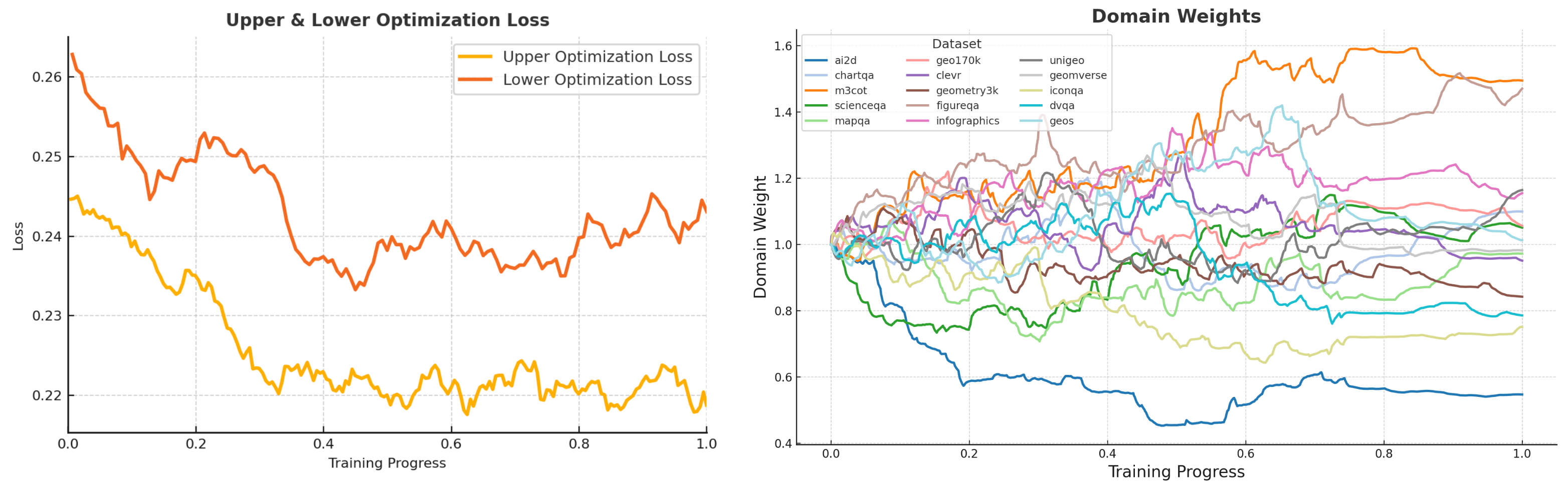
## [Chart Type: Dual Line Charts]
### Overview
The image displays two side-by-side line charts sharing a common x-axis ("Training Progress") but measuring different metrics. The left chart tracks optimization loss, while the right chart tracks the evolution of domain weights for various datasets during a training process. The overall visual suggests a machine learning or model training context where performance (loss) and internal weighting of data sources are being monitored over time.
### Components/Axes
**Left Chart: "Upper & Lower Optimization Loss"**
* **X-Axis:** "Training Progress" (linear scale, from 0.0 to 1.0).
* **Y-Axis:** "Loss" (linear scale, from 0.22 to 0.26).
* **Legend:** Located in the top-right corner.
* Orange line: "Upper Optimization Loss"
* Red line: "Lower Optimization Loss"
**Right Chart: "Domain Weights"**
* **X-Axis:** "Training Progress" (linear scale, from 0.0 to 1.0).
* **Y-Axis:** "Domain Weight" (linear scale, from 0.4 to 1.6).
* **Legend:** Located in the top-left corner, titled "Dataset". It lists 15 datasets with corresponding line colors:
* `ai2d` (blue), `chartqa` (light blue), `m3cot` (orange), `scienceqa` (green), `mapqa` (light green), `geo170k` (pink), `clevr` (purple), `geometry3k` (brown), `figureqa` (light brown), `infographics` (magenta), `unigeo` (gray), `geomverse` (light gray), `iconqa` (olive), `dvqa` (cyan), `geos` (light cyan).
### Detailed Analysis
**Left Chart: Upper & Lower Optimization Loss**
* **Trend Verification:** Both lines show a general downward trend from the start (Training Progress 0.0) to approximately 0.4, followed by a period of fluctuation and relative stability.
* **Upper Optimization Loss (Orange Line):**
* Starts at approximately 0.245.
* Decreases steadily, reaching a local minimum of ~0.22 around progress 0.4.
* Fluctuates between ~0.218 and 0.225 for the remainder of the training, ending near 0.22.
* **Lower Optimization Loss (Red Line):**
* Starts significantly higher at approximately 0.262.
* Shows a steeper initial decline, dropping to ~0.235 by progress 0.4.
* After progress 0.4, it exhibits more volatility than the upper loss, with values ranging roughly between 0.235 and 0.245. It ends the training at approximately 0.245.
**Right Chart: Domain Weights**
* **Trend Verification:** The 15 data series exhibit diverse behaviors. Some show clear upward or downward trends, while others fluctuate around a central value. The lines are densely packed, indicating complex, dynamic adjustments.
* **Key Data Series & Approximate Final Values (at Training Progress 1.0):**
* **Highest Weights:** `m3cot` (orange) ends highest at ~1.55. `infographics` (magenta) is next at ~1.25.
* **Lowest Weights:** `ai2d` (blue) shows the most dramatic decrease, ending at ~0.55. `iconqa` (olive) also trends downward to ~0.75.
* **Clustered Around 1.0:** Many datasets, including `scienceqa` (green), `clevr` (purple), `unigeo` (gray), and `geomverse` (light gray), finish in a band between approximately 0.95 and 1.15.
* **Notable Trajectories:**
* `ai2d` (blue): Sharp, consistent decline from ~1.0 to ~0.55.
* `m3cot` (orange): Strong upward trend from ~1.0 to ~1.55.
* `iconqa` (olive): Gradual decline from ~1.0 to ~0.75.
* `infographics` (magenta): Rises early, peaks near 1.4 around progress 0.5, then declines to ~1.25.
### Key Observations
1. **Loss Convergence:** The "Upper Optimization Loss" converges to a lower and more stable value than the "Lower Optimization Loss," which remains higher and more volatile. This suggests the optimization process for the "upper" component is more effective or stable.
2. **Dynamic Weight Adjustment:** Domain weights are not static; they are actively adjusted throughout training. The system appears to be dynamically re-weighting the importance of different datasets.
3. **Divergent Importance:** The training process significantly increases the weight of `m3cot` and `infographics` datasets while drastically reducing the weight of `ai2d`. This implies the model finds the former more valuable for its objective and the latter less so, or potentially noisy.
4. **Stability Phase:** After an initial period of rapid change (roughly progress 0.0 to 0.4), both loss values and most domain weights enter a phase of slower change or fluctuation, suggesting the training is approaching a steady state.
### Interpretation
This data visualizes the inner dynamics of a multi-domain model training process, likely using a technique like meta-learning or dynamic curriculum learning where the model learns *how* to weight its training data.
* **What the data suggests:** The simultaneous decrease in loss (left chart) and the dramatic re-weighting of domains (right chart) indicate the model is successfully learning to prioritize certain data sources over others to improve its overall performance. The high final weight for `m3cot` (a multi-step chain-of-thought dataset) suggests the training heavily favors data that promotes complex reasoning.
* **Relationship between elements:** The two charts are directly linked. The adjustments in domain weights (right) are the mechanism driving the changes in the optimization loss (left). The system is likely trying to minimize the loss by finding the optimal mix of training data.
* **Notable anomalies:** The starkly different fates of `ai2d` (plummets) and `m3cot` (soars) are the most significant outliers. This could indicate a mismatch between the `ai2d` dataset's content and the model's target task, or that `ai2d` is being "down-weighted" to make room for more beneficial data. The volatility in the "Lower Optimization Loss" after progress 0.4, despite stable weights, might point to an inherent instability in that part of the optimization landscape.