## Line Charts: Performance Comparison on Different Datasets
### Overview
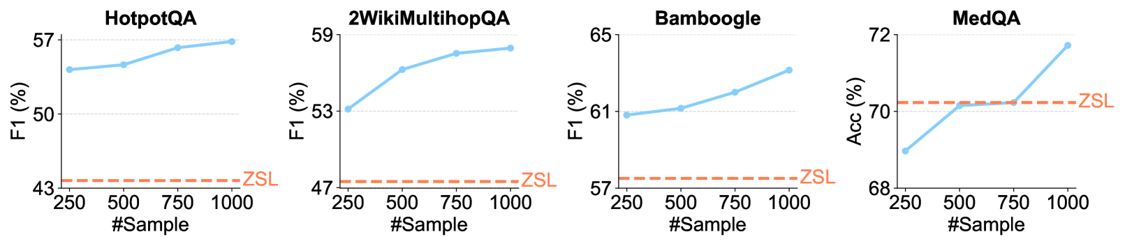
The image contains four line charts, each displaying the performance of a model on a different question-answering dataset. The x-axis represents the number of samples used for training, and the y-axis represents the performance metric (F1 score or Accuracy). A horizontal dashed line indicates the Zero-Shot Learning (ZSL) performance for each dataset.
### Components/Axes
* **Titles (Top of each chart):**
* HotpotQA
* 2WikiMultihopQA
* Bamboogle
* MedQA
* **X-axis (Shared for all charts):**
* Label: "#Sample"
* Values: 250, 500, 750, 1000
* **Y-axis:**
* **HotpotQA:**
* Label: "F1 (%)"
* Values: 43, 50, 57
* **2WikiMultihopQA:**
* Label: "F1 (%)"
* Values: 47, 53, 59
* **Bamboogle:**
* Label: "F1 (%)"
* Values: 57, 61, 65
* **MedQA:**
* Label: "Acc (%)"
* Values: 68, 70, 72
* **Data Series:**
* Blue Line: Performance with increasing number of samples.
* Orange Dashed Line: ZSL (Zero-Shot Learning) performance.
### Detailed Analysis
**1. HotpotQA**
* Y-axis: F1 (%)
* Trend: The blue line shows an upward trend, indicating improved performance with more samples.
* Data Points:
* 250 Samples: F1 ≈ 55%
* 500 Samples: F1 ≈ 56%
* 750 Samples: F1 ≈ 57%
* 1000 Samples: F1 ≈ 57%
* ZSL: The orange dashed line is at F1 ≈ 43%.
**2. 2WikiMultihopQA**
* Y-axis: F1 (%)
* Trend: The blue line shows an upward trend, indicating improved performance with more samples.
* Data Points:
* 250 Samples: F1 ≈ 53%
* 500 Samples: F1 ≈ 56%
* 750 Samples: F1 ≈ 58%
* 1000 Samples: F1 ≈ 58.5%
* ZSL: The orange dashed line is at F1 ≈ 47%.
**3. Bamboogle**
* Y-axis: F1 (%)
* Trend: The blue line shows an upward trend, indicating improved performance with more samples.
* Data Points:
* 250 Samples: F1 ≈ 61%
* 500 Samples: F1 ≈ 62%
* 750 Samples: F1 ≈ 63%
* 1000 Samples: F1 ≈ 64%
* ZSL: The orange dashed line is at F1 ≈ 57%.
**4. MedQA**
* Y-axis: Acc (%)
* Trend: The blue line shows a significant upward trend, indicating improved performance with more samples.
* Data Points:
* 250 Samples: Acc ≈ 69%
* 500 Samples: Acc ≈ 70.5%
* 750 Samples: Acc ≈ 71%
* 1000 Samples: Acc ≈ 72%
* ZSL: The orange dashed line is at Acc ≈ 70.5%.
### Key Observations
* For all datasets, increasing the number of samples generally improves performance (F1 score or Accuracy).
* The MedQA dataset shows the most significant performance increase with more samples.
* The ZSL performance varies across datasets.
* For MedQA, the performance with 500 samples is already at the ZSL level.
### Interpretation
The charts demonstrate the impact of increasing training data size on the performance of a model across different question-answering datasets. The upward trends in the blue lines suggest that the model benefits from more data. The ZSL performance provides a baseline for comparison, showing how well the model performs without any training on the specific dataset. The MedQA dataset's rapid performance increase suggests that the model can quickly adapt to this dataset with relatively few samples. The fact that the performance on MedQA surpasses the ZSL baseline with only 500 samples indicates that even a small amount of training data can significantly improve performance compared to a zero-shot approach.