\n
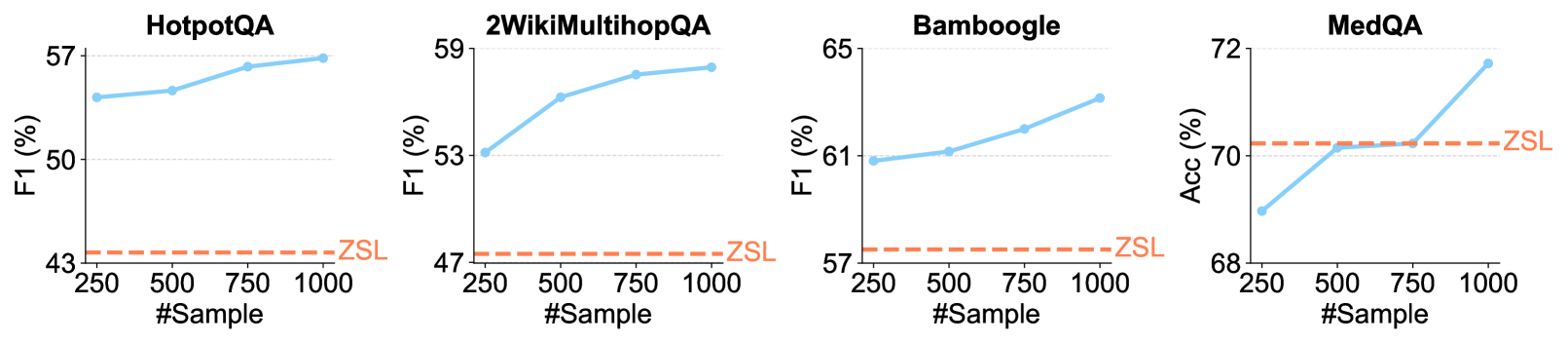
## Line Charts: Performance vs. Sample Size Across Four QA Datasets
### Overview
The image displays four separate line charts arranged horizontally, each comparing the performance of a method (solid blue line) against a Zero-Shot Learning (ZSL) baseline (dashed orange line) as the number of training samples increases. The charts evaluate performance on four distinct question-answering (QA) datasets: HotpotQA, 2WikiMultihopQA, Bamboogle, and MedQA.
### Components/Axes
* **Titles (Top-Center of each chart):** "HotpotQA", "2WikiMultihopQA", "Bamboogle", "MedQA".
* **Y-Axis Labels (Left side):**
* Charts 1-3: "F1 (%)"
* Chart 4: "Acc (%)"
* **X-Axis Label (Bottom-Center of each chart):** "#Sample"
* **X-Axis Markers:** 250, 500, 750, 1000 (consistent across all charts).
* **Legend/Series Labels:**
* **Blue Solid Line with Circular Markers:** Represents the performance of the evaluated method. No explicit label is given for this series in the legend.
* **Orange Dashed Line:** Labeled "ZSL" (Zero-Shot Learning) at the right end of the line. This serves as a constant baseline.
* **Spatial Layout:** Each chart is a self-contained plot. The ZSL label is positioned to the right of its corresponding dashed line, near the right edge of each plot area.
### Detailed Analysis
**1. HotpotQA (Leftmost Chart)**
* **Y-Axis Range:** 43% to 57%.
* **ZSL Baseline (Orange Dashed Line):** Constant at approximately **44%**.
* **Method Performance (Blue Line) - Trend:** Slopes upward consistently.
* @250 Samples: ~54%
* @500 Samples: ~54.5%
* @750 Samples: ~56%
* @1000 Samples: ~57%
**2. 2WikiMultihopQA (Second Chart)**
* **Y-Axis Range:** 47% to 59%.
* **ZSL Baseline (Orange Dashed Line):** Constant at approximately **48%**.
* **Method Performance (Blue Line) - Trend:** Slopes upward, with a steeper initial increase.
* @250 Samples: ~53%
* @500 Samples: ~56%
* @750 Samples: ~58%
* @1000 Samples: ~59%
**3. Bamboogle (Third Chart)**
* **Y-Axis Range:** 57% to 65%.
* **ZSL Baseline (Orange Dashed Line):** Constant at approximately **58%**.
* **Method Performance (Blue Line) - Trend:** Slopes upward steadily.
* @250 Samples: ~61%
* @500 Samples: ~61.5%
* @750 Samples: ~62%
* @1000 Samples: ~63%
**4. MedQA (Rightmost Chart)**
* **Y-Axis Range:** 68% to 72%.
* **ZSL Baseline (Orange Dashed Line):** Constant at approximately **70.5%**.
* **Method Performance (Blue Line) - Trend:** Slopes upward, with a notable sharp increase between 750 and 1000 samples.
* @250 Samples: ~69%
* @500 Samples: ~70%
* @750 Samples: ~70%
* @1000 Samples: ~72%
### Key Observations
1. **Universal Positive Trend:** In all four datasets, the performance of the evaluated method (blue line) improves as the number of training samples (#Sample) increases from 250 to 1000.
2. **Consistent Outperformance:** The method's performance is consistently above the ZSL baseline across all sample sizes for HotpotQA, 2WikiMultihopQA, and Bamboogle.
3. **MedQA Crossover:** For MedQA, the method starts below the ZSL baseline at 250 samples, matches it at 500 and 750 samples, and then surpasses it significantly at 1000 samples.
4. **Performance Ceiling:** The rate of improvement varies. HotpotQA and Bamboogle show more linear growth, while 2WikiMultihopQA shows diminishing returns after 500 samples, and MedQA shows a late surge.
5. **Baseline Stability:** The ZSL performance is depicted as a flat line, indicating it is a fixed reference point not dependent on the number of samples shown.
### Interpretation
The data demonstrates the **value of in-context learning or few-shot training** for the evaluated method across diverse QA tasks. The consistent upward trend of the blue lines indicates that providing more examples (increasing #Sample) allows the model to better adapt to the task, leading to improved F1 or Accuracy scores.
The comparison to the ZSL baseline highlights the **efficiency of the method**. For most tasks, even a small number of samples (250) yields a substantial gain over zero-shot performance. The MedQA chart is particularly insightful; it suggests that for this specific (likely more complex or domain-specific) task, a **critical mass of examples (between 750 and 1000)** is needed for the method to fully leverage its capabilities and surpass the zero-shot baseline. This could indicate a higher learning threshold or a need for more diverse examples to capture the task's nuances.
The charts collectively argue that the method benefits significantly from, and is effective at utilizing, provided examples, making it a more powerful approach than zero-shot inference for these benchmarks when sample data is available.