\n
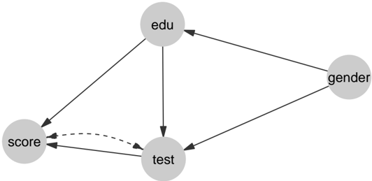
## Diagram: Causal Relationship Model
### Overview
The image depicts a directed acyclic graph illustrating potential causal relationships between four variables: "edu" (education), "gender", "test" (test score/performance), and "score" (outcome score). The diagram uses circles to represent variables and arrows to indicate the direction of influence. A dashed arrow indicates a potential, less direct, or hypothesized relationship.
### Components/Axes
The diagram consists of four nodes (circles) labeled:
* "edu" – positioned at the top-center.
* "gender" – positioned at the top-right.
* "test" – positioned at the bottom-center.
* "score" – positioned at the bottom-left.
There are five directed edges (arrows) connecting these nodes:
* "edu" -> "test"
* "edu" -> "gender"
* "gender" -> "test"
* "test" -> "score"
* "test" --(dashed)--> "score"
### Detailed Analysis or Content Details
The diagram shows the following relationships:
1. **Education ("edu") influences Test ("test")**: A solid arrow points from "edu" to "test", suggesting that education level impacts test performance.
2. **Education ("edu") influences Gender ("gender")**: A solid arrow points from "edu" to "gender", suggesting that education level impacts gender.
3. **Gender ("gender") influences Test ("test")**: A solid arrow points from "gender" to "test", suggesting that gender impacts test performance.
4. **Test ("test") influences Score ("score")**: A solid arrow points from "test" to "score", suggesting that test performance impacts the final score.
5. **Test ("test") potentially influences Score ("score")**: A dashed arrow points from "test" to "score", suggesting a possible, but less certain, direct influence of test performance on the final score. This could represent a confounding variable or a weaker relationship.
### Key Observations
The diagram highlights "test" as a central variable, influenced by both "edu" and "gender", and in turn influencing "score". The dashed arrow from "test" to "score" suggests a more nuanced relationship than a simple direct causal link. The diagram does not provide any quantitative data or specific values; it only illustrates the proposed relationships.
### Interpretation
This diagram represents a hypothesized causal model. It suggests that education and gender are factors that can affect test performance, and test performance, in turn, affects the final score. The dashed arrow indicates that the relationship between test and score might be more complex, potentially involving other unobserved variables or a weaker direct effect. This type of diagram is often used in causal inference and structural equation modeling to visually represent assumptions about the relationships between variables before conducting statistical analysis. The model implies that interventions aimed at improving education or addressing gender disparities could potentially impact test scores and ultimately, the final outcome score. The dashed line suggests that the relationship between test and score is not necessarily a direct causal one, and other factors may be at play.