\n
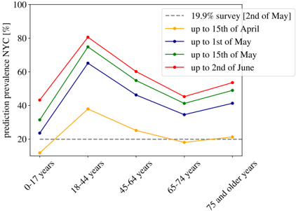
## Line Chart: COVID-19 Prediction Prevalence in NYC by Age Group and Date
### Overview
This is a line chart displaying the predicted prevalence (as a percentage) of a condition (likely COVID-19 infection) in New York City, segmented by age group. The chart compares predictions made at four different time points against a baseline survey result. The data shows how predicted prevalence varies across age cohorts and how these predictions evolved over a period from mid-April to early June.
### Components/Axes
* **Chart Type:** Multi-series line chart.
* **Y-Axis:** Labeled "prediction prevalence NYC [%]". Scale runs from 0 to 100 in increments of 20.
* **X-Axis:** Represents age groups. The categories are, from left to right: "0-17 years", "18-44 years", "45-64 years", "65-74 years", and "75 and older years".
* **Legend:** Located in the top-right corner of the chart area. It contains five entries:
1. A dashed grey line: "19.9% survey [2nd of May]"
2. A yellow line with circle markers: "up to 15th of April"
3. A blue line with circle markers: "up to 1st of May"
4. A green line with circle markers: "up to 15th of May"
5. A red line with circle markers: "up to 2nd of June"
### Detailed Analysis
**Data Series and Approximate Values:**
The following table reconstructs the data points from the chart. Values are approximate visual estimates.
| Age Group | 19.9% Survey (Dashed Grey) | up to 15th of April (Yellow) | up to 1st of May (Blue) | up to 15th of May (Green) | up to 2nd of June (Red) |
| :--- | :--- | :--- | :--- | :--- | :--- |
| **0-17 years** | 19.9% | ~10% | ~23% | ~32% | ~43% |
| **18-44 years** | 19.9% | ~38% | ~65% | ~75% | ~81% |
| **45-64 years** | 19.9% | ~25% | ~46% | ~57% | ~61% |
| **65-74 years** | 19.9% | ~18% | ~35% | ~42% | ~47% |
| **75 and older years** | 19.9% | ~21% | ~41% | ~46% | ~50% |
**Trend Verification:**
* **19.9% Survey (Dashed Grey):** This is a horizontal reference line, constant at 19.9% across all age groups.
* **All Prediction Lines (Yellow, Blue, Green, Red):** Each follows a similar shape. They start lower for the 0-17 age group, peak sharply at the 18-44 age group, then decline through the 45-64 and 65-74 groups, with a slight upturn or plateau for the 75 and older group.
* **Temporal Trend:** For every age group, the predicted prevalence increases sequentially from the earliest date (Yellow: April 15) to the latest date (Red: June 2). The vertical gap between the lines is largest at the 18-44 age peak.
### Key Observations
1. **Peak in Younger Adults:** The highest predicted prevalence across all time points is consistently in the "18-44 years" age group.
2. **Increasing Predictions Over Time:** Model predictions for prevalence grew substantially between mid-April and early June for all age categories.
3. **Survey vs. Predictions:** The "19.9% survey" line acts as a baseline. By June 2nd (Red line), the model's predicted prevalence exceeds this survey baseline for all age groups except possibly the 0-17 group (where it is ~43%, well above 19.9%).
4. **Relative Age Group Risk:** The model consistently predicts the lowest prevalence in the "0-17 years" group (except for the April 15 prediction which is lowest for 65-74) and the second-lowest in the oldest ("75 and older") group, relative to the peak in young adults.
### Interpretation
This chart visualizes the output of an epidemiological model predicting COVID-19 prevalence in NYC. The data suggests two key narratives:
1. **Age-Stratified Risk:** The model indicates that, during the period analyzed, the highest burden of predicted infection was among young to middle-aged adults (18-44), not the elderly. This could reflect higher exposure rates due to work or social activity, or it could be an artifact of the model's assumptions or the data it was trained on. The lower predicted prevalence in the oldest groups might account for more stringent shielding behavior.
2. **Model Evolution:** The sequential upward shift of the lines from April to June shows the model's predictions becoming more severe over time. This likely incorporates new case data, indicating the epidemic was growing or that the model was being calibrated to better match observed trends. The consistent shape of the curves suggests the model's understanding of relative risk between age groups remained stable, even as the absolute predicted prevalence increased.
The "19.9% survey" line from May 2nd provides a crucial reality check. The fact that most later predictions lie above this line suggests the model was forecasting a prevalence higher than what a point-in-time survey had measured, potentially indicating an expectation of future growth or a difference in methodology (e.g., model predicting active infections vs. survey measuring antibodies). The chart effectively communicates both the age-specific predictions and their temporal uncertainty.