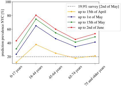
## Line Chart: Prediction Prevalence NYC by Age Group and Date
### Overview
The image is a line chart showing the prediction prevalence of a condition (likely a disease) in New York City (NYC) across different age groups, measured at different points in time. The x-axis represents age groups, and the y-axis represents the prediction prevalence in percentage. Several lines represent data collected up to different dates, and a horizontal dashed line indicates a survey result from May 2nd.
### Components/Axes
* **Title:** prediction prevalence NYC [%] (y-axis)
* **X-axis:** Age groups: 0-17 years, 18-44 years, 45-64 years, 65-74 years, 75 and older years
* **Y-axis:** Prediction prevalence NYC [%], ranging from 0 to 100 in increments of 20.
* **Legend:** Located in the top-right corner of the chart.
* Gray dashed line: 19.9% survey [2nd of May]
* Yellow line: up to 15th of April
* Dark Blue line: up to 1st of May
* Green line: up to 15th of May
* Red line: up to 2nd of June
### Detailed Analysis
* **19.9% survey [2nd of May] (Gray dashed line):** This line is horizontal, indicating a constant prevalence of 19.9% across all age groups.
* **up to 15th of April (Yellow line):**
* Starts at approximately 12% for the 0-17 age group.
* Increases to approximately 38% for the 18-44 age group.
* Decreases to approximately 25% for the 45-64 age group.
* Decreases to approximately 18% for the 65-74 age group.
* Increases slightly to approximately 21% for the 75 and older age group.
* **up to 1st of May (Dark Blue line):**
* Starts at approximately 31% for the 0-17 age group.
* Increases to approximately 66% for the 18-44 age group.
* Decreases to approximately 47% for the 45-64 age group.
* Decreases to approximately 35% for the 65-74 age group.
* Increases to approximately 49% for the 75 and older age group.
* **up to 15th of May (Green line):**
* Starts at approximately 32% for the 0-17 age group.
* Increases to approximately 75% for the 18-44 age group.
* Decreases to approximately 55% for the 45-64 age group.
* Decreases to approximately 42% for the 65-74 age group.
* Increases to approximately 53% for the 75 and older age group.
* **up to 2nd of June (Red line):**
* Starts at approximately 43% for the 0-17 age group.
* Increases to approximately 80% for the 18-44 age group.
* Decreases to approximately 60% for the 45-64 age group.
* Decreases to approximately 45% for the 65-74 age group.
* Increases to approximately 54% for the 75 and older age group.
### Key Observations
* The 18-44 age group consistently shows the highest prediction prevalence across all dates.
* The 65-74 age group consistently shows the lowest prediction prevalence after the 18-44 age group across all dates.
* The prediction prevalence generally increases from April to June, especially in the younger age groups.
* The survey result from May 2nd (19.9%) is significantly lower than the prediction prevalence for most age groups and dates, suggesting a potential discrepancy between the survey and the prediction model.
* For all dates, the 75 and older age group shows a slight increase in prediction prevalence compared to the 65-74 age group.
### Interpretation
The chart suggests that the prediction prevalence of the condition in NYC varies significantly by age group and over time. The 18-44 age group appears to be the most affected, while the 65-74 age group is the least affected. The increase in prediction prevalence from April to June could indicate a seasonal trend or an actual increase in the prevalence of the condition. The discrepancy between the survey result and the prediction prevalence raises questions about the accuracy or reliability of the prediction model. Further investigation is needed to understand the underlying factors driving these trends and to validate the prediction model against real-world data. The slight increase in prediction prevalence for the 75 and older age group compared to the 65-74 age group could be due to factors such as increased susceptibility or different exposure patterns in this age group.