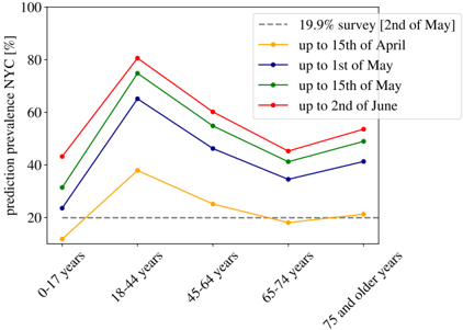
## Line Chart: Prediction Prevalence NYC by Age Group and Date
### Overview
This line chart displays the predicted prevalence of a condition (likely an infection or disease) in New York City (NYC) across different age groups, as measured on several dates. The x-axis represents age groups, and the y-axis represents the prediction prevalence in percentage. Five different lines represent prevalence estimates collected on different dates.
### Components/Axes
* **X-axis:** Age Groups - 0-17 years, 18-44 years, 45-64 years, 65-74 years, 75 and older years.
* **Y-axis:** Prediction prevalence NYC [%] - Scale ranges from 0 to 100, with increments of 10.
* **Legend:** Located in the top-right corner.
* 19.9% survey [2nd of May] - Dashed brown line.
* up to 15th of April - Yellow line.
* up to 1st of May - Blue line.
* up to 15th of May - Green line.
* up to 2nd of June - Red line.
### Detailed Analysis
Here's a breakdown of the data series and their trends:
* **19.9% survey [2nd of May] (Brown Dashed Line):** This line is relatively flat.
* 0-17 years: ~18%
* 18-44 years: ~75%
* 45-64 years: ~58%
* 65-74 years: ~42%
* 75 and older years: ~52%
* **up to 15th of April (Yellow Line):** This line shows an initial rise and then a gradual decline.
* 0-17 years: ~10%
* 18-44 years: ~42%
* 45-64 years: ~22%
* 65-74 years: ~20%
* 75 and older years: ~22%
* **up to 1st of May (Blue Line):** This line initially rises sharply, peaks in the 18-44 age group, and then declines.
* 0-17 years: ~28%
* 18-44 years: ~70%
* 45-64 years: ~48%
* 65-74 years: ~38%
* 75 and older years: ~45%
* **up to 15th of May (Green Line):** This line also rises sharply, peaks in the 18-44 age group, and then declines, but remains higher than the blue line across most age groups.
* 0-17 years: ~42%
* 18-44 years: ~78%
* 45-64 years: ~55%
* 65-74 years: ~45%
* 75 and older years: ~53%
* **up to 2nd of June (Red Line):** This line shows a similar pattern to the green line, with a peak in the 18-44 age group, but with slightly lower values in the older age groups.
* 0-17 years: ~45%
* 18-44 years: ~75%
* 45-64 years: ~58%
* 65-74 years: ~48%
* 75 and older years: ~55%
### Key Observations
* The 18-44 age group consistently shows the highest predicted prevalence across all dates.
* The prevalence generally decreases with increasing age, although the 75 and older group sometimes shows higher prevalence than the 65-74 group.
* The prevalence estimates generally increase from April 15th to June 2nd, suggesting a potential spread of the condition over time.
* The "19.9% survey [2nd of May]" data appears to be a separate data point, potentially representing a different data collection method or a specific sub-population.
### Interpretation
The data suggests a condition is more prevalent among young adults (18-44 years) in NYC. The increasing prevalence over time (from April 15th to June 2nd) indicates a potential outbreak or increasing transmission rate. The relatively flat "19.9% survey" line suggests that this survey may be capturing a different aspect of the prevalence, or a different population segment. The differences between the lines representing different dates likely reflect the accumulation of new cases and the refinement of the prediction model as more data becomes available. The consistent trend of higher prevalence in younger adults could be due to factors such as social behavior, vaccination rates, or underlying health conditions. Further investigation would be needed to understand the specific drivers of these patterns. The data could be used to inform public health interventions, such as targeted vaccination campaigns or social distancing measures.